1.33:1, 1.85:1 and 2.35:1, these are the three most mainstream frame ratios in film history. 1.33:1 is the earliest established screen aspect ratio, known as the “standard screen”, the latter two are evolved from it.
1.85:1 is the widescreen standard established by the American Academy of Motion Picture Arts and Sciences, called “academic widescreen”, and mainstream literary and artistic films basically use this frame ratio.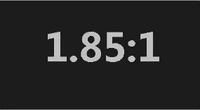
2.35:1 is the frame standard for Hollywood blockbusters. It is shot by an anamorphic lens and is called an anamorphic screen, which has the highest aspect ratio.
The origin of the standard screen
You may ask, why is 1.33:1 established as the standard screen for movies? This matter has something to do with Edison.
That’s right, it was Edison, the king of invention. He invented and applied for an invention patent for perforated film. Before mass-produced and launched on the market, the aspect ratio of the frame must be determined. This small problem has caused turmoil. debate.
Everyone put forward all kinds of suggestions, such as squares, rectangles, and even rounds (which are technically difficult to achieve). Speaking of rectangles alone, some people suggested that it should be a vertical rectangle, and the height of the picture should be greater than the width, and they gave seemingly sufficient reasons.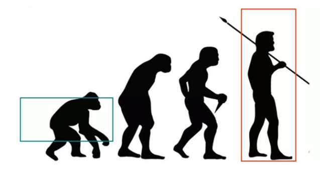
The reason is quite interesting: humans have evolved from reptiles to walking upright, and the state of walking upright is closer to the vertical rectangle. The photography is mainly human, of course the vertical ratio is more appropriate!
Don’t be fooled by this argument. It seems reasonable, but it’s nonsense. Because it does not take into account the visual field of the human eye at all.
The field of view of human eyes is equivalent to the horizontal crossing of two circles. If simplified as a rectangle, it is obviously horizontal rather than vertical. From the perspective of viewing, a horizontal rectangle is definitely more appropriate for a movie frame.
Edison also preferred the aspect ratio of the banner, but he had no idea about the specific ratio. Finally, he thought of the golden ratio principle in painting and set the film aspect ratio to 4:3, which is 1.33:1.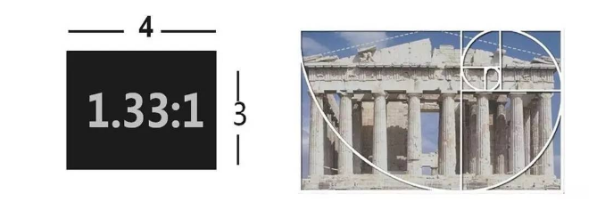
The golden ratio in the painting is like this on the right, not as simple as applying numbers directly. But in any case, the 4:3 frame ratio is so determined. Although it is made by the engineering male Edison, it cannot be said that it has nothing to do with art (the golden section).
Although the visual experience of this picture frame ratio is not very good, it has been used as an industry standard. After the birth of the TV, in order to facilitate the movie on the TV screen, the 4:3 frame ratio was also used.
“Metamorphosis” adapted to the TV screen
TV screens have always been an important channel for movie broadcasts. The two are both in the 4:3 era. Everything is so harmonious. When the movie becomes a wide screen, the 4:3 TV screen is a bit overwhelming, and you must continue to play it. Movies, you have to think about something.
The first method is to directly broadcast the widescreen movie on the TV. This is the most convenient, but there are black borders on the top and bottom, which wastes the display range of the TV screen, which is a pity. And the picture becomes very small and it looks uncomfortable.
The second method is to crop the widescreen movie to a 4:3 ratio so that it can be played on a full screen.
In fact, many films do this. In order to prevent the important information from being missed after cutting and affecting the audience’s understanding, the cutting problem of TV broadcasting must be considered when making a movie, and the drama elements must be arranged in the box of TV cutting as much as possible. The technical term is “TV Security Range”.
The filming should consider the composition of the two frame ratios of film and television, which makes the photographer too hard to toss.
The third method is the most weird, it directly transforms the wide screen picture into 4:3 projection.
In the 1990s, many TV stations broadcast movies in this way. The picture frame was squashed horizontally, and the result was that the fat man in the movie became thinner, and the thin man became a matchstick, which made the audience think that people look like this.
Nowadays, TV screens have popularized wide screens, and they are basically no longer bothered by the above-mentioned problems.
By the way, the current standard for high-definition TV is 1920*1080, and the calculated aspect ratio is about 1.78:1, which is between the college wide screen and the anamorphic wide screen. As shown in the figure: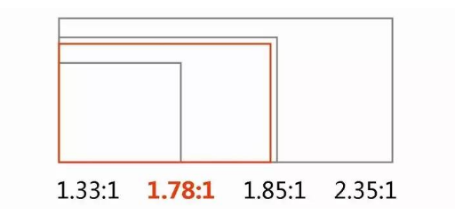
Of course, it was a rather compromised result. The purpose was to take into account the needs of two wide-screen movies on the TV screen, and to consider a large number of news programs shot in 4:3 format.
Which frame ratio is the most popular?
There is no doubt that the 4:3 frame is too narrow, it cannot fill the field of vision of our eyes. Watching a 4:3 movie will give people a feeling of peeping through the window, which weakens the appeal of the picture.
All kinds of screens we come into contact with in our lives have gradually become widescreens, such as movies, TVs, computers, mobile phones, etc. Because most viewers do not like 4:3, it does give people an impression of being behind the times.
By the way, the 4:3 format is close to the monocular field of vision. If you open an old movie, close one eye, and look at it with the other eye, the field of vision will be much more comfortable, at least the field of view is basically filled, but would you like to finish watching a movie like this?
Let’s talk about it again, the multimedia screens in the classroom basically still use the ratio of 4:3. I applaud this “backward” design because it is not easy for students to immerse themselves in the screen, allowing students to switch their attention at any time. On the nagging teacher on the side.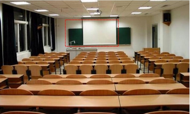
1.85:1 is the closest human vision to the binoculars. It is the most plain and natural frame ratio. It is best at expressing the relationship between characters and the environment. It is the favorite frame of literary films.
2.35:1 It has a wider field of vision than the human eye, giving people a feeling of extreme openness, beyond the experience of daily life. Hollywood blockbusters love this ratio the most. They like to create spectacles on the screen, create shocking magnificent scenes, and create daydreams that you can’t see in life. This is undoubtedly the most suitable ratio.
The influence of frame ratio on photography
1.33:1
The picture is mainly human figures. When shooting close-ups, medium and close shots, the picture appears full and natural, but the performance of the environmental space tends to appear cramped.
If the film focuses on characters and shows the relationship between the characters, and there is no need to highlight the environmental modeling elements, 4:3 is actually a good frame ratio. You can try the 4:3 format when you are shooting student homework, which can also save a lot of art work.
1.85:1
It can combine the characters and the environment in a more harmonious way. While expressing the characters, it can also present the relationship between the person and the environment more comfortably, and it is a more natural and intimate relationship, which is similar to what we see in life.
2.35:1
First of all, the magnificent environment is easy to do.
However, shooting small scenes is a bit at a loss. For example, to take close-up shots of people, a 1.33:1 frame is actually the most suitable. At 1.85:1, there is a bit of extra environment. The 2.35:1 frame is directly empty, and there is a suspicion of wasting film.
It’s not that the 2.35:1 frame will not be able to take close-ups comfortably. It is still feasible to find ways to use the extra frame, such as adding some props or actions. In short, it will take a little effort, otherwise the frame will be quite thin.
The more common double medium shot is very suitable to be placed in a 1.85:1 frame, and how comfortable it looks.
But in the 2.35:1 frame, there is a problem. Either let the actors be far away, like shouting in the air, or grab more actors and props to fill in the blanks, and the composition will become more complicated.
