When beginners take photos, they often encounter some problems in composition.
Today, we summarize several typical composition problems and show the front and back comparison photos. You can see at a glance where the problem lies by comparing.
Table of Contents
The Main Body is Not Prominent
One of the most common mistakes beginners make when framing and composing a picture is that they always want to put many elements of the scene into the picture. In the end, the picture is too cluttered, the subject is not prominent, or there is no subject at all.
So what is the subject?
Simply put, the subject is the most important scene in a photo relative to the background scene. This most important scene undertakes the main task of expressing the subject of the photograph.
A good photo usually quickly draws the viewer’s attention to the subject that can express the subject of the photo.
Since the subject has such an important task, we must consider how to highlight the subject in the picture?
First of all, a photo should not have too many subjects, preferably only one.
Of course it is not advisable for a photo to have no subject, but too much subject cannot make the subject well expressed. When it is necessary to express the key points of multiple pictures, in order to avoid affecting the expression of the theme, it must be done in a primary and secondary order.
Secondly, as far as the position of the subject is concerned, it is best to place the subject in a prominent position, and try to exclude or compress other scenes that interfere with the subject.
The framing range is too large, the picture is cluttered, and the subject is not prominent enough
Narrow the framing range and select one of the flowers to focus on, so that the subject stands out
Horizon Position Is Too Stiff
In the photographic composition, if there is a horizon, the choice of the horizon position will play a very important role in the final effect of the picture. Especially in landscape photography, the horizon is the most common element.
When shooting, we are often used to the rule of thirds composition, that is, placing the horizon in the upper or lower third of the picture to highlight the subject of the picture and maintain the stability and harmony of the picture.
Sometimes, the horizon can also be placed in the center of the frame.
Of course, this is a relatively special horizon composition. For example, when shooting the shore scenery against the water surface, we can place the horizon in the center of the picture to get a symmetrical picture.
The most common problem with framing with the horizon is that the horizon is skewed or placed too rigidly.
Some do use the rule of thirds for composition, but the choice of the upper or lower thirds without considering the actual position of the subject in the frame is not accurate enough, causing the horizon to distract people’s attention.
Some place the horizon line very bluntly near the edge of the picture, which has a sense of abrupt stop and makes the picture look very uncoordinated.
By the lake, the view before the sun goes down is very attractive, but because the position of the horizon is arranged too close to the edge of the frame, the picture is very incongruous
Arrange the horizon in the lower third of the picture, so that the scenery of the water surface appears reasonably in the picture, and let the sky occupy more of the picture, so that the theme of the sunset is more prominent, and the picture is very artistic
Horizon is Skewed
The horizon can also be said to be a horizontal line, so if you want to be “level”, you must keep the horizon level in the picture when composing the shot.
Some friends just ignore this point when taking pictures with the horizon appearing.
A slanted horizon line would disrupt the harmony of the picture, making it uncomfortable. We say the composition is a flexible, skewed horizon that affects the beauty of the picture.
Sometimes, we can try to break the rule of keeping the horizon level, and pursue the dynamic and freshness of the picture by tilting the horizon. But most of us still have to keep this rule, after all, this is the best composition rule that photographers have been exploring for many years.
The skewed horizon affects the aesthetics of the picture
Put the horizon at the position of the upper third line, and keep the horizon level, the picture looks more natural and harmonious
When shooting sunsets in the canyon, keeping the horizon level can make people feel comfortable after seeing the picture, and the scenery of the canyon matches the scenery of the sky, which is very charming
Blindly Use the Head-up Angle to Shoot
Head-up is the most common visual angle in our lives, and it is also the shooting angle that is most in line with the visual habits of the human eye. But if you blindly use the head-up angle to shoot, it will inevitably give people a boring feeling.
For example, when taking portrait photos of tourists, using the same head-up angle to shoot will make the picture appear flat and boring.
Some people only use the head-up angle when shooting portraits, and even when shooting landscapes, animals, buildings and other subjects, ignoring other shooting angles. This will miss a lot of the original wonderful picture.
Even if it is the same thing, different picture effects can be obtained by using different angles. Some pictures may only become a photographic work if they are shot upward or downward.
So when shooting, we might as well try to squat down and shoot from a low angle, or find a commanding height to try the effect of looking down.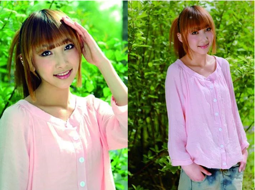
Although there is no problem with each composition of these beautiful portrait photos taken from a horizontal perspective, the pictures will appear very dull if they are shot blindly with a horizontal perspective.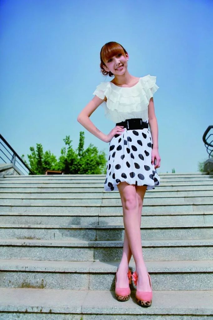
Using the wide-angle end of the lens to look up to shoot beautiful portraits, on the one hand, you can shoot the effect of slender legs, and on the other hand, it can also give the viewer a very novel visual experience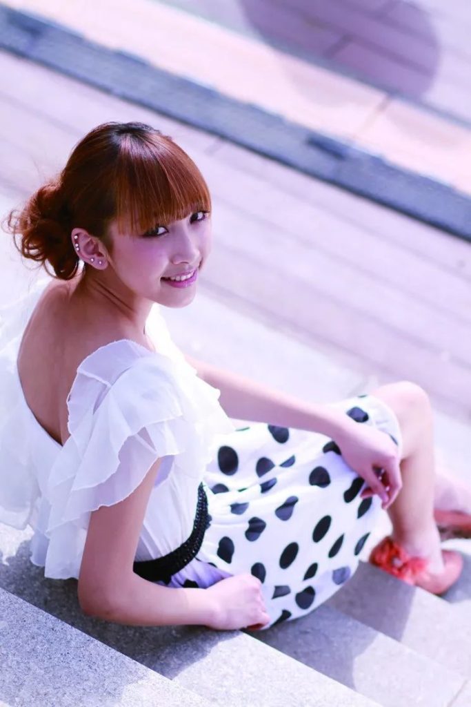
Looking down on a portrait of a beautiful woman from a height, the character will appear petite and cute, and at the same time, it will also give the viewer a refreshing and eye-catching effect.
The Picture Composition Lacks Visual Center
When we see a photographic work, the most eye-catching place is often the visual center in the picture, which can also be said to be the most attractive point of interest. However, many photos taken by beginners will lack this visual center, resulting in a flat picture.
Sometimes, the scenery in front of us is obviously beautiful, but the pictures we take are dull and unattractive. This may be the lack of a visual center in the picture, that is, the lack of something that can attract the viewer’s eyes.
For example, when we take pictures of landscape subjects, the blue sky and the sea are beautiful and vast. But as far as photographic composition is concerned, if there are no particularly brilliant colors, it is not enough to have the two elements of the blue sky and the sea, and there needs to be a visual center to stay in the viewer’s line of sight.
For example, arrange a boat on the sea, or arrange a shell in the foreground of the picture. In this way, the visual center and other elements of the picture contrast with each other, which can make the picture more complete.
In the picture, the Tyndall effect caused by the clouds covering the sun is actually very attractive, and the color of the sky and the lake is also very good, but it always feels like something is missing.
When there is a boat passing by, we can take a picture of the boat just passing the highlight area on the water. In this way, the sky, the lake, and the boat form a very charming picture.
Handheld Shooting Results in Blurry Picture
Whether the picture is clear and whether the subject is in focus is the most basic requirement for evaluating the quality of a photo.
In addition to the pursuit of some blurring effects, most photos with blurred images and out-of-focus subjects can be classified as waste.
Only photos with clear picture and accurate subject focus can let people see the content of the picture clearly, and can also give people a visual experience.
When shooting handheld, there are two reasons why we encounter blurring of the picture. The first point is because of the exposure conditions.
In low-light conditions, the camera needs to slow down the shutter speed to get an accurate exposure. Shooting with a handheld camera without a tripod to hold the camera, even the slightest shake can result in a blurry picture.
The second point is the problem of inaccurate focus.
In fact, this is not only encountered when holding a camera, but also when shooting with a tripod.
Some friends who are new to photography can’t find the focus area of the camera when shooting, and they don’t know that the focus area must be aligned with the subject to achieve focus. In the end, the subject is out of focus and the picture is blurred.
Therefore, if we want to shoot good photography works, we still need to shoot more and become more familiar with our cameras and shooting techniques.
When shooting portraits at night, because the shutter speed of the camera is too slow, and there is no tripod to keep the camera steady, the picture is blurred.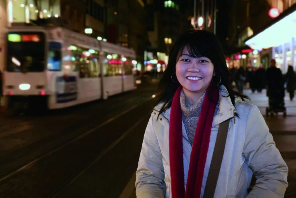
When shooting portraits at night, we can choose a place with better lighting conditions and use a tripod to stabilize the camera in order to obtain high-quality night portrait photos.
The Background Is Too Cluttered
For beginners, there is also a common problem that the background of the photos taken is too cluttered.
When shooting, you can clearly see the subject, and shoot at the subject through the viewfinder, but the obtained picture is still cluttered, and the subject cannot be highlighted.
There are many reasons why the subject is not prominent. The most common situation is that the background is too cluttered when framing the shot, or the background is not noticed, as long as the person is in the picture, the shutter is directly pressed to shoot.
For example, when taking commemorative photos of people during travel, many people have such problems. Regardless of the choice of the background and the clutter around the characters, just press the shutter to shoot the characters as long as the characters are in the picture.
In this way, the picture without the composition arrangement will eventually cause the subject to not stand out in the picture.
In fact, we can choose a simple and clean background when framing, or use a large aperture to blur the background, or change the shooting angle to avoid the clutter of the background and make the subject more prominent in the picture.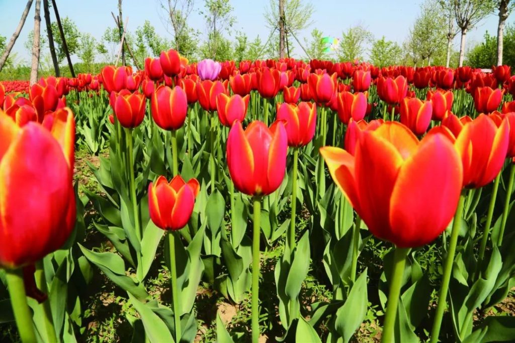
When taking pictures of flowers, a cluttered background can distract the viewer’s view and reduce the appeal of the subject.
In order to avoid the cluttered background interfering with the blooming flowers, we can use the upward viewing angle and shoot with the sky as the background.
In this way, the flowers will be more prominent in the picture, and the details such as the shape and color of the flowers can also be well reflected, making the picture more attractive.
There Is No Reserved Space in Front of the Field of View
When composing a shot, the use of scenery is a very flexible composition technique.
In order to make the picture more attractive, we can add a foreground in front of the subject, which will not only increase the spatial layering of the picture, but also guide and set off the subject.
Some friends are not used to taking pictures, or do not know how to use the foreground, so that there is no reserved space in front of the field of view of the picture, or there is no foreground to set off the subject to embellish the picture. Although there is nothing wrong with the subject presented in this way, after adding some foreground in front of the subject when shooting, it will definitely have a visual freshness compared with the previous effect.
For example, when shooting the scenery of the seaside, we can use the rocks on the seaside as the foreground of the picture to highlight the sense of space in the picture. Or use the beach as the foreground to play a role in a visual extension of the sea.
When shooting outdoor portraits of beautiful women, using some branches, flowers and plants as the foreground can increase the attractiveness of the picture.
Using the lower third of the composition method to shoot the sea and sky, there is not much problem in the composition. But the picture looks very dull and lacks attractiveness.
Arrange the beach in the foreground of the picture, and combine the waves, small islands, and blue sky for composition shooting. That
makes the picture have a strong sense of spatial hierarchy and adds to the attractiveness of the picture.
Using the rock with a very strong seaside texture as the foreground of the picture can make the photo more three-dimensional.
