Categories
Studio Lights Education

Composition and Exposure in Photography

Capture the Moment and Various Compositions-Basic Composition 1

One day, stop in front of a beautiful cafe on the street. The girl yelled “Really handsome” in her mouth, and she bounced around with a childlike smile. I followed the fashion model and put on a variety of looks, looking very cute. Because the moment the girl laughed was very beautiful and natural, she involuntarily pressed the shutter.

Girl’s glowing face-basic exposure

In portrait photography, the most basic thing is to correctly expose the face of the person. The face of a character must be the first thing people pay attention to. If it is not a special advertising idea, then the face of the character must be fully illuminated. When shooting, the reflector is the most effective tool to express the light on the person’s face. It’s good to find something that reflects light and reflect the light on the character’s face to make the face look bright.
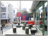
The cafes on the street, although there is plenty of sunshine behind, the light ratio is not high. There are appropriate red modeling objects in the picture, which gave me the urge to take pictures.

The sun shines on the model’s back, creating strong light on the head and shoulders. The character should not be nervous in front of the camera, just show a natural posture. Let the model relieve the tension and pose naturally as usual to capture the best expression of the model.
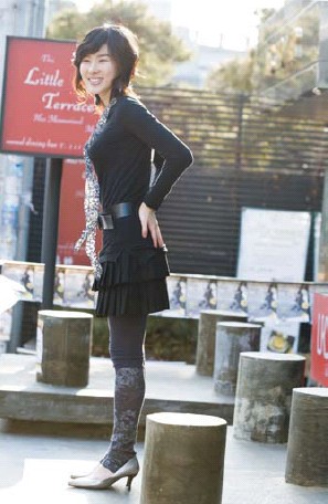
Lens: 100mm F2.8︱Aperture: f/5︱Speed: 1/100sec︱Sensitivity: ISO200︱Illumination: Natural light︱Color temperature 5600K︱Metering method: Multiple

The Format of Portrait Photography-Basic Composition 2

People photography is divided into full-length photos, half-length photos (head to knees, head to waist, head to chest) and close-up photos. It is distinguished according to which part of the body is photographed. When shooting, consider the composition according to the model’s expression and background. Here, we try to make a few compositions in accordance with this distinction. Shoot according to the principles of “low angle for people with short legs” and “being beautiful with blurred background”. Turn the camera’s viewing angle higher or lower to see the effect. Of course, it is very important to focus on the model’s feelings, expressions, and postures. Only in this way can a “beautiful woman” with full of confidence be photographed.

Lens for Portrait Photography-Basic Composition 3

No lens can easily take pictures of people more beautifully or more successfully. For the wide-angle series of lenses, due to the distortion of the lens itself, you should pay more attention when using it. The telephoto series of lenses can blur the background other than the characters. Even with a standard 50mm lens, when shooting close-ups, distortion will occur because the distance is too close.

The elements of portrait photography-models

Anyone can become a model, family, friends, and lovers are no exception. Photos are a medium for sharing warmth. If you watch it together, you will feel very happy. In order to take pictures, even if it is just a day, the photographer and the model should have a good understanding.

A photographer once said, “The short moments of getting along with the models will make you fall in love with them.” It is not how attractive they are, but because they have love in their hearts, they understand which lens to use, what kind of expression and shape can best express the beauty of the subject. Just like the mother knows best when the child is the most beautiful. If a faint smile with a wrinkled nose is more beautiful than a big laugh, then the photographer should give the model a sense of intimacy and let the model show that expression.

The elements of portrait photography-place

When we eat delicious food and look at the beautiful scenery, we will think of our lover. If you come with him (her), it must be a suitable place for him (her). Because we understand that the moment of being with him (her) is the moment that constitutes a harmonious picture.

The location in portrait photography is another coat of the model. The place plays the role of aligning the characters with the background. However, it is not easy to take “photos of people in harmony with the background”. You have to work hard, but also be willing to pay for travel expenses. Only by walking a lot of places can you find the ideal shooting location.

Use the red publicity board as the background to conceive the picture and grasp the composition as a whole.
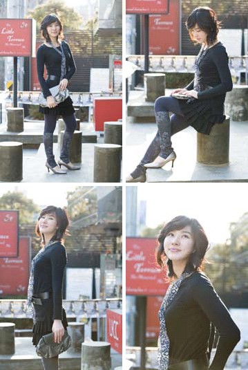
Lens: 100mm F2.8︱Aperture: f/5︱Speed: 1/100sec︱Sensitivity: ISO200︱Illumination: Natural light︱Color temperature: 5600K︱Metering method: Multiple

The elements of character photography-clothing

The clothing of the characters is different, the degree of harmony with the scenery will also be different. Our mothers know better what kind of clothes to wear when admiring the maple leaves. When going to the scenic snow-capped mountains, you should prepare more gorgeous clothes than the scenery. Under the beautiful maple leaves, all kinds of hats and coats, flowers and mountains together form a beautiful scenery. Today we live in a world full of youth and vitality. In order to take a beautiful portrait of a person, it is not difficult to find a dress that suits the location. Photographers should be more fashionable and youthful.
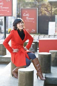
To echo the red background, prepare a jacket of the same color. Let the model pose in the most natural pose to capture the moment of smile.
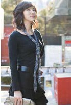
Half-length shot to the waist. Designed the composition of the model’s hand.
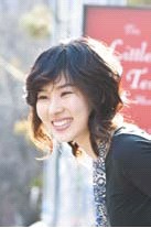
Picture of a bust to the chest. I took a few photos with moving eyes.

Let’s take a look at the photos taken by the same model in another location. With the wooden board room as the background, the model wore clothes that were completely opposite to the background color. At first glance, it looks like a person has changed.
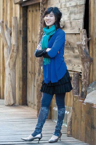
Lens: 100mm F2.8︱Aperture: f/5︱Speed: 1/100sec︱Sensitivity: ISO320︱Illumination: Natural light︱Color temperature: 4900K︱Metering method: Multiple

Can make the face shine without special lighting

For TV actresses, it is the reflector that can bring out the soft skin. It is more effective than spending millions to do plastic surgery or skin beauty. In fact, in the photography supplies store, the price of a reflector is much cheaper than other supplies. The portable reflector is not large. As long as you understand the principles of reflection and diffusion, you can get good lighting effects at any time.

The following are items that can be used as reflectors and can be purchased at photo equipment stores. You can buy round reflectors at stationery stores. White cardboard, moisture-proof mat for picnics and tin foil for kitchen.
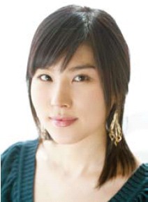
Sitting in front of the window, the model’s face is illuminated by reflected light, which looks good.

Lens: 70mm F2.8︱ Aperture: f/4.5︱ Speed: 1/60sec︱ Sensitivity: ISO200︱ Lighting: Natural light︱Color temperature: 5600K︱Metering method: Multiple
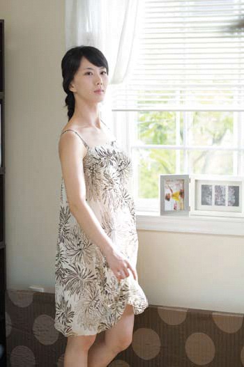
Direct sunlight coming in from outside the window is the best lighting. Use the reflection of light to gently reflect on the model again. This place has formed a very soft effect even if “just standing”.

Lens: 70mm F2.8︱ Aperture: f/5.6︱ Speed: 1/50sec︱ Sensitivity: ISO100︱ Lighting: Natural light︱Color temperature: 5600K︱Metering method: Multiple

Shooting Angle and Composition

For shooting portraits, we usually use a head-up shooting angle, that is, the camera is in a straight line with the shooting eye. A shooting angle that is too high or too low can easily cause the model’s face to be deformed. In addition to looking up, another common shooting angle is looking up, that is, shooting from the bottom up. Looking up shots usually use a wide angle, and close up shots can achieve that dramatic and exaggerated effect. Digital camera users with a wide-angle lens below 28 mm can try shooting. Shooting at this angle may give you some unexpected results.

Pay attention to the combination of the subject’s portrait and the surrounding environment when shooting the composition. The main character should occupy at least one-fifth of the entire photo. Because in the portrait photos we take, if the characters occupy too small a ratio, the scenery in the whole photo will become overwhelming. Fans who are new to portraits should pay special attention to this.
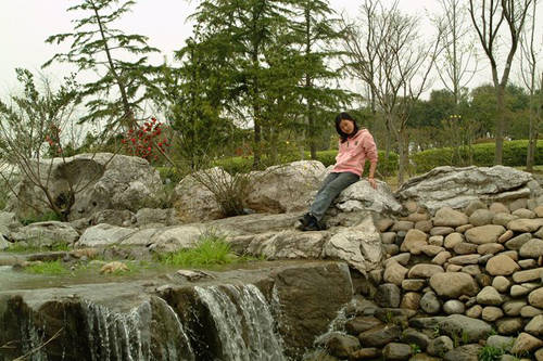
The proportion of characters is too small, and the key points are not prominent

If you want to leave a large amount of blank space in the photo to give a sense of majestic atmosphere, then you must pay attention to the contrast between the tones of the characters in the picture and other aspects, as well as the simplicity of the background. But I think that for beginners, the subject of the portrait should be arranged in more positions in the picture as much as possible.

The Choice of Focal Length

For portrait photos, it can usually be divided into several common modes: full body, half body, and face close-up. Generally, you can take ideal portrait photos by using these modes and combining with the composition described above. But one thing worthy of beginners’ ideas is the issue of focal length selection.
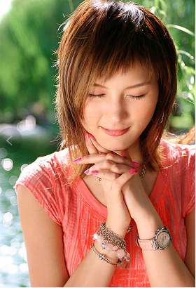
A reasonable focal length can reflect a stronger sense of space and three-dimensionality. The wrong use of the focal length may cause the face of your beautiful model to be deformed or lack the sense of layering in the photo.

When shooting full-length and half-length portraits, we can’t blindly pursue a beautiful background blur and directly pull the 10x aperture zoom in our hands to the end. Although this can give you a certain small depth of field, the negative effect it brings is the feeling of narrow space vision. This is because when shooting with telephoto, the angle of light entering the lens is very small, so you can only take a small piece of scenery behind the person.

Therefore, when taking full-body photos, we should choose a standard focal length of about 50 mm. For such a photo bust, it is more natural to use a mid-focus perspective. For half-length and partial close-ups, it is necessary to use a telephoto of 135 to 200 mm or more.

Lighting During Outdoor Portrait Shooting

When shooting outdoor portraits, which lighting method is better? Generally speaking, don’t let your model’s face directly face the direct sunlight. The strong sunlight would make Mott lower his head and squint his eyes, unable to express the charm of portrait photos.

We can choose to shoot in the shadows. The diffused light in the shadow on a sunny day is also enough to provide the color we need. But one thing to be aware of, try not to hide from the sun under the big tree. This is not to prevent accidental lightning strikes, but when direct sunlight hits the model’s face through the leaves, it will produce unsightly spots and bright spots.
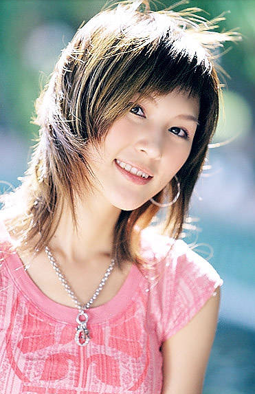
Although the shaded area is a good choice, the portraits under the sun still have her unique style. The first thing we need to do when shooting in the sun is to make the model’s face not directly facing the sun, let alone facing the sun, because this will create more ugly facial lighting. So in the sun, we usually let the model face the sun, which is what we usually call the backlight shooting.

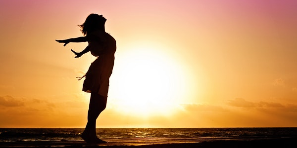
Backlight shooting is easy to cause shadows on the face or underexposure because the back is facing the sun. When shooting against the light, because the background brightness is usually too large, the conventional average metering easily leads to underexposure of the face. We can use exposure compensation or spot metering to increase the exposure to make the face brighter. But when using this method, the brightness of the entire photo may become higher. While making the face brighter, the background also brightens, causing the background sky to turn white or cause the loss of other details.

Categories
Studio Lights Education

The Basic Law of Portrait Photography Composition

When we pick up the camera to take a portrait, the lines, colors, beauty, shooting angle, composition method, etc. in the picture are all issues we have to consider. To create an excellent portrait photography, composition is very important. Composition is often the key to the success or failure of a work. It is also an important factor in the expression of the photographer’s subjective consciousness.

1. The Meaning of Portrait Photography Composition

A portrait photography work is composed of factors such as character scene, light and shadow, color, tone level, distance and contrast between virtual and real. Through the adjustment of the shooting distance, angle and position, as well as the selection and trade-off of the person being photographed, it is as perfect as possible to concentrate and coordinate them in one picture. This is the composition process of portrait photography.

The composition must also pay attention to artistic skills and means of expression. The composition is directly related to the artistic conception of a work. Composition is an important part of the formation, but it must be based on the conception. The composition of a portrait photography work embodies the photographer’s ingenuity and arranging skills, and reflects the photographer’s intention and specific method of expressing the theme. Therefore, it is a concrete reflection of the photographer’s artistic level.

The importance of composition

The composition of portrait photography, generally speaking, is based on the character as the main body, organically combining the various elements that make up the picture, so that the character can be fully expressed. It appeals to the coordination of points, lines, surfaces, shapes, light, light and shade, and colors of vision in terms of the beauty of form. The composition of portrait photography is an important factor in expressing the content of the work. It is the organization method of all photographic visual art language in portrait photography. It makes the certain internal structure constituted by the content get the proper expression.

2. The Purpose of Portrait Photography Composition

Highlight the theme of the work through the basic rules of composition and make the characters more perfect. A good composition can better convey the photographer’s picture information to the viewer. Emphasize and highlight the typified characters in the conception, so as to abandon the general, superficial, tedious, and secondary things. And arrange the companion appropriately, choose the environment, make the portrait photography work stronger, more concentrated and more typical than real life.

3. Features of Portrait Photography Composition

Portrait photography composition uses different focal length lenses to obtain different perspective effects. Different photosensitive materials get different artistic effects, or through the computer post-secondary composition processing. But the composition of portrait photography also has its limitations. It is not as fictitious as painting.

The vivid postures, touching expressions, and fascinating eyes in many portrait photography works are inseparable from the momentary capture. Instant composition requires us to have long-term and solid basic composition skills.

4. The Content of Portrait Photography Composition

Portrait photography composition is diversified and comprehensive. It has various means of expression, such as shooting position, lens, light, shade, color and so on.

5. The Basic Requirements of Portrait Photography Composition

(1) Highlight the main body

Characters are the main objects to be expressed in portrait pictures, and they are an important part of the picture. It is not only the center of the screen content, but also the center of the screen structure. Other sceneries must be around the r character, echoing with it, forming a whole. On the screen, the themes can be highlighted by the contrast between the big and the small, the whole and the part, the far and the near, the deep and the light.

(2) Picture should be complete

The so-called picture integrity is not simply to keep the image of the subject intact. Rather, it means that the picture can fully express the author’s shooting intention and fully reveal the nature of the person photographed, so that people can more fully accept the theme of the photo. Another requirement for the completeness of the picture is to achieve the completeness of the picture in the form of the display. The main thing is to correctly and completely handle the position of the subject in the picture, so that the subject’s image has a more complete expressive force.

(3) The layout should be balanced

Balance is a kind of human visual perception. Seeing a balanced and stable scene, people have a more comfortable and stable visual experience. But the balance of the layout is not to use the picture evenly, put the subject in the center of the picture and arrange them symmetrically. Although this arrangement is average, the picture will lose its liveliness, and instead will be monotonous and dull.

(4) The form should be vivid

The vividness of the composition form requires the picture to be full of change and not rigid, and to meet people’s requirements for visual beauty.

6. The basic rules of portrait photography composition

Portrait photography composition is a comprehensive application of various form factors. Including: contrast and harmony, symmetry and change, balance and echo, etc. Mastering these laws and applying them will make the characters we express in our works more connotative and aesthetic. A portrait photography work may conform to several composition rules at the same time, but on the basis of the basic composition rules, it is often expressed by one composition rule. Its application is not absolute, you must learn to use it flexibly.

(1) The use of contrast in the composition of portrait photography

In the composition of portrait photography, contrast is to compare the different qualities and quantities of various form elements between the characters and the environment, so that the respective characteristics of different objects are more obvious and prominent. There are various forms of contrast in portrait photography composition, such as area contrast, size contrast, color contrast, light and dark contrast, and so on.

Area comparison

Area contrast is often used in portrait photography composition. This is a very important element in the law of contrast. Use the distribution and arrangement of the characters and the contrast in the area produced by factors such as background and props to achieve the purpose of highlighting the main body.

Sparse and dense contrast

“Impermeable to the wind, sparseness can be a happy horse” This is the best description of the contrast between sparseness and denseness. In the composition of portrait photography, the use of strong contrast between sparse and dense is more conducive to the expression of the subject.

Size comparison

The use of size contrast in the picture will make the main body more prominent, so that the existing but indistinct shape and connotation of the original factors will be more prominent, full and strong in the size contrast.

Dynamic and static contrast

The contrast between movement and static makes the picture more vivid, full of vitality, visual impact, and easy to make the vision exciting.

Chiaroscuro

The contrast of light and dark can be the difference between light and dark of the figure’s own body, or the difference between the light irradiation area and the light irradiation intensity. The use of chiaroscuro is conducive to portraying the character and heart of the characters.

Contrast between virtual and real

Virtual scene and real scene are a relatively important method in the law of contrast, which can be divided into foreground virtual and background virtual. When taking photos with virtual and real contrast, you can choose the companion as the front virtual scene or the back virtual scene to shoot. But pay attention to controlling the blur degree of the companion, which will directly affect the strength of the protruding subject.

Specific contrast

The continuous use of the same element in the picture becomes a repetitive basic shape, which can make the picture feel harmonious and unified. We call it repetitive composition. This form is to order and integrate the visual image.

(2) Application of symmetry and balance in the composition of portrait photography

Symmetry and balance in portrait photography composition are two forms of balance. Balance gives a sense of stability. A picture gives people a sense of balance. Relatively speaking, this is the basic requirement for the composition of the picture.

A, symmetry

It refers to the same scene form of equal quality and quantity on both sides of the central axis of the screen. And the two sides maintain an absolutely balanced relationship. It feels rigorous, rational, and solemn psychologically. Improper use often makes people feel dull, monotonous, and boring.

  1. Balance

Picture balance usually refers to the composition of unequal quality, unequal quantity or different scene forms along the two sides of the central axis of the picture. For example, the subject is leaning to one side in the frame, which is unbalanced from the visual form. But the object has a tendency to move to the other side. So people will also have a sense of balance in their psychology.

In portrait photography composition, the factors that affect the balance are the size of the object, the direction of movement, the spatial position, as well as the color, light and shade, the virtual reality of the image, the dense layout, and so on. When shooting, make clear judgments and appropriate treatment, otherwise it will affect the viewing effect of the picture.

(3) The application of concentration and echo in the composition of portrait photography

In the composition of portrait photography, focusing and echoing is to form a unified and orderly whole of the numerous sceneries in the picture. It comes with a sense of order and clarity.

Concentration means that many sceneries converge towards one goal. So that the picture establishes an order and organically integrates into a whole.

There are two types of concentration in the composition of portrait photography. The concentration of gesture and the concentration of artistic conception. The concentration of the posture is the concentration in the form. That refers to the concentration of the actions and postures of the characters or objects. The concentration of artistic conception is internal. It has the function of expressing the inner meaning, and also has the function of exaggerating the atmosphere. The concentration of the posture has the function of highlighting the subject’s theme. And has the function of establishing the visual focus and the center of interest.

Correspondence refers to the direct or indirect connection between the characters and objects in the picture. It can make use of light, shadow, tone, entity, virtual body, and the shape of objects, and the relationship between different objects, so that the overall layout of the picture can achieve an orderly and balanced effect.

(4) The application of change and unity in the composition of portrait photography

Variation is a vivid factor in the composition of portrait photography. Generally speaking, without changing the composition, the picture will look dull and boring. So in the composition of portrait photography, change is also the most basic and important element. There are two categories of change. One is the change of the constituent elements of the character itself. That is, the change of the character’s posture and expression. The second is the change of the objective scene being incorporated into the photographic picture. The change of the scene entering the picture is mainly formed by the shooting angle, shooting moment, and the use of lens, camera, light, color and other means. Such as changes in the composition of the scenery, changes in light and shade, and colors.

Unity refers to the coordinated, overall, and beautiful organization of various elements in the composition of portrait photography to act on the vision and produce pleasant feelings in people’s psychology. In portrait photography composition, it is mainly manifested as a perfect organization in terms of tone, line, color, shape, subject, companion, foreground, background, etc.

(5) The use of rhythm in the composition of portrait photography

Rhythm in portrait photography composition means that certain modeling forms form a certain sense of visual rhythm. It gives change and rhythm to the styling form. The performance of rhythm in the modeling form is rich and colorful. Rhythm and rhythm can be generated between the line structure of the characters, between the light and dark changes, between the color configurations, between the arrangement of objects. And the combination of points, lines and surfaces.

Each picture in portrait photography contains different composition rules. Only by mastering and using these composition rules can we shoot relatively good portrait photography works.

Categories
Studio Lights Education

How to Make the Most of On-site Light

How to make full use of the light on the spot when shooting beautiful women? Through actual combat analysis, this technique teaches you how to use artificial fill light reasonably in different light environments to obtain ideal lighting. How to combine the original light of the environment, reasonably adjust the position and output parameters of the flash lamp, so as to achieve the perfect fusion of artificial light and natural light.

Shooting Guide 1:

camera position analysis

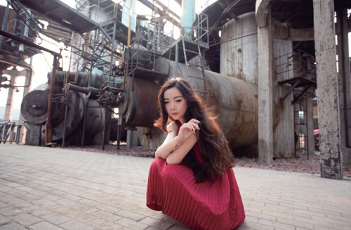
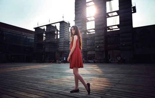
Novices in portrait photography are accustomed to cutting a person’s half-length or head to shoot a part of it. Such works convey very limited information. As the shooting progresses, it is necessary to exercise the ability to shoot environmental portraits, so that the lines, colors, light and shadow of the characters and the environment can be combined to obtain a richer expression. This work incorporates the lines of the environment into the picture. The industrialized complex and detailed structure and cool colors reflect the soft beauty of the model, and the red clothing creates a contrast between warm and cold and the environment.

When shooting, aim at the highlight of the model’s forehead to meter the light. After slightly reducing the exposure compensation, pull the flash out of the reflector. With the help of a small area of reflected light,  it illuminated the model’s body properly, so as to retain the overall sketch relationship of the light in the picture.

Shooting parameters: ●Aperture: F2.8 ●Shutter speed: 1/125s ●Focal length: 22mm ●Sensitivity: 100 ●Exposure compensation: EV-0.3

Shooting Guide 2:

camera position analysis

Using a wide-angle lens to shoot, the relationship between the surrounding environment and the characters has been more fully expressed. The large area of blank space on the ground creates a dense contrast with the complex industrial installations behind, allowing the audience to see a richer picture of information.

Shooting parameters: ●Aperture: F2.8 ●Shutter speed: 1/100s ●Focal length: 21mm ●Sensitivity: 100 ●Exposure compensation: EV-0.3

Shooting Guide 3:

camera position analysis

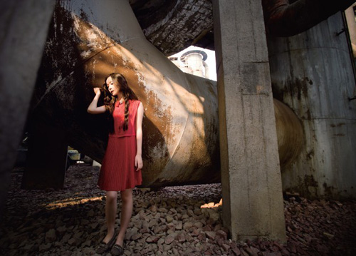
The sunlight passes through the device and is projected onto the U-shaped tube. The huge industrial device structure and cold texture echo the model’s melancholy atmosphere, giving the picture a unique mood. This is a unique effect obtained by bringing in the environment.

Shooting parameters: ●Aperture: F2.8 ●Shutter speed: 1/80s ●Focal length: 16mm ●Sensitivity: 100 ●Exposure compensation: EV-0.3

Shooting Guide 4:

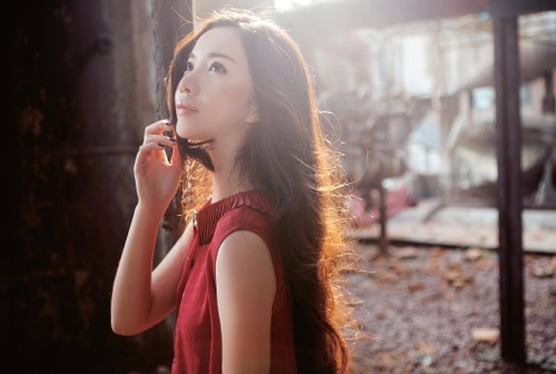
Ask the model to reverse his body to take the shot, and a golden marginal light appears behind the model’s hair. Due to the reverse shooting, the face of the model will appear darker with the back-to-top backlight. So photgraphers activate the ETTL mode of the flash, and  pull out the light-emitting board to fill in the light. Artificial fill light will generally show shadows. At this time, we must pay attention to make sure that the direction of the shadow produced by artificial supplementary light is consistent with the shadow produced by natural light to prevent the appearance of “two suns” (that is, two or more shadows in different directions).

Although photographers use the front flash to fill light in the above two pictures, there is no reflector behind the model. In addition to illuminating the body of the model, the fill light has no reflector reflection. So there is basically no visible shadow.

Shooting parameters: ●Aperture: F2.8 ●Shutter speed: 1/60s ●Focal length: 40mm ●Sensitivity: 100 ●Exposure compensation: EV-0.3

Shooting Guide 5:

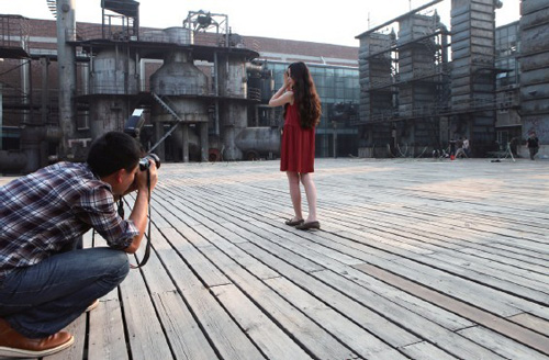
This is a large square with a tall installation tower behind it. The dense horizontal lines of the wooden boards on the ground form a “broken” relationship with the vertical lines of the distant installation. This increases the linear orientation of the picture. At the same time, the perspective of the near and distant lines of the floor strengthens the sense of depth of the scene and the sense of space.

Shooting portraits in large scenes can easily cause the separation of people and scenes. When shooting, pay attention to the model not too far from the lens. Otherwise the big environmentit will submerge it. In this work, there are two reasons for the model to obtain the main position in the picture. One is the red clothes, and the other is the light on the body.

Pay attention to the light on the scene before shooting. And you will find the light spot projected by the light on the ground, so that the model is in the spot area. Here we apply the principle of finding light  again. At this time, the bright area behind the model emphasizes the main position of the model. At the same time, the backlight casts a contour light on the model’s body, echoing the light spots emitted from the towers in the background. And there is a sharp contrast of light and dark in the picture.

Photographers can deal with the characters in the dark background. But because it is in the dark, it basically won’t snatch the model’s dominant position. And it also adds a sense of plot to the picture. Therefore, it is reserved here.

Shooting parameters: ●Aperture: F2.8 ●Shutter speed: 1/1250s ●Focal length: 25mm ●Sensitivity: 100 ●Exposure compensation: EV-0.3

Categories
Studio Lights Education

How to Solve the Problem of Exposure in a Large Light Ratio Environment

When we are shooting scenery, we will inevitably encounter some environments with high light ratio. The camera is different from our naked eyes, which can be adjusted automatically. The limited latitude of the camera does not provide a good balance between highlights and shadows. For example, the sky and the ground, if the light ratio is too large, we will find that either the dark part is pitch black or the sky is pale. At this time, we are going to solve the problem through some special means.

There are many methods, such as: shaking the black card, gradient mirror, HDR post-production and so on. Each method has its advantages and disadvantages.

Shake Black Card Technology

Advantages: the transition between light and dark is natural, and the color reproduction is real.

Disadvantages: The success rate is low, and it is easy to succeed only when the exposure is longer. Of course, the success rate will increase a lot after being proficient.

A more commonly used method, but it is generally used before sunrise or after sunset. Properly maintain a long exposure time to ensure the success rate.

As shown in the figure below, shooting parameters: manual exposure, aperture 11, exposure time 4 seconds.

Use of Gradient Lens

Advantages: convenient, and the price of the gradient lens is very cheap, and it can be used for one-time imaging.

Disadvantages: the color tone is easy to change, the picture quality is easy to deteriorate, and the gradient lens also has the problem of light gear. For each different light ratio, a gradient lens with a different light ratio gear should be used.

As shown in the figure below, shooting parameters: aperture 11, exposure time 1.3 seconds. The color of the sky has obviously changed.

HDR Post-production

Advantages: It is more convenient and easy to grasp by using bracketing to take several photos with different exposures. Through post-production, you can better take into account the details of the light and dark parts.

Disadvantages: Not very natural, especially the edges are prone to bright edges.

As shown in the picture below: Taken at the Catholic Church in Weizhou Island, bracketing and shooting three different exposure pictures. Canon DPP software post HDR production.

Some Other Tips

In addition to the above methods, let me share some tips below, hoping to help everyone.

Method: Take two photos with different exposures, or shoot in RAW format, and adjust the two photos with different exposures. Afterwards, it is processed by the PS post mask tool to take into account the exposure of highlights and shadows.

1. Meter the highlights

Meter the highlights and shadows separately, write down the parameters at that time, and fix the camera on a tripod to compose the picture. Manual M file exposure, adjust two different parameters and take two different photos (one with normal exposure for highlights and one with normal exposure for dark parts).

High-light exposure photos: The sky is exposed normally, and the dark parts are too dark.

Shooting parameters: manual exposure, Tv (shutter speed) 1/13, Av (aperture value) 11.0

Dark part exposure photo: normal exposure of the water surface, high light exposure of the sky.

Shooting parameters: manual exposure, Tv (shutter speed) 1/4, Av (aperture value) 11.0

2. shoot in RAW format

Without a tripod, shoot in RAW format, adjust two photos with different exposures in the later stage, and then synthesize them through the above-mentioned later stage methods. The prerequisite is to ensure that the highlights and shadows can retain certain details.

(1) Shoot the original film in RAW format, the highlights of this film are not overexposed, and the dark parts can also retain certain details, as shown in the following figure:

Shooting parameters:

Shooting mode: aperture priority automatic exposure, Tv (shutter speed) 1/200, Av (aperture value) 11.0, metering mode is evaluative metering

(2) Adjust the highlight to a satisfactory result. At this time, the dark part is completely black, but the highlight is normal. As shown below:

(3) Adjust the dark part to a satisfactory effect. At this time, the highlight position is pale, but the dark part is normal. As shown below:

Precautions for Using Large Light Ratio

This method is to be carried out under the premise of shooting in RAW format, and to ensure that the shooting time ratio cannot be too large. Appropriate remediation in the later stage can get more satisfactory photos. However, no matter how you remedy it, such processing will lose a certain amount of image quality, such as brightening the dark areas and there will be obvious noise. Therefore, it is strongly recommended that you, if possible, don’t be afraid of trouble and try to use the first method to shoot. Of course, you can also choose other methods, the one that suits you is the best.

The large light ratio environment is an unavoidable situation that we encounter in landscape photography. But if the light ratio has exceeded a certain level, no matter what method you use to shoot and process, it doesn’t make any sense. Try to shoot in the early morning and dusk, because the light-to-light ratio at that time is relatively small, and the colors are rich and changeable.

The Use of Neutral Gray Density Lens and Gradient Lens

The filters with the highest usage rate of water scene slow gate include the use of polarizer CPL, medium gray gradient filter GND, medium density ND filter, and reverse gradient near RGND for shooting. The use of CPL is very simple, it is to make the sky bluer by rotating the filter, eliminate reflections, and make the water surface clearer. This article will describe the application of ND and GND, which are less exposed to everyone.


Mid-Gray Density Mirror:

The neutral gray scale mirror is also called the neutral gray scale mirror, or ND for short, its function is to filter light.

The main purpose of using the ND lens is to prevent overexposure. If the light is too bright, it is difficult to choose a slower shutter speed to shoot. At this time, using the ND lens to reduce the light entering the lens, you can use a slower shutter to shoot.

Under the same light conditions, aperture size and ISO, the higher the number behind ND, the higher the gear.

Due to process reasons, the larger the coefficient behind ND, the more color cast. When we buy ND, we only need to say “How many levels of dimming ND do I want to buy”. If you often shoot water scenes in the afternoon, then I suggest you buy a high-end ND. My current ND configuration is two pieces, namely LEE minus 3 gears and Lee’s big stopper minus 10 gears. These two ND lenses are sufficient for most of my shooting needs.

The basic principle of using ND

For example, to shoot at the beach, the aperture is set to 11, ISO is set to 100, we use spot metering to measure the brighter area in the sky, and the shutter is 1/1000th of a second after the measurement. We get a set of data that will take this photo: F11, 1000/1, ISO100.

If we want to shoot foggy water surface, or calm water surface like a mirror, a shutter of 1/1000th of a second is definitely not possible. At this time, we need to install the ND in front of the lens to reduce the amount of light. Because it was in the afternoon, the sunlight was relatively strong, and the shutter speed reached one thousandth of a second, so a 10-speed ND was used for dimming. What is the concept of dimming 10 gears? It is to reduce the shutter speed by 10 steps, and each step is to reduce the current shutter speed by half.

If the 16-second exposure does not achieve the fogging effect we want (to make the sea surface foggy, the big waves must hit the reef for more than 30 seconds), we can extend the exposure time in other ways. For example, reduce the aperture by one level, or adjust the ISO to 50, or even overexpose the photo by one stop.

Adopt right exposure mode

When shooting in RAW format, we recommend to use the “right exposure mode (refers to the histogram)”. 80% of the information contained in a photo in a digital photograph, which concentrates in the highlights, which means that if the photo is underexposed, many details in the photo will lose. Try to brighten the dark part of an underexposed photo in post-production, you will find a lot of noise. Camera has not recorded the under-exposure and the pixels, which caused the noises, so the software can only replace these pixels with noise.

This photo uses a 10-stop ND. The long-term exposure makes the clouds in the sky appear in a brushed shape that is usually invisible to the naked eye, and the impact is full. Designers have made some color adjustments in the later period to make the whole photo feel like the end of the world.

To shoot such a cloud effect, you must choose a windy day with clouds.

Digital photography can allow 1-2 files of overexposure. In the case of ensuring that the highlights do not overflow, I tend to overexpose slightly. In this way, the RAW file in the camera will be able to record more information in the photo. In the later stage, LR can pull back the overexposed part casually. And ensure that the information recorded in the entire photo is intact.

What should I do if there is no ND medium density lens?

When there is no ND, in order to increase the exposure time, you can lower the ISO to 50 and set the aperture to 22. This setting can maximize the exposure time. Photographer has taken the following photo without a filter.

GND gradient mirror:

Square insert type gradient, gradient lens come with two types, that is, hard and soft edges.

Hard edge transition: The transition between light and dark is sharper. Under normal circumstances, photographers often use it when shooting waterscapes, seascapes, and sharp horizons.

Excessive soft edges: Generally adapted to the situation where the transition of shooting mountains is not very sharp.

Photographers should use the gradient mirror GND when there is a light ratio between the sky and the ground (or water). Without using GND, we often took a picture with normal ground exposure and overexposed sky. That was pale with no details. Or the sky is exposed normally, but the ground is underexposed, and an exposure value that has the best of both worlds cannot be found. This situation is because the gray gradient mirror GND, which is necessary for landscape photography, is not used. In our daily shooting process, the sky is generally brighter than the ground. Therefore, in order to ensure consistent upper and lower exposures, we need a gradient lens to suppress the upper light. The upper part of GND is a medium gray area, and the lower part is a transparent area.

How to use GND gradient mirror

For example, to shoot a seascape, set the camera to F11 and ISO to 100. First, use spot metering to measure the lighter area in the sky and the shutter is 1/1000 second. And then we should use spot metering  to test the darker area on the water. The shutter is 1/250 second. Then the light ratio of the upper and lower parts we get is different by two gears (1/1000 second reduced by one stop is 1/500 second, and reduced by two stops is exactly 1/250 second). Through calculation, we can conclude that the photographer has used a two-level GND to take this photo to achieve the balance of the upper and lower light ratios.

This photo is the most typical example of using GND, taken against the light. The sky light is very strong. If you don’t use GND, either the ground must be dark or the sky will be pale. After metering, the upper and lower light ratio has five gears. I used two GND stacks to suppress the glare of the sky.
Categories
Studio Lights Education

Composition Rules to Enhance Visual Impact

The basic composition rules include rule of thirds, golden intersection, triangle composition, etc. But in addition to these rules, in fact, you can also use contrast to create. The contrast can be to compete or echo each other. The sense of stability created by geometric shapes and the beauty of the perfect combination of lines and graphics are also the subject of photography that artists and architects like. The extension has a sense of perspective, which can extend the imaginary space infinitely through the extension movement of the lines. Vignetting is the favorite of the LOMO family. Although the picture is a flaw on the lens, proper placement of the subject will naturally create a framed effect.

Comparison

Making good use of contrast to create the dynamic and atmosphere of the image is the foundation of the composition that has remained unchanged throughout the ages. No matter what kind of art, contrast is a very important basis for composition. As long as two things can be distinguished in appearance, color, volume, texture, and even meaning, they can be used for comparison.

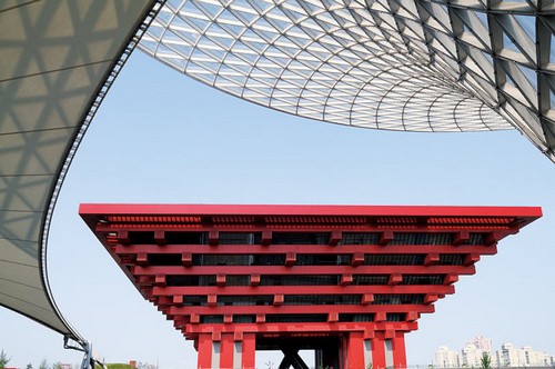
The arc-shaped white and sharp red look quite dynamic under the blue sky

Contrast can be against each other, it can also be echoed with each other, and it can be compared and presented at the same time. In terms of appearance lines, we can use circles and squares or corners to make a comparison. In terms of color, we can use contrasting colors such as red and green, yellow and purple to create a sense of conflict. In terms of volume, maximum and minimum, or equal proportions, are all methods that can be used. In terms of texture, rough and smooth, dry and slippery, etc., are also common comparisons. If you mix and match, we can also use some basic color principles, such as light color forward, dark color backward, white enlargement, black reduction, etc., to assist in making the contrast more interesting.

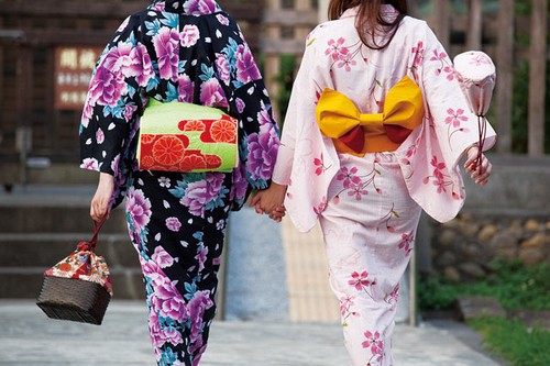
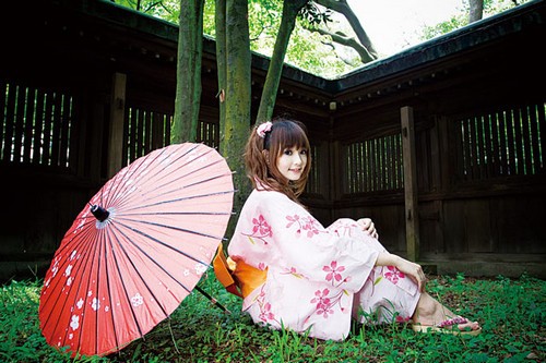
The two brightly colored kimonos each have complementary and contrasting colors that are worthy of fun, which complement each other.

Geometric Shape

The stability and balance constituted by geometric figures is a good subject that never fades in photography. The beauty of balance and rationality presented by the proper combination of perfect lines and geometric figures is originally one of the favorite themes of artists and architects. For example, Islamic art exerts this rational spirit to its extreme. They abandon any tangible decorations such as figures and animals, and only use the shapes of flowers and plants and pure triangles, squares, circles, etc. to repeatedly mix and collage, and they can build amazing mosques. People can’t help but express their sincere admiration when they walk in.

Using a camera to capture the beauty of human construction craftsmanship, you can take pictures that are completely different from natural scenery.

It may not be easy to find pure and simple geometric figures in nature, but they are everywhere in cities. From high-rise buildings to interior decoration, parallel lines, various grids, triangles, circles, spirals… flood our lives. As long as you look for it with your heart, there are plenty of subjects worthy of shooting.

Use Perspective to Create a Sense of Extension

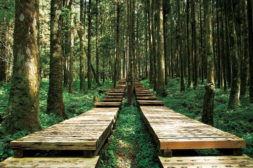
The edge of the image is the boundary. We can use perspective to extend the progression of lines, allowing our imagination to advance infinitely. Perspective is the basis of composition that is highly valued in Western classical painting. Regardless of the theme, the location of the vanishing point must be considered before layout, and then the lines and colors can be arranged to create a lifelike, fake and real three-dimensional sense of space on a two-dimensional plane. In photography, you don’t have to be so troublesome. As long as you find the vanishing point and press the shutter, the perspective will be formed naturally, giving the image a feeling of natural extension.

The wooden plank road extends towards the depths of the forest, creating a deep sense of space

Of course, this means that the sense of extension needs to be based on a longer spatial distance. It is best to add some line assistance to successfully express the effect of extension. It is not difficult to find suitable subjects in buildings, but there are also good subjects in nature. For example, meandering streams, silently moving gravel roads between mountains… are all topics that can be used wisely. Of course, remember not to open the aperture too much, so as not to damage the perspective of forward movement by the bokeh.

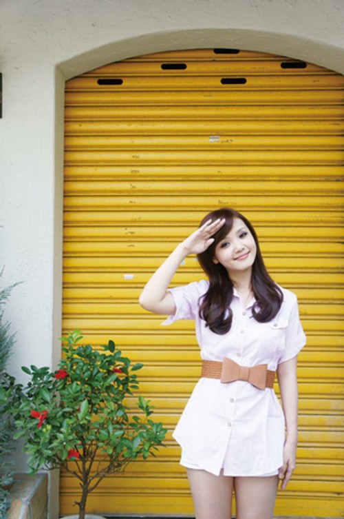
Ask the model to stand in front of the yellow door, and the white wall next to it will naturally form a frame of focus

Frame Composition

The image can also be regarded as a stage, and the focus can be enhanced by using the composition to frame the focus. Although the edge of the image is a helpless boundary, it also outlines a stage where you can play to your heart’s content. If we can make good use of compositional elements other than the subject and frame the subject, we will be able to emphasize the key points in the image. Large-scale color blocks, lines, contours, and even just looking for a door or window to ask the model to come to the back to probe it out are all methods that can be considered, and they can also add interest to the image creation.

Maintain the Integrity of the Picture

Many photographers who stick to tradition believe that you must never get stuck or cut your hands when taking photos of people. It must be all included in the image frame. This shooting method can fully present the appearance and details of the subject, which is very important for commercial photography. After all, whether the photos are beautiful or not, what customers want to see is what the entire product looks like. Isn’t it annoying if you only see the corner of the phone when you take a picture of your phone, or if someone has no hands or shoulders when you take a family portrait?

When shooting a portrait, if the photographer can take the model into the lens, he can fully show the beauty of the model.

Vignette

Affected by the LOMO style, vignetting has become a unique style pursued by many photographers, and even complained about the trouble of not being able to shoot vignetting. In fact, this is because the obvious vignetting was originally a flaw that the lens designer tried to avoid. When designing a wide-angle lens, in addition to maintaining the surrounding area of the image taken without distortion, another difficulty is that it does not produce vignetting.

Although designers did overcome the problem of vignetting in various ways from the structural design, number of lenses and coating, but limited by the design and cost of each lens, it may still affect the edges of the photo and cause loss of light. If this problem cannot be overcome, the lens designer will try to keep the lens at a certain aperture size without vignetting that can be discerned by the human eye. However, because everyone’s shooting habits and the aperture used are different, usually in the case of a large aperture, some lenses will appear vignetting.

Although vignetting is an imaging flaw, it can also assist in the composition and frame the subject, so that the focus can be more focused on the subject.

The Meaning of Vignetting to Composition

Although vignetting is actually a symbol of lens flaws and poor image quality, with the popularity of the LOMO style, vignetting has become a popular photography style. But in fact, from the point of view of composition, the image as a whole loses the possibility of many details due to the appearance of vignetting. However, if we try to avoid placing the subject in the four corners when composing the image, and instead frame the subject in the center of the image with the surrounding dark corners, it will naturally form a framing effect, which can actually help the image appear richer.

Categories
Studio Lights Education

Outdoor Portrait Photography Tips in Autumn

The clouds in autumn are full of changes, and the sky is particularly bright. All the vegetation has changed colors, highlighting its unique beauty. This is a very temperamental season. Bring the temperament girl and your camera, let’s create together! Today, I hope to help you with some practical tips for popularizing outdoor portraits.

Scene Selection

Autumn has strong seasonal characteristics, so when shooting autumn portrait creation outdoors, try to choose scenes that can show seasonal characteristics as much as possible. The first choice is the woods. Whether it is weeds or fallen leaves, they have turned yellow, and it feels like autumn. Or you can choose the open field, with yellow weeds all over the mountains and the sky with few clouds, presenting a unique feeling of depression and loneliness in autumn, which is very charming.

Backlight

Backlit portraits are very commonly used in outdoor photography. Especially in summer, backlighting can highlight the bright and fresh. In the fall, the backlit portraits are equally unforgettable. In the open field, among the dry grass, the girl fluttered her hair casually. Her face is looming in the camera. The taste of wildness and freedom is quietly hidden in this warm time.

Using fallen leaves

We returned to the woods, and the fallen leaves covered the hillsides and paths. Pick up a piece of beauty that is full of gold at will. Such a unique natural element must be used well! Picking it up, sprinkling it gently, and watching the fallen leaves slowly fall in the sky, it’s like experiencing a game of life again. Isn’t it beautiful? Go close to them and enjoy them, then you and nature are like one.

Lying Position

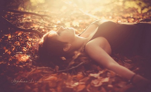
The fallen leaves covered the earth, piece by piece, forming natural lichens. So the lying position is very commonly used in autumn portraits. At this time, man and nature have formed a subtle harmony, which makes people relax both physically and mentally. You may think, it’s great, never so close to nature. In the hearts of the viewers, there is the same resonance. At the same time, different light effects and combinations can be used to form a completely different effect.

Close-up Eyes

If you have a big scene, you need to take some close-up shots at the same time. With a large aperture, the withered grass is no longer clear, and the golden fallen leaves are no longer dazzling. They retreat quietly, forming a complete environment color and continuing to act on the picture effect.

Another important point to pay attention to at this time is the look in your eyes. The look in the eyes in portrait photography is a weapon that directly points to the heart. Especially in a sentimental season like autumn, ask the model to align her eyes with your lens for sure, and see what secrets about autumn are hidden in her heart.

The clever use of light in portrait photography

For some people, taking pictures is a kind of expression of mood and a kind of emotional projection. Some people think that taking pictures is just to record a beautiful picture of life. Some people even believe that the photo must be exposed correctly, the composition must have the golden rule, and the color can be gorgeous, and the resulting image can be brilliant. But after taking portraits, I deeply feel that the atmosphere is the key to the most moving people in the image.

However, how should the atmosphere of the image be created?

Usually special attention is paid to the performance of light and shadow, color tone, “framing” and “emotion of the subject”. Especially the “emotion of the subject” is the most important. Of course, it includes the matching of clothing, makeup, and hairstyle.

“Light and shadow” and “tone” have always been the focus of most of the styles in the image. If you can make good use of the fascinating and rich uncertainty of light, and master the application of changes in warm and cold tones, the basic sense of the atmosphere of the picture will be in your hands.

The light of each day changes with nature and seasons. Good photographers will learn to feel the direction and texture of light and shadow, and make good use of the milder oblique light in the morning and afternoon, or the diffuse light through the clouds and the golden-toned sunset backlight. The light contrast during this period is small, with a warm and uniform tone, which can bring out a very powerful atmosphere of light and shadow.

Clever use of the directionality of light projection

With the projection of light, the shadows of leaves can be as beautiful as oil paintings, and buildings can show their majestic momentum. The three-dimensional and dark side of the scenery can bring you different surprises, and it can also give the image a sense of life and texture.

The contrast of the top light for about two hours before and after noon is too large. The pictures taken are usually without details in the dark parts and dead white in the bright parts. Unless it’s a special subject of calendering, it is usually recommended to avoid such a period.

To shoot a charming white cloud and blue sky background, it is also necessary to pay attention to the directivity of the sunlight. Generally speaking, it is calculated by making a vertical 90 degrees between the sun and the subject. The side where the sun is, usually has a larger contrast, and the model is usually asked to face the sun. And her back is the most beautiful side of the blue sky, and the texture of the background emerges spontaneously.

White balance

Of course, you can also be a little sideways, and the background will be well-lit and even. Another method is to use the camera’s color temperature function to adjust the appropriate color temperature and white balance. Assuming that it is generally sunny, the color temperature can be set at 4700K~5200K. This is probably close to the actual white balance color temperature seen by the naked eye. But such images are more boring and tasteless, so they will be slightly increased to a color temperature setting of about 5500~6000K. This can present a warmer tone. Of course, if you want to express the feeling of cool colors, the color temperature K must be lowered below 4500K.

Learn to observe the temperature of light

Learn to observe the temperature of the light according to your expected shooting style and the light on the spot. The proper adjustment of camera settings is also an advanced knowledge to learn how to feel the ambient light source. Even to the corresponding color temperature and white balance settings for complex light sources such as indoors, night scenes, street scenes, etc., you can calmly respond to changes.

When you can use it freely to create a distinctive tone style, congratulations, your photography skills are already quite good!

When looking at the captured images, you should always ask yourself: “Is this the light you see right now?”

Is it real?

Is this the light tone you want to present?

Even if the photos taken in this way are not post-modified, they are still images with a sense of atmosphere. Try not to rely on automatic white balance as much as possible, just hope that the setting can be accurate at the moment of shooting. Feel the change in color temperature adjustment and let white balance be your helper.

Remember to use your ideas to control the camera, rather than just want to go home and use photo editing software to adjust. I admire the friends who made great photos in the original file.

Because I think that the things that are photographed should be structured in my mind before I press the shutter. As the captured image gets closer to your preview, you will become more and more harmonious with your camera. This makes it easier to shoot an atmospheric and intoxicating style.

To light and shadow is to “observe” and “feel”.

Categories
Studio Lights Education

Implied Meaning in Photography

What is the Hint in Photography

Hint is a commonly used method in photography, it inspires people to explore deeper connotations. The sense of form of the picture and the elements that make up the form of the picture, the persistence of aesthetic vision in the picture, the overall feeling of the background and the strengthening hints of certain characteristic visual language can all play a role in aesthetic appreciation. The guidance of meaning and the limitation of the scope of meaning make the picture expression more concentrated and clearer.

Various constituent factors in the picture, such as tone, color, line, shape, rhythm, texture, texture, subject position, etc., have a certain degree and scope of suggestive effect on the accurate expression of the emotion and meaning of the picture.

Hints of Color

The suggestive effect of color on emotions is the most obvious. The color phenomenon itself is a psychological reflection. In the graphic art of visual modeling, the modeling role of color is extremely important.

Aperture: F/13, shutter speed: 1/125s, focal length: 85mm, ISO: 50

Cool colors and warm colors, light colors and heavy colors, have their own emphasis on emotional meaning. Cool colors are quiet, warm colors are warm, light colors are elegant, and heavy colors are solemn. The color scheme of the picture can be selected according to the emotional characteristics of the picture. The color relationship in the picture is actually a certain emotional relationship. In order to ensure the quality of emotional expression in the photographic images, the color configuration must be both varied and harmonious.

Aperture: F/16, Shutter Speed: 1/160s, Focal Length: 70mm, ISO: 50

Light orange and light brown make up the warm atmosphere of the picture, setting off the characters’ rosy skin.

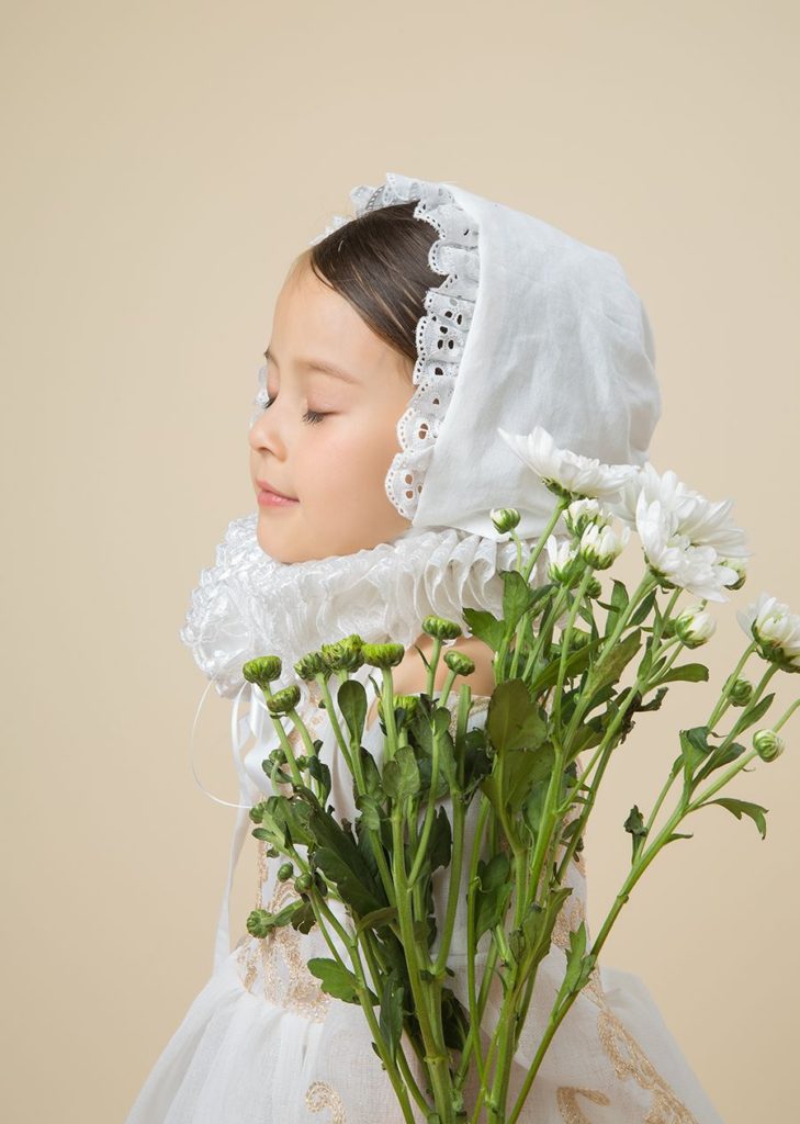
Aperture: F/16, Shutter Speed: 1/125s, Focal Length: 63mm, ISO: 50

The white clothing and white flowers match the light background to form a unified color tone.

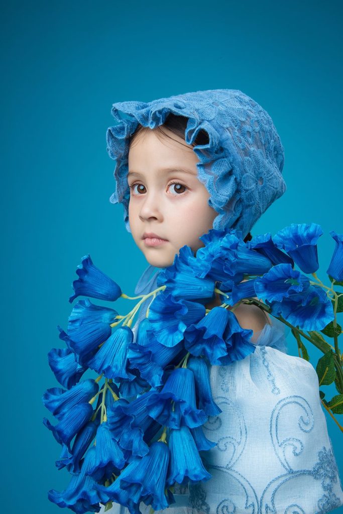
Aperture: F/18, shutter speed: 1/125s, focal length: 38mm, ISO: 50

As the main color of the picture, blue conveys a calm sense of distance.


Hint of Texture

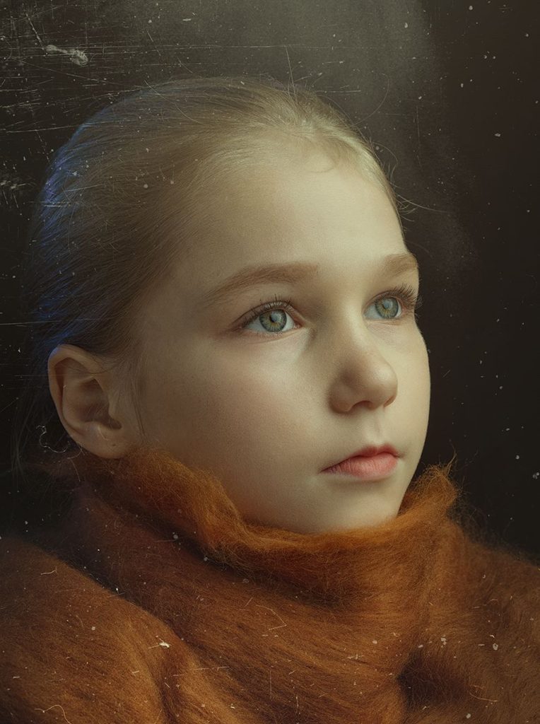
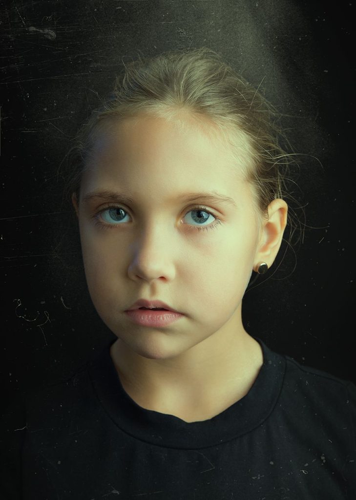
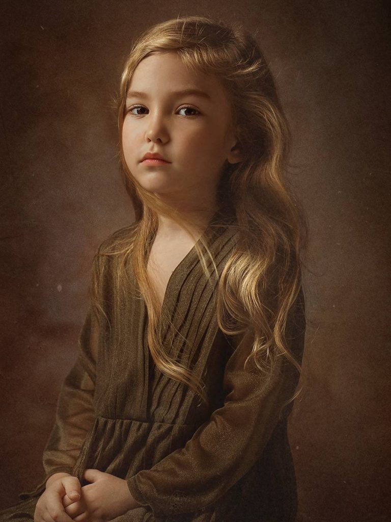
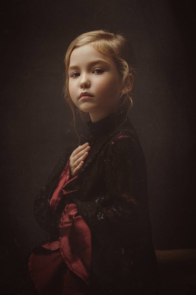
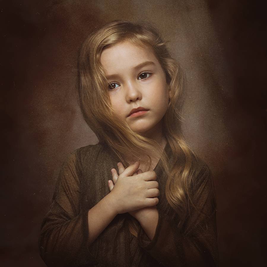
Controlling texture mainly refers to how to emphasize texture, how to restore texture, and how to weaken texture in photographic images. Of course, there are also texture replacement and texture superposition. The emphasis or weakening of texture is consistent with the photographer’s creative intentions. Taking this group of works as an example, the photographer wants to show nostalgic and retro image quality. Therefore, from the early lighting and character modeling to the later adjustments, all follow the same rules.

The more three-dimensional lighting is the first step to reflect the texture of the picture. The small aperture plays a key role in restoring details in the picture. In the latter part of the process, by adding material layers to add grain and scratches to the picture, making the picture more retro and aging.

Aperture: F/13, Shutter Speed: 1/125s, Focal Length: 85mm, ISO: 50

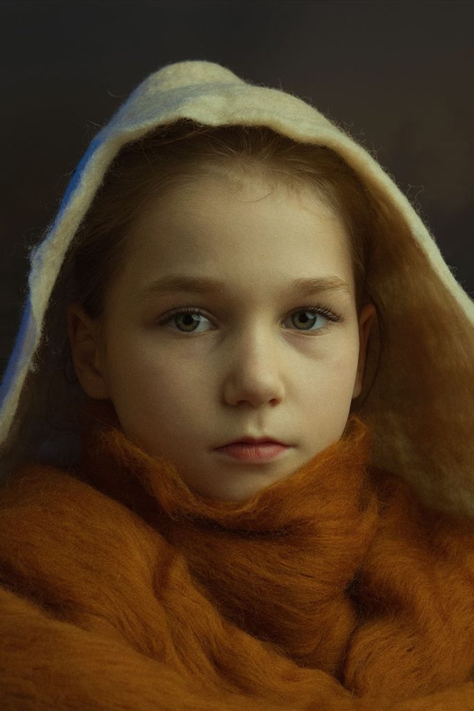
Warm-tone Color

The main light is a soft box, arranged at about 45° to the left of the character. The auxiliary light is a blue color chip light, arranged on the right back side of the character. The blue contour light contrasts with the overall warm tone of the picture, adding a sense of calm and tranquility to the warm-toned picture.

Aperture: F/13 Shutter speed: 1/125s Focal length: 85mm ISO: 50

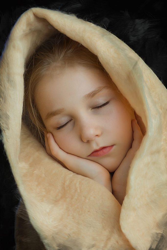
Wrapped cloth made of wool felt is soft in texture and vintage in color. The smooth line texture reflects the brush touch of Van Gogh’s paintings.

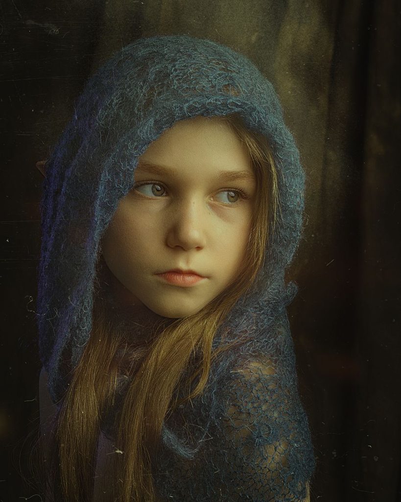
Aperture: F/13, shutter speed: 1/125s, focal length: 85mm, ISO: 50

Blue clothing makes the picture show a tendency of cool colors. The blue color film light on the back of the character further strengthens this tendency.

Aperture: F/13, Shutter Speed: 1/125s, Focal Length: 85mm, ISO: 50

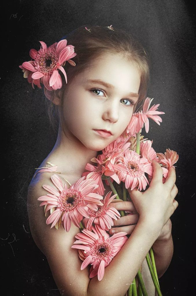
Pink is a warm color with a sense of intimacy. The blue contour light weakens the feminine temperament of pink to a certain extent, giving the picture a sense of tranquility.

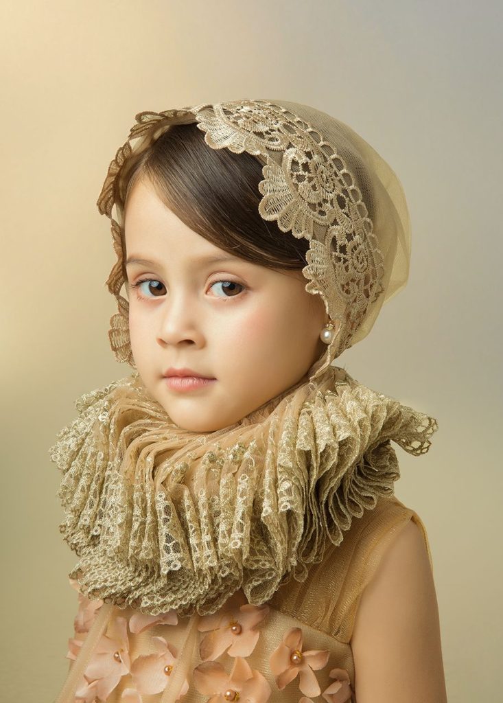
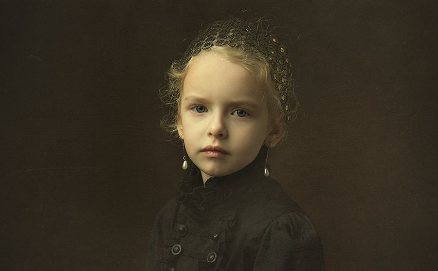
Aperture: F/4, Shutter Speed: 1/200s, Focal Length: 70mm, ISO: 100

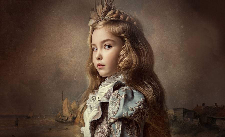
The golden headwear and pearl earrings symbolize the nobility of the character’s identity. The character looks straight into the camera, attracting the viewer’s attention, and looks thoughtful.


Emotional Cues of Environmental Atmosphere

Environmental atmosphere is a concentrated expression of a specific emotion. The atmosphere of the environment is a state of mind, a state.

In the treatment of tones and tones, we generally adopt the law of corresponding isomorphism. Under normal circumstances, to express mysterious, melancholic, and sad themes, it is advisable to use low-key, heavy-color or dark-key images. When you want to express lively and cheerful themes, you should choose a high-key, light-colored picture.

In order to express the author’s creative intentions more fully and accurately, a unified tone must be determined in the picture. That is to unify the inner basic mood with the outer tone and tone, so that all elements are unified in this tone. Sometimes, it is borne by a large area of ​​tone. Sometimes, it is governed by a specific hue. This large-area tone or specific tone becomes the “base tone” of the picture at this time.

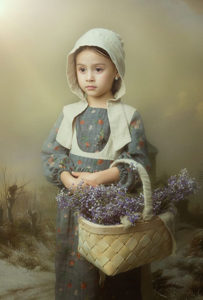
Aperture: F/20, Shutter speed: 1/125s, Focal length: 42mm, ISO: 50


The background material is an oil painting style farm scene. The character is the shape of a European farm girl. The colors and textures of costumes and props show a uniform and simple style. Light brown and gray blue are the main colors of the picture, forming a harmonious tone with the girl’s peaceful demeanor.


Environmental Hints of “synthetic Background”

Composite photos are not a product of the digital age. As early as the 19th century, Swedish photographer Leiland began to experiment with photo collage technology and multi-negative stacking technology, and exhibited the first composite photo in 1855. Therefore, he was called “the father of artistic photography” by later generations.

Although the work of “synthesis” is completed in the later stages of photography, the complete picture has been presented in the photographer’s mind in the early creative conception. Background, as an important factor in explaining the environment and atmosphere, is the element that needs to be established first in the conception. Based on this, the photographer then conceived the design and arrangement of the character and the scene, in order to reach a consensus with the environment explained by the background. Especially when it comes to lighting considerations, photographers need to carefully observe the light effect presented by the background image, and then simulate this light effect in the studio. Only in this way can the characters and the background be fully integrated.

Benefits of “Synthetic Technology”

The advantage of using the “synthesis” technology is that the photographer is no longer stuck in the shooting environment and scene, and can even set the scene as desired, and then derive the character shape and lighting arrangement according to the scene.

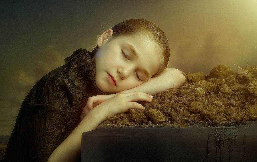
Aperture: F/11, Shutter speed: 1/125s, Focal length: 85mm, ISO: 50

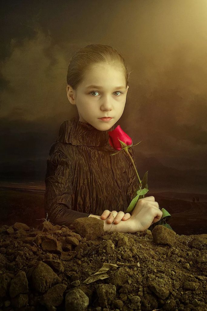
The rough graininess of the soil contrasts sharply with the delicate and smooth skin of the characters. The lines and textures of the clothes also show a corresponding texture.

Aperture: F/13, shutter speed: 1/125s, focal length: 85mm, ISO: 50

The background is the late dissolution map. Add a little warm color to form a unified hue with the color of the earth and the costumes of the characters. At the same time, the sense of space of the whole picture has also been rendered.

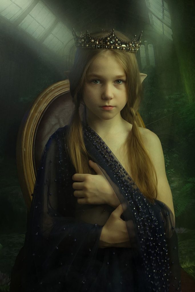
Aperture: F/11, Shutter speed: 1/125s, Focal length: 85mm, ISO: 50

The styling is inspired by the elves series of movies. I want to express the beauty of retro, magic, and imposing manner. The background is a dissolving picture in the later stage, which wants to show the mystery and sense of space in the palace of the elves.

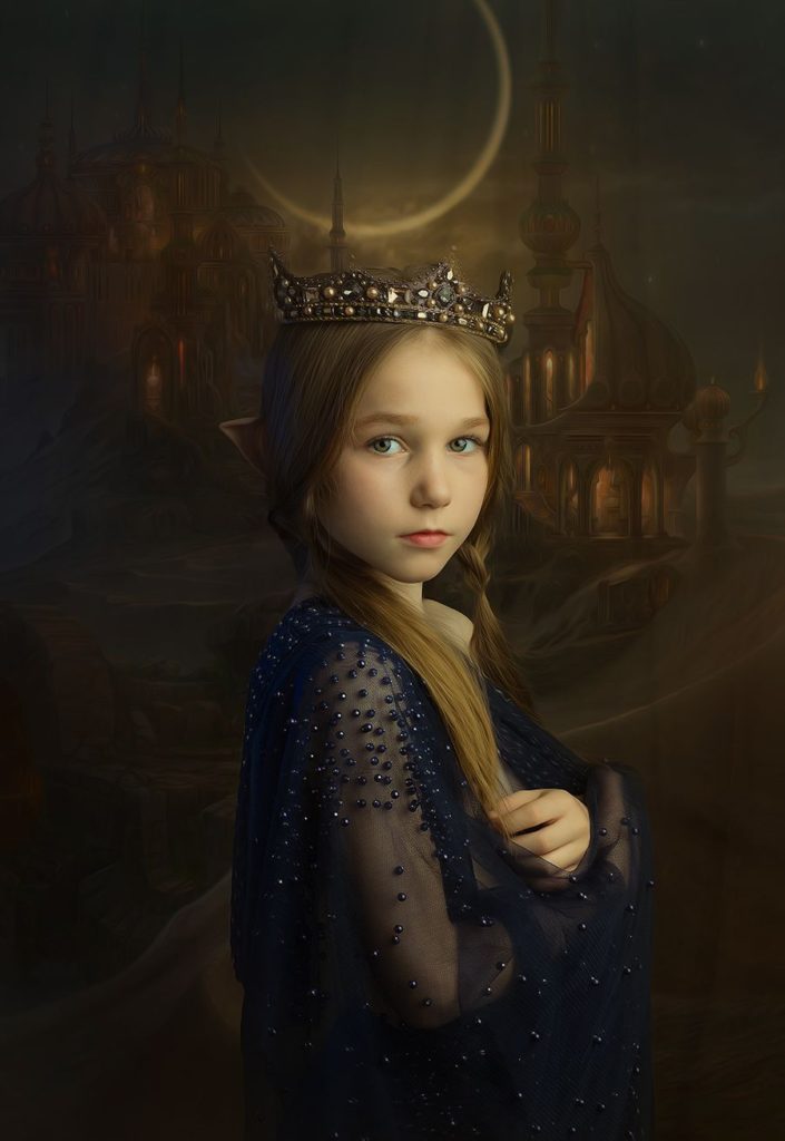
Aperture: F/13 Shutter speed: 1/125s Focal length: 85mm ISO: 50

The background is the late dissolution map. At night, with the distant royal city as the background, a crescent moon adds a sense of mystery to the picture.

Hint of Tone

The hints of the tone to the emotion and meaning conveyed by the picture are very obvious. High-key pictures often give people a bright and cheerful feeling, while low-key pictures make people feel heavy.

Low-key picture lighting

1. Front side light + side backlight

The main light is a soft box, which is placed about 90° to the left of the character. Provide positive metering lighting to ensure that there is a certain light-dark transition on the face of the character, and create a three-dimensional feeling. Arrange a soft box as an auxiliary light on the right back side of the character. The photographer added a cool color film to the wick to provide cool contour light, adding a sense of calmness and stability to the picture.

The front side lighting will form a stronger contrast between light and dark, and the contours of the light-receiving surface of the characters will be more three-dimensional. Photographers often use single-lamp front side lighting to create a low-key atmosphere.

Aperture: F/11, Shutter Speed: 1/200s, Focal Length: 70mm, ISO: 50

The front side lighting forms two areas with the bridge of the character’s nose as the dividing line, with a large contrast between light and dark.

2. Front side light + top light

The main light is an octagonal soft box, which is placed about 45° to the left of the character. Arrange a soft box directly above the character to provide top light and form a headlight. It also helps to separate the characters from the black background, enhancing the sense of space and the three-dimensional sense of the characters.

Compared with the lighting method where the auxiliary light is arranged opposite the main light, the lighting of the front metering plus the top light can form a richer tone transition.

Aperture: F/6.3 Shutter speed: 1/125s Focal length: 57mm ISO: 50

3. Front side light + side backlight

The main light is an octagonal soft box. It is placed about 45° to the left of the character. Arrange a soft box as an auxiliary light on the back side of the character (diagonal to the main light) to provide contour light and create a sense of space in the picture and a three-dimensional sense of the character. And to provide details for the decoration of the back of the character.

Aperture: F/7.1, Shutter speed: 1/125s, Focal length: 50mm, ISO: 50

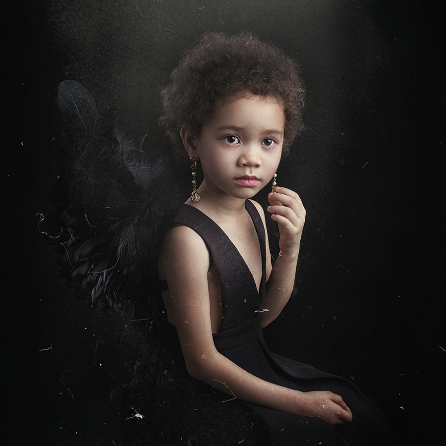
The character faces the main lamp side, and the light-receiving surface is larger, so it gets more light. The auxiliary lights provide contour light and also highlight the details of the wings behind.


High-key picture lighting

  1. Front side light + reflector

The main light is a soft box. The photographer has arranged it at a position about 90° to the left of the character to provide positive metering lighting. Arrange a folded foam reflector on the right side of the character to reduce the contrast between light and dark.

Aperture: F/2.5, Shutter Speed: 1/125s, Focal Length: 50mm, ISO: 100

The light background and shooting environment can create a high-key picture atmosphere.

  1. Front side light + reflector

The main light is a soft box. The photographer has arranged it at a position about 45° to the left of the character, providing front metering lighting and providing eye catching light. Arrange a folded foam reflector on the right side of the character to fill in the light, reduce the contrast between light and dark, and make the transition between light and dark even.

Aperture: F/10, Shutter Speed: 1/125s, Focal Length: 65mm, ISO: 50

  1. Front side light + contour light

On the premise of front metering and reflector, photographer has arranged a soft box behind the character higher than the top of the head (diagonal direction of the main light) to provide light and emphasize the details and texture of the hair.

Aperture: F/8, Shutter Speed: 1/125s, Focal Length: 70mm, ISO: 50

The light distribution method of softbox and reflector is to arrange an auxiliary lamp on the back of the character to provide headlight. The tone retains the rosy authenticity of the skin tone.

Categories
Studio Lights Education

Practical Lighting Technique-Soft Treatment of Monochrome Background

Introduction to Monochrome Background

Monochrome background is a shooting technique often used in indoor studio shooting. Photography is constantly updated with the changes of the times. With the explosive growth of location scenes and the rapid development of various real scenes, the proportion of monochrome background studio shooting in photography has declined. But in the past two years, the monochromatic background has been valued again by us. The reason is that the monochromatic background can highlight the characters to the maximum.

Indoor monochromatic background lighting is varied, and it can be “knowledgeable” depending on the subject of the shot. Here I will share with you several lighting methods for monochromatic backgrounds. Discuss how to use the design of light to make the picture more suitable for the theme and express the photographer’s creative intentions.

In a monochrome background, the use of a single lamp is more common, and it can be said to be diverse and eclectic. Of course, the single-lamp technique used by different themes, such as soft light, hard light, flash light, continuous light, etc., and the lamps used-soft box, radome, honeycomb, etc. are different. Here we will gradually decompose the usage of lights from simple to complex.

Two Simple and Practical Single-light Lighting Methods

One is hard-light single-lamp shooting, and the other is soft-light single-lamp shooting. The luminaire uses two kinds of radome and soft box. Obviously, the use of different light qualities can express two different character emotions, fashion and feminine.

When shooting with a radome, keep people as close to the background as possible. This can reduce the shadow area on the background when the light illuminates the person.

The lights should be as far away from the characters as possible. The recommended distance is about 6 meters. The purpose is to make the background light in a large area. In this way, the lighting screen is cleaner, and the shape of the character’s face is more three-dimensional.

The height of the radome should be as high as possible, and the light position should be in a straight line with the lens and behind the camera. In this way, the projection area of ​​the characters can be reduced, which is more conducive to shooting.

The advantage of shooting with this kind of light is that the characters and the background are in a light field, the light is cleaner, and the characters have better texture performance. The disadvantage is that the projection caused by the light on the face of the character is slightly harder.

The single-lamp shooting method of the softbox is actually the same as the use of the radome, the difference is that the different light quality causes the change of the projection. The projection under the soft box is softer and the transition is more natural.

Shooting with a radome

Aperture: f/4.5, speed: 1/125s, ISO: 200, focal length: 85mm

Use softbox to shoot

Aperture: f/5.6, speed: 1/160s, ISO: 200, focal length: 70mm

Single lamp lighting method with reduced light ratio

On the basis of a single light, we can make some adjustments to make the background and the light of the characters cleaner and softer. In short, it is to reduce the light ratio. Generally, you only need to add two more lights next to the background.

The two lights next to the background are crucial to the light ratio control of the entire picture. The light value is strong, the background color is light, the light value is weak, the background color is dark, and the projection is strong.

Key points of lighting:

It is recommended to use a soft box for the two lights next to the background, so that the light quality is softer. The direction of the light is to hit the walls on both sides of the background, so that the light will be reflected back and irradiate the entire background and the characters evenly.

The light ratio of the background and the characters is controlled at 1:1 or 1:2. In this way, the light of the whole picture will be more clean and soft. The transition of light projections on the characters and faces is smooth.

Aperture: f/4.0, speed: 1/160s, ISO: 200, focal length: 85mm

Single lamp lighting method with white background

The white background is also what we often use when shooting the subject. There are many lighting methods, here is a form I prefer: two background lights and a foam reflector. This kind of lighting is transparent and soft, making it easy to shoot. After arranging the light field, the light does not need to change with the turning of the character’s face.

1. Arrange the main light

When conditions permit, the characters should be about 3 meters away from the background. Place a light on a corner parallel to the background as the main light. Raise the position of this light to the highest possible position. The lamp head illuminates the area behind the person and the background 45 degrees downward.

Try not to sweep the main light on the character. Because the main light is a hard light, if it shines on a character, it will increase the light ratio between the highlight and dark areas of the character. It is difficult to control the details of highlights and dark parts, and it is also difficult to fill in the dark parts to achieve the same or close to the light ratio of the highlight area (here is the case of using a foam reflector to fill light).

2. Arrange auxiliary lights

After the main light is arranged, we can arrange the auxiliary lights. The auxiliary lamp is placed in the other corner parallel to the background, the difference is that the lamp head faces the ceiling.

The height of the auxiliary lamp should not be too high, and there should be a certain distance from the ceiling. In this way, the area of ​​light reflected by the auxiliary lamp hitting the ceiling will be larger. The main and auxiliary light lines are coordinated to basically control the light ratio of the entire screen.

The main light exposes the background and creates the contour light of the character, and the auxiliary light compensates for the area light in the dark part of the character.

3. Reflector fill light

At this time, we also need a large foam reflector to place on the floor in front of the character to fill the front of the character. The light effect of the whole picture is a diffuse dream effect.

Aperture: f/2.2, speed: 1/160s, ISO: 200, focal length: 85mm

Several reflected light application monochrome background

In monochrome background shooting, most photographers like to shoot the flash directly on the person. But I prefer the soft and beautiful diffused light, which is more mysterious. Suitable for expressing calm and introverted character emotions.

Let me share with you several applications of reflected light on a monochromatic background. The light shines on the characters through diffuse reflection, with a soft texture and the effect of natural light.

1. Front side diffused light

Place two large foam reflectors at a 45-degree angle in front of the character, and there must be a certain distance from the character, at least 3 meters. Because the farther you are from the character, the larger the area of ​​light reflected back.

Place a flash with a soft box in front of the reflector. Pay attention to the distance between the lamp and the reflector here. If the lamp is too close to the reflector, the reflected light will easily become a point source. The farther the flashlight is from the reflector, the wider the area of ​​light reflect back, and the more diffuse the light quality.

At the same time, the up and down angle of the main lamp and the height of the lamp directly affect the light reflected on the face of the character. If the lamp holder is too low, the reflected light will become “ghost light”. If photographer raise the light head too high, the intensity of the reflected light will reduce sharply. So try more and adjust the height of the light according to the character’s posture (standing or sitting).

On the other side of the character, photographer should also place a foam reflector to fill in the light. The purpose is to reduce the contrast of light. At the same time, photographer should also reduce the intensity of the main light as much as possible, so that you can use a larger aperture value to shoot.

Aperture: f/2.2, speed: 1/160s, ISO: 200, focal length: 85mm

2. High level diffused light

Diffuse light is also directional, and can also be used for light ratio. The key is how we control the intensity of the light and the direction of the light. The lighting method introduced next is actually the same as the above one, but the difference is the incident angle of the light, that is, the photographer uses the light source shining from above the person’s side.

In the same way, if we want to get a larger projection area, we must pay attention to the distance between the light and the reflection source. The distance is far, the area reflected back is larger. If I need a larger area of diffused light, I can use two softboxes and place them on the side of the character. The distance between the two soft boxes should also be opened to further expand the irradiation area.

The two lamps are facing the ceiling at the same time, so that the light diffuses down from the upper side of the characters, creating a light effect with both a soft light ratio and a strong directionality.

Place a foam reflector on the other side of the character to fill in the dark parts. Because the light is diffused from the top of the character’s head, the details of each area of the character are very ideal.

Aperture: f/2.8, speed: 1/160s, ISO: 200, focal length: 125mm

What I have introduced to you above is the lighting application of several kinds of monochrome background shooting. When shooting, pay attention to the light ratio of the background to the person, and handle the direction of the light. With a full understanding of the principle of light reflection, you can do well in shooting a monochrome background, and draw inferences about it.

Categories
Studio Lights Education

Examples of Portrait Lighting in Oil Painting Style

Light Art in Painting and Photography

Painters throughout the Renaissance era are studying the light and shade changes and expressive power. For example, Da Vinci, although he uses a lot of light and shade, the edges are still sharp, but the light and shade have never been separated.

Caravaggio took to the extreme the Titian tradition of expressing volume and space with light and shade and creating a mysterious atmosphere. In order to highlight the expressive and dramatic effects of light and shade, the color was boldly simplified, and the era of “soy sauce tone” that has been brown since he started has arrived.

Rembrandt also likes to create wonderful light effects in front of dark backgrounds. The bright part has a thick color, and the dark part is thin and transparent. The different methods of the two areas of light and darkness cooperate with each other to obtain a full sense of shaping and dramatic charm.

The painters’ achievements in using light were easily grasped by the photographers. In fact, the same problem faced by photography and painting is to transform the three-dimensional world into a two-dimensional world, that is, how to present a three-dimensional visual experience on a plane. The light and shade can suggest volume and space, and become an effective means of expression.

Aperture: F/4.0 Shutter speed: 1/125s Focal length: 85mm ISO: 50

Darkness is the Premise of Lightness

Darkness and lightness are relative. They are mutually cause and effect and complement each other. In photography, if the expression of “bright” is the only one-it comes from light, then the expression of “darkness” is diverse. For example, the color of the background and the subject, such as the shadow formed due to the inaccessibility of light.

In this group of works, the dark background and dark clothing become the premise of lighting. This “soy sauce tone” that has been popular since the 17th century is very popular among photographers. The real reason is that this contrast between light and dark makes people feel comfortable and pleasant visually.

Three Elements of Lighting Layout

The wonderful thing about light is that it can divide a chaotic darkness into bright parts, dark parts, and transitional areas in the middle. The photographer guides the viewer’s line of sight and the sequence of visual attention through the brightness and darkness of the light, so as to realize the expression of his shooting intention.

In this process, three factors need to be considered:

  1. 1. The direction of light projection. This is the most important link in lighting, because light in different directions has different modeling meanings. It also determines the size of the subject’s light-receiving surface and the area of ​​the shadow, and the resulting contrast of light and dark will directly determine the tone and atmosphere of the picture.
  2. 2. The orientation of the character’s face. The orientation of the character’s face will ultimately determine how much light the face receives. Generally speaking, the face of a person faces the direction of the light source, that is, the light illuminates the face, and the key lies in the proportion of light and shade of the face. This is more flexible. When the character’s face needs more light, you can make the character turn to the light slightly. It needs to be emphasized that it will cause a series of changes in contours, eyes, limbs, etc., so you need to pay attention to the overall adjustments.
  3. 3. The direction of the character’s gaze. The eyes are the most important organ for expressing feelings, and the expression in the eyes can convey the mood and atmosphere of a work. Whether a character’s eyes are looking at the camera or looking elsewhere has different meanings. Whether the characters open or close their eyes also describe different emotions.

Top Light Source 1

Main Light Source

The main light source is a soft box located about 1 meter above the subject. Adjust the position of the soft box so that it is 45° to the right of the subject. Keep the subject at the edge of the soft box so that only the subject’s face is exposed to light. The details of the hair are also limited to the front side. Arrange a reflector at 45° on the left side of the subject, with a distance of about 1 meter between the two to reduce the contrast between light and dark and ensure that the details of the dark parts are reflected.

The role of top light

Under the condition of the top light source, the protruding parts of the character’s forehead, cheekbones, and bridge of the nose are very bright, while the backlight under the brow bones, eye sockets, under the nose, and chin will form heavy shadows. The subject’s face has distinct levels and a strong sense of three-dimensional outline. The height of the top light and the distance to the subject will affect the character’s shape. The relative distance between the light source and the person should be adjusted according to the shooting intention. What needs to be emphasized is that the closer the light source is to the subject, the softer the light, and vice versa, the harder the light.

Top light is a kind of special modeling light effect. In addition to providing main light illumination, it can also take into account contour light (such as luminescence) and modification light (such as catch light). Of course, these effects require the photographer to properly adjust the relative position of the light source and the subject to be achieved. The concept of portraits shot with top light is relatively strong, and it can highlight the character characteristics of the characters.

Aperture: F/3.2, shutter speed: 1/125s, focal length: 85mm, ISO: 50

Top Light 2

The main light source is a soft box located about 1 meter above the subject. The subject is at the back edge of the softbox. The light is soft and uniform, which dilutes the shadows on the faces of the characters.

The background light is a flash with a standard cover, which hits the background directly at the height of the person’s shoulders. This creates a transition from light to dark from the center to the surroundings on the background, which enriches the tonal levels of the picture. It also opens up the distance between the characters and the background, increasing the sense of space in the picture.

Another auxiliary lamp is behind the photographer, with the lamp head facing the ceiling, creating a diffuse reflection effect. Because the shooting environment is dark, the light provided by this auxiliary lamp can reduce the contrast between light and dark, so that the transition between light and dark is natural.

Aperture: F/4.0, shutter speed: 1/125s, focal length: 85mm, ISO: 50

Front Side Light 1

The main light is a flash with a soft box, arranged at 45° to the right of the character. A reflector is arranged at 45° to the left of the character, and the distance between both and the character is 1 meter. This can ensure the softness of the light.

The front side light can form a larger area of light-receiving surface on the character, which is not only conducive to the detailed description of the five senses, but also easy to emphasize the texture of the character’s skin and clothing.

Front Side Light  2

Combination lighting method of single-lamp softbox and reflector. The distance between the lamp and the character is about three meters, so that the entire scene can be illuminated. The character image is more three-dimensional, and the texture of the background cloth has a larger contrast between light and dark. The distance between the lamp and the character determines the contrast between light and dark in the picture. The closer the distance, the smaller the contrast. The greater the distance, the greater the contrast.

Aperture: F/2.2, shutter speed: 1/125s, focal length: 85mm, ISO: 50

Aperture: F/2.2, shutter speed: 1/125s, focal length: 85mm, ISO: 50

Side Backlight 1

The main light is a flash with a soft box. It is located 45° behind the right side of the character, about two meters away from the character. The reflector is 45° to the left of the character, about two meters away from the character. Such lighting can emphasize the three-dimensional and spatial sense of the screen.

The background light is a flash with a standard cover, and the height is level with the shoulders of the person. The light hits the background directly, allowing the background to form a light-dark transition from the center to the surroundings, presenting a deep sense of space.

Another auxiliary lamp is arranged behind the photographer, with the lamp head facing the ceiling. The diffusely reflected light illuminates the entire space to adjust the contrast of existing light.

The light source of the side backlight is located behind the person’s side and will form a bright spot on the edge of the person’s light. Because the shadow surface occupies a larger area, the tones of the character’s face appear deeper. Side backlighting can separate the characters from the background, creating a greater sense of space. The  best light ratio of the color portrait is 2:1 or 3:1.

Aperture: F/4.0, shutter speed: 1/125s, focal length: 85mm, ISO: 50

Side Backlight 2

The main light is a flash with a soft box. It is located 45° behind the right side of the character, about two meters away from the character. The reflector is 45° to the left of the character, about two meters away from the character. Since the face of the person faces the main light side, the light-receiving surface of the face is larger, so the photographer has added no auxiliary light.

Aperture: F/2.2, shutter speed: 1/125s, focal length: 85mm, ISO: 50

Lighting for Location Shooting

Outdoor lighting needs to consider two factors: flash and ambient light (natural light). Since natural light is uncontrollable, we need to choose the appropriate weather and time period for shooting. The flash can help us achieve the shape of the light.

Photographer has taken this location photo at about 5 o’clock in the afternoon on a cloudy day. The sun hides in the thick clouds, the light is dark and soft. At this time, a flashlight to provide lighting will be perfect. I placed the flash with the soft box at 45° to the right of the character. And the distance between the light and the character was about three meters. This not only darkens the background, but also gives the characters a sense of three-dimensionality.

Aperture: F/2.2, shutter speed: 1/125s, focal length: 85mm, ISO: 50

Aperture: F/2.2, shutter speed: 1/125s, focal length: 85mm, ISO: 50

Categories
Studio Lights Education

How to Take Good Photos Easily During Travel

Breakthrough Composition in Photography

Avoid tourists

There are always many tourists in popular travel destinations, and they always appear chaotic in the screen. How to do? Teach you three tricks of composition techniques to make these people disappear.

1. Use foreground occlusion

We can try to find some prospects to block other tourists. For example, low shrubs on the roadside, hanging willow branches, beautiful railings, delicate small objects with regional characteristics, etc.

2. Close to the main body

“If you are not shooting well enough, it is because you are not close enough.” This famous quote by Robert Capa is really useful. When we shoot close to the subject, whether with a wide-angle or telephoto lens, the picture will be filled with the subject. Will there be room for passers-by? I think it shouldn’t be too much. Even if there is, it is not so conspicuous because of the perspective effect of near and far.

▼Get close to the subject and use the wide-angle lens to make the person in the distance smaller and less conspicuous.

CANON EOS 1Ds MARK II, EF24mmF2.8, F5, 1/2000s, ISO125. Daylight white balance. San Francisco

3. Low angle shooting

If you are close to shooting and still feel that there are too many people waiting, the second trick must have a better effect at this time-low-angle upside down shooting. Shoot upward from a slightly lower angle, and irrelevant people will run out of your lens. Generally, the sky or landmark buildings are used as the background, and the picture will appear simple and clean and rich in regional characteristics. However, getting too close and the angle too low will cause serious deformation of the opponent, remember!

▼Kandy is a very noisy and crowded city, with people coming and going on the streets. It is not easy to take a picture with a simple composition and a prominent subject. I chose to squat down and take photos of two roadside vendors from a low angle upwards. With the sky as the background, the picture is much simpler.

SONY A900, 16-35mmF2.8ZA, F11, 1/200s, ISO200. Daylight white balance. Kandy, Sri Lanka.

Central Composition

The central composition method is the simplest way of composition. Anyone who takes the first photo will naturally place the subject in the middle of the frame. This kind of composition requires the subject to occupy a large area in the picture, be obvious, and there should be no clutter around to interfere with the line of sight.

CANON EOS1, 28-70mmF2.8L, F4, 1/125s, FUJI RDPIII, automatic white balance. Kathmandu, Nepal

Golden Section

What kind of composition is unique and not rigid? In fact, the ancients had arranged for us a long time ago, and the secret is the golden section.

The golden section has strict proportionality, artistry and harmony, and contains rich aesthetic values. The value of 1:0.618 plays an important role in photography, painting, sculpture, music, architecture and other artistic fields. Our common golden section has the golden section line and the golden section point.

Let’s first take a look at how to use the golden section line and the golden section point. When we divide the four sides of a photo according to the golden ratio, we can get two horizontal, two vertical and four lines. We call it the golden section line, and the four intersections are called the golden section point. The edges of the picture are divided into three equal proportions by these lines, so we sometimes call it the “rule of thirds.” These lines divide the picture into nine grids, sometimes called “Nine-grids” composition.

Golden section line and golden section point

The Location of the Horizon

The position of the horizon is very important in landscape photography. In order to avoid the boringness and ambiguity of the picture, it is generally avoided to place the horizon in the middle of the picture. The horizon is located in the lower 1/3, suitable for showing the sky. The horizon is located in the upper 1/3, emphasizing the scenery on the ground.

CANON EOS 1Ds MARK II, EF24-70mmF2.8L, F3.5, 1/3200s, ISO320, -0.3EV. Daylight white balance. Munich Germany

When taking portrait photos, the position of the characters can also be arranged on the golden section line in the vertical direction. Usually we leave 2/3 of the area in front of the character’s line of sight to give the vision a sense of extension.

SONY A900, 85mmF1.4ZA, F2.5, 1/2000s, ISO200, 4800K white balance

▼Sometimes the opposite can be done to increase the imagination of the picture.

CANON EOS 1, 2 8-70 m m F 2. 8 L, F2.8, 1/500s, FUJIRDP III. Kathmandu, Nepal

Tips: AF Point and Golden Section

Most SLR digital cameras have 9 or 11 or more AF points. The distribution of these focus points mostly coincides with the position of the golden section. Using these focus points can complete the composition while focusing, so that the efficiency is greatly improved. Of course, in some cameras, in order to save costs, the distribution of focus points is closer to the middle of the frame, but it is still necessary to focus first and then recompose the picture.

▼The diamond-shaped focusing system, the four focusing points at the waist are just close to the golden section point.▼On the right side of this photo is a door, the color is very dark. If the child is centered in the composition, the black on the right is very ugly, and the blue kettle on the left is not fully photographed. With the current composition, the child’s eyes are exactly at the golden ratio point, and there should be no more, no less, just right.
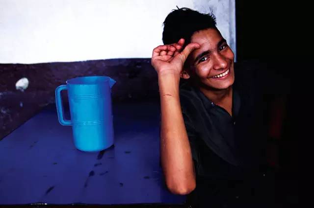
CANON EOS 1, EF28-70mmF2.8L, F3.5, 1/60s, FUJI RDP III. Kathmandu, Nepal

Tips: Press the Shutter Halfway to Recompose the Picture

If you are used to autofocus with the center focus point, you need to learn the technique of half-pressing the shutter to recompose the picture. Use the center focus point to focus on the subject, and you will hear a beeping focus lock sound from the camera after aiming. When the shutter button is pressed halfway down, there will be an obvious sense of resistance. Don’t let go to maintain this sense of resistance. Move the camera to recompose the picture, and place the subject you want to take to the golden section. Note that when recomposing the picture, do not move the camera forward and backward, but pan, otherwise the focusing distance will change and the picture will be unclear.

▼This is a picture that is more elaborate. The figure and the edge of the table are on the vertical and horizontal golden section lines, and the face and the pot are on the two golden section points. Just this kind of composition picture still has a sense of imbalance that is too heavy on the right side, and the cart frame at the edge of the picture appears to be much more balanced.

NIKON F100, 17-35mmF2.8, F5.6, 1/200s, FUJI RDP III. Pokhara, Nepal

Threaded golden section

▼The ratio of the diameter of each thread on Nautilus to the diameter of adjacent threads also meets the golden ratio. So when we photograph some thread-like objects, we can also apply the golden section method to compose the picture. The curvature of the spiral staircase is fixed, but as the shooting angle changes, the curvature of the line of the staircase in the picture will still change. We can choose the right angle to make the curve match the visual effect of the golden section.

CANON EOS 5D, EF24mmF2.8. Paris, France

The golden section of the triangle

▼Let’s look at this triangular spiral staircase. Generally, the spiral staircase is more beautifully photographed from top to bottom. But this one is quite special. It’s very common from the top down, but it’s quite charming when you look up at the bottom of the building. The triangle is similar to the spiral, but it has higher requirements for line control.

When taking this photo, my first reaction was to place the vertices of the triangle on the right side of the screen at the center of the vertical direction of the screen.

However, the bottom of the upper part of the stairs is too dark and will appear top-heavy. So I rotated the picture a little bit to make the vertices go up, the dark area was reduced, and the power ratio between it and the space below and to the left became more balanced.

SONY A900, 16-35mmF2.8ZA, F3.5, 1/25s, ISO 320, 5000K white balance, Galle, Sri Lanka

Golden Section in Area

In addition to the common points and lines, the golden section also has the golden ratio in area.

Draw a diagonal line in the picture, and then draw a vertical line from a vertex. This divides the rectangle into three different parts. Now, in theory, the golden section has been completed. In the next step, you can arrange the scenes you want to shoot roughly according to these three areas. You can also flip the schematic diagram by 180° or rotate or rotate it by 90° for comparison.

Summary of golden section technology:

  1. Do not place the horizon in the center,
  2. Leave 2/3 of the space in front of the face,
  3. Pay attention to the balance and power ratio of the picture.