The three elements of color
- Hue:
A characteristic of the difference between colors, determined by the dominant wavelength of the colored light.
- Lightless:
how the human eye perceives the lightness of a color.
- Chrome:
the feeling of color purity, so it is also called “saturation”.
The resolution of human eyes to hue is related to the wavelength of light. The sensitivity of human eyes to different color light is different in the whole wavelength range of visible light. Human eyes are most sensitive to the wavelength region of yellow and green light, and human eyes are more comfortable to feel the light of this wavelength.
Color mixing
The law of color mixing
Metamerism: the color of an object is related to the spectral power distribution of the reflected (transmitted) light, but it is not one-to-one correspondence. As a result, many lights with different spectral distribution can also cause the same color sense of human eyes. Metamerism is caused by the low resolution of human eyes. Metamerism makes color matching easier.
Three primary colors: any color light can be obtained by mixing no more than three proper primary colors in a certain proportion. The three primary colors are independent of each other, that is, any primary color cannot be generated by mixing the other two primary colors.
There are three rules of color mixing
- Complementary color law: color a + complementary color of color a = white
- Intermediate color law: any two non complementary color mixture = intermediate color
- Law of substitution: for example: color a = color B; color C = color D
Then: color a + color C = color B + color D
Additive color mixture
Definition: using two or more kinds of color light to synthesize new color light by direct or indirect mixing method.
Color light three primary colors: CIE regulations; red light (700nm), green light (546nm), blue light 435.8nm.
Subtractive color mixture
Definition: according to the characteristics that white light is polychromatic light and pigment selectively absorbs chromatic light, it is a method to use two or more kinds of pigment to absorb different chromatic light in white light, so as to obtain the required color. The three primary colors of pigment, cyan, magenta and yellow, are respectively the complementary colors of the three primary colors of light, red, green and blue.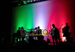
Mixed method
Comparison item additive subtractive primary shade
Primary colors: red, green, blue, R, G, B, magenta, yellow, cyan, M, Y, C
The relationship between primary colors and chromatogram: each primary color radiates only one spectral area, each primary color absorbs one spectral area and reflects two spectral areas.
The basic law of color change in color mixing:
Red + Green = yellow
Blue + Red = magenta
Green + Blue= cyan
Red + Green + blue = white
Magenta + yellow = red
Magenta + cyan = blue
Yellow + cyan = green
Magenta + Yellow + cyan = black
The brightness of the new color is the sum of the brightness of each mixed light, and the color is saturated. The brightness of the new color is the average value of the brightness of each primary color, and the color is not saturated. When two primary colors are superimposed, the brightness and chromaticity of the new color are reduced.
Color method
- Color mixing outside visual organs
- Color mixing within visual organs
- Static color plus color mixing
- Dynamic color adding, mixing, superimposing,
combining,
dot forming
Color measurement and matching of application
The effect of theater lighting on color separation of original manuscript
Cool and warm feeling of light color
Generally speaking, the arrangement of colors from warm to cold is: red, orange, yellow, green, cyan, blue, purple. The warm and cold feeling of colored light is very obvious in forming people’s mood and the atmosphere effect of the background environment. In the design of the background environment, the uniform light distribution of cold color is used to express a dignified and quiet atmosphere; while in the design of the background environment, the uniform light distribution of cold color is used to express a dignified and quiet atmosphere The warm color has a bright, comfortable, warm and pleasant atmosphere, and the effect of color on people’s mood is more obvious. The following are the psychological effects of color to human kind:
Big red — excited, dangerous, angry
Blue — solemn, lonely, deep
Pink — warm, hot
Purple — elegant, mysterious, serious and safe
Orange red — happy, healthy
Blue green — confusion, mystery
Orange – happy, optimistic, bright, comfortable –
Blue purple – dull, dark.
Yellow – bright, gentle, submissive –
Red purple – depression
Green — comfortable, peaceful, leisurely, lively ﹣
White — pure, refreshing ﹣
Dark green – cool
Atmosphere effect of lighting color
The expressive power of various colors is as follows:
Green – can give people fresh, comfortable, quiet and young people’s sense of vitality,
pink – implies maturity, gives people a mild, comfortable atmosphere, white – can show a kind of purity,
Blue – induce people to think in the dark, and infinite breadth of depth, Sky blue – give people a feeling of spring.
Peach – gives the feeling of summer,
golden – gives the feeling of autumn,
silver – gives the feeling of winter.
Emotional effect of light color
Blue green can express deep, calm and serene main characters, yellow environment background can induce happy and happy emotion effect, dark purple can express a kind of sadness and loneliness, dark blue background can induce a kind of sad emotion, light blue feeling is more calm and comfortable, light rose red expression is lively and gives people a happy feeling, dark blue background can induce a kind of sadness and loneliness, light blue feeling is more peaceful and comfortable, light rose red expression is lively and gives people a happy feeling, Red is warm and exciting.
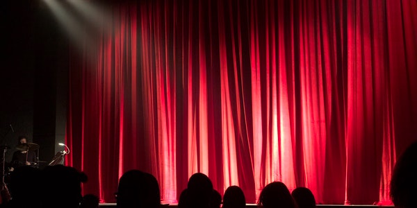
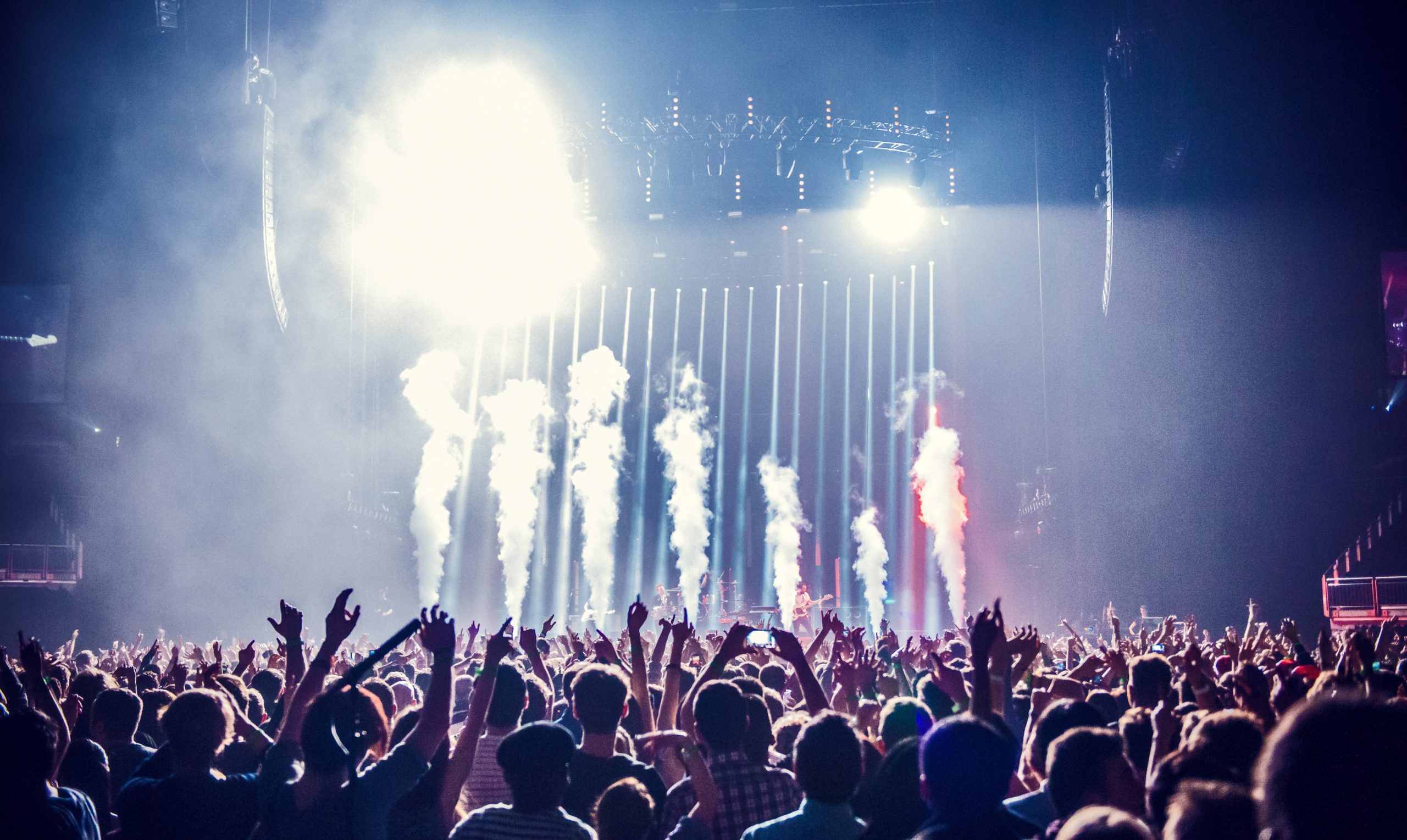
Flexible use of the lighting color in the song and dance hall, combined with the temperament of the performance and actors, to achieve the harmony of all kinds of color and light, can more fully express the artistic conception of the song and dance program, make the guests devote themselves, shorten the psychological distance with the guests, and activate the scene atmosphere of the song and dance hall.
Matching of lighting colors
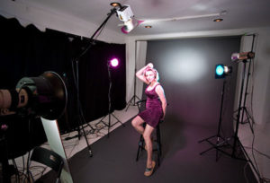
No matter in the stage, dance hall or studio, the matching of lighting color is very important. The harmony and unity of lighting color is the highest requirement for color art. In order to make the lighting and song and dance show content to be amiable and unified, we must set a kind of tone color in the performance area, and other kinds of color lights should obey this kind of tone color, In addition, it is also necessary to deal with the order of similar color lights and the complementary deployment of similar color lights. The orderly arrangement of similar color lights can achieve a harmonious effect, while the application of complementary color lights can increase the intensity of each other, highlight the contrast, and highlight the content of the performance.

Color application of art lighting
Whether in the field of architectural lighting or stage lighting, the application of lighting color is an important content. The correct use of different lighting colors can achieve unexpected good results; on the contrary, if the color is used improperly, it will bring bad or even bad effects. It can be seen that mastering the application skills of lighting color is a very important condition in decoration and lighting design.
Theoretical research and practical experience have proved that different colors have different physiological stimulation on people, so that people have different psychological feelings on different colors. Here are some examples.
Cold and warm feeling: red and orange give people a warm feeling, blue and purple give people a cold feeling. In addition, white, gray, black and colorless also belong to the category of cold color sense.
Sense of distance and nearness: at night, people feel close to the red light, while I feel far away from the blue light. Room with light blue tone will have a sense of emptiness, if you use warm tone, in addition to giving people a sense of warmth, there is a sense of strictness.

Sense of weight: red and orange objects look heavier, while blue and white objects look lighter.
Excitement and calmness: red will make people excited, blue will make people calm.
Appetite enhancement and loss: food in red system can increase appetite, while food in blue system can decrease appetite.
As mentioned earlier, the color of the light source can be expressed by the color temperature. Both theory and practice have proved that the color of light source will give people cold or warm feeling according to its color temperature. Generally, the color temperature greater than 5000K is called cool color, the color temperature between 3300 and 5000K is called intermediate color, the color temperature less than 3300K is called warm color.
Practice has also proved that when the illuminance of light source is different under the same color temperature, people’s feeling is also different. Generally, the light with low color temperature makes people feel happy under low illumination, but it is too exciting under high illumination. The light with high color temperature feels gloomy and dim under low illumination, while it feels pleasant under high illumination.
Therefore, in order to adjust the feeling of cold and warm, the light source opposite to the feeling can be adopted to increase the sense of comfort according to the climate conditions of different regions or environments. For example, in warm or hot areas, it is better to use high color temperature and cold color light source; on the contrary, in cold areas or winter, it is better to use low color and warm color light source.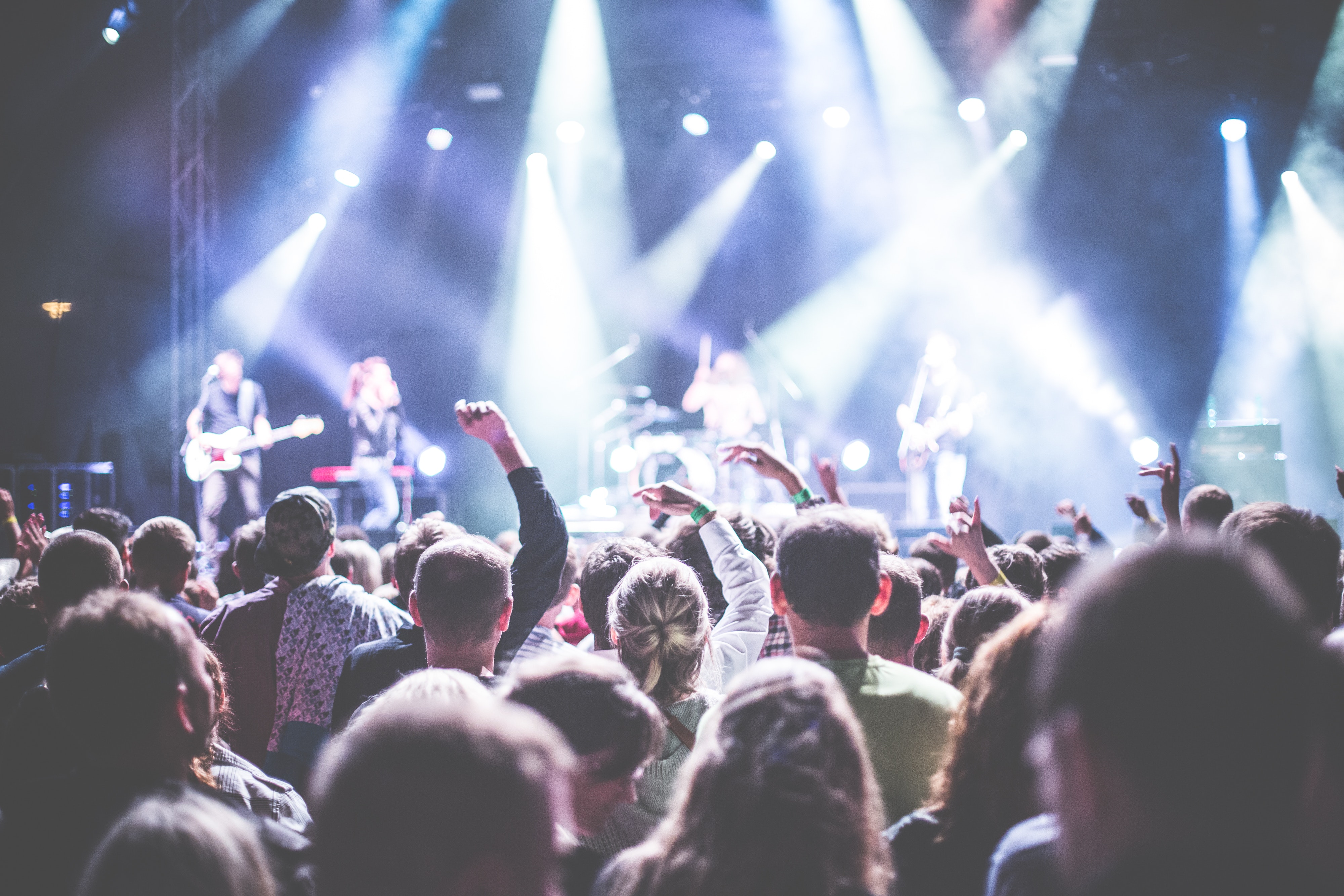
Now take the high-end hotel as an example to illustrate some examples of color and illumination adjustment. Hotel rooms are mainly rest, should use low illumination and soft light.
In order to create a quiet, comfortable and elegant atmosphere. Considering that the guests need to work or study, add local lighting, such as desk lamp, floor lamp and bedside lamp. It’s better to add up lighting device. The color and shape of the lampshade should also adapt to the atmosphere of the environment. Restaurants and banquet halls need warm colors and higher illuminance. They mostly use light with rich red and yellow components and better color rendering, which can make food color delicious and help to increase appetite.
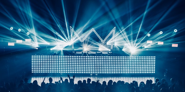
The cold light source with higher illumination should be used in the ice room and cold drink section. As for cafes, they need to be relaxed, quiet and intimate, which can create a reverie atmosphere. They should use low illumination, or even no electric light, and only light one or two candles on each table. Discos, on the contrary, need strong lighting contrast, a variety of bright colors, plus special effects such as rotation and flicker, to set off an exciting and warm atmosphere. As for offices, meeting rooms, kitchens, laundry rooms, electrical rooms and other places, a large number of low-voltage fluorescent lamps are used. Because these places have no special requirements for color, color rendering and atmosphere, saving electricity is the main focus.
Through in-depth research and analysis, people summarize the effects of seven kinds of monochromatic light (red, orange, yellow, green, cyan, blue, purple) in the visible light on human physiology and psychology, which can be used as a reference for decorative lighting design and other decorative design, product design, logo design and film and television stage lighting design.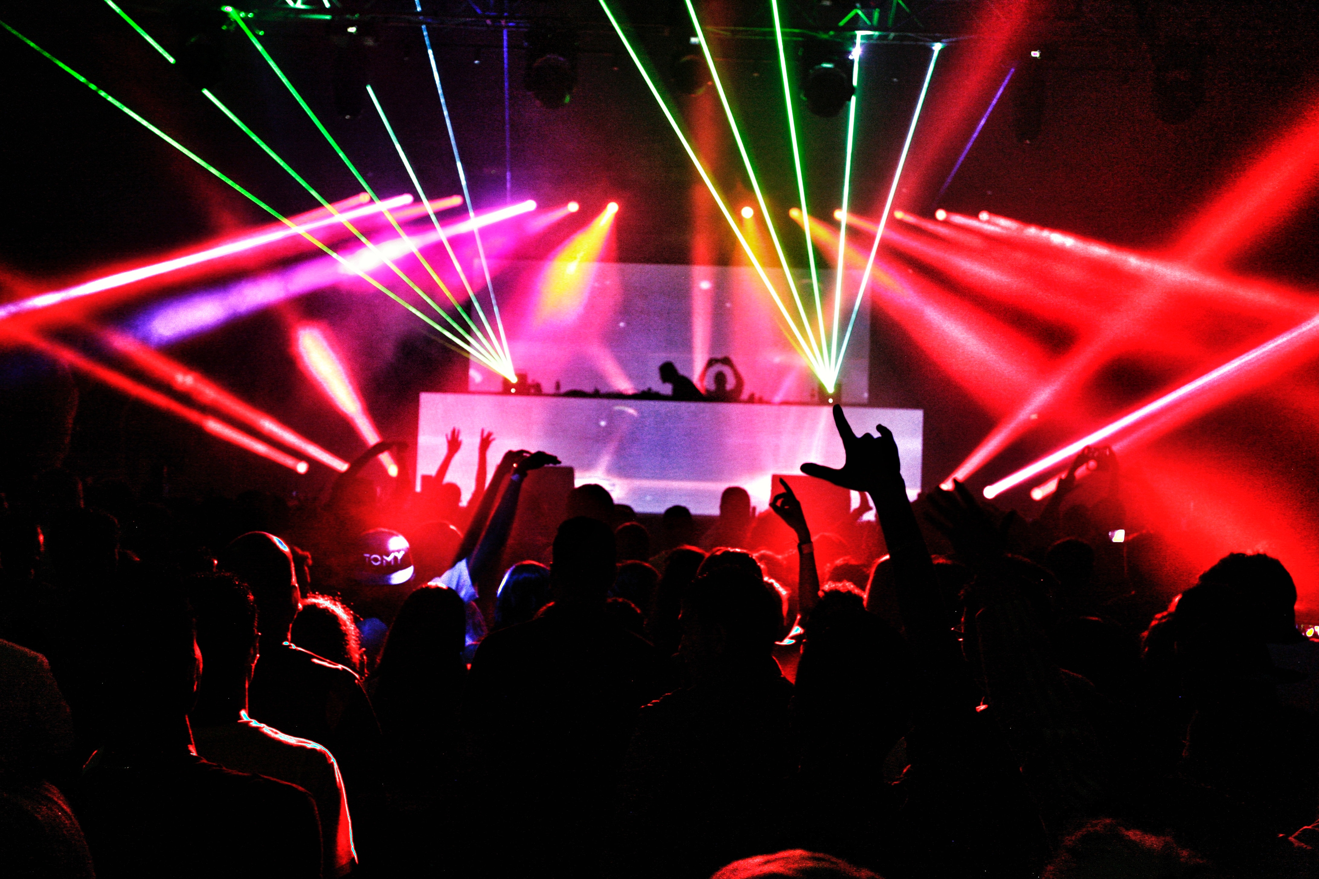
It should be admitted that people with different ages, genders, nationalities, religions, occupations, personalities, tastes, cultural attainments and social experiences may have different feelings, likes and dislikes of colors and their reactions. However, there are still some relatively common rules to follow. Here are some examples.
Red: red is a warm color, it is the most exciting. Red can stimulate and excite nervous system, accelerate blood circulation. But long time exposure to red can make people feel tired. Red reminds people of the sun, red flag, fire and blood. It makes people feel warm, warm, warm, auspicious, energetic, positive and strong. It inspires people and inspires them. But it also reminds people of danger, anger, rudeness, vulgarity and floating bath. As a sign, red usually means fire prevention, stop, prohibition and high danger.
Orange: the effect of orange is similar to that of red. Orange makes people feel bright, energetic, happy and carefree.
Yellow: yellow is a warm color. Give people a noble, bright, cheerful, open, wisdom, bright, soft, active and elegant feeling.
People’s eyes are particularly sensitive to orange and yellow, so orange or yellow is often used as warning color. For example, bright orange and yellow signs often appear on the work clothes of pilots, traffic poli
ce and road cleaners.
Green (cyan): green is the main tone of the forest, full of vitality. It makes people think of green mountains and green waters, beautiful spring and vitality. It symbolizes youth, peace, life, health, eternity, fairness, serenity, tranquility, wisdom and modesty. A green environment is conducive to digestion and sedation, and can promote physical and mental balance. As a sign, green usually means safety, passage, sanitation and environmental protection.
Blue: blue is a very calm color, it can help to eliminate tension, forming elegant, quiet atmosphere. Blue reminds people of blue ocean and blue sky, which makes people feel deep, broad, long, pure, rational, calm, harmonious and peaceful. However, it may also arouse the feelings of darkness, melancholy, poverty, indifference, sadness, mourning and even terror. Therefore, the use of blue, especially dark blue, should be cautious. 
Purple: the effect of purple is similar to that of blue. Purple may be associated with mystery, romance, elegance, nobility, solemnity and luxury. White: white is a cool color, it often makes people think of ice and snow, think of cold, give people elegant, noble, clean, pure, holy, noble, peaceful and bright feeling, but also may make people think of cold, empty, pity, sadness and even terror.
In addition, in the process of using lighting color, we must pay attention to the harmony and unity of color. When designing, we should first set up a basic color matching, and other colors should obey this basic color matching. We should also pay attention to the correct handling of the deployment of similar colors and complementary colors. The so-called similar colors refer to purple and red, purple and blue, green and yellow, etc. they are arranged in an orderly manner and can receive a harmonious effect. The so-called complementary colors refer to red and green, blue and orange, purple and yellow. They complement each other and can enhance each other’s strength.
