Central method
The central method is to place the subject to be expressed and prominent on the most eye-catching and prominent center of the picture. The central method has the following composition methods:
1. Foreground method: Put the subject to be expressed at the forefront of the picture, so that people will have a sense of “the ancestor is the main” and “open the door”, so as to leave a deep impression on the viewer and achieve the purpose of highlighting the subject.
- Tonal method: express the subject with tone structure and color relationship, and use the contrast between warm and cold tones or harmonious relationship to set off the subject.
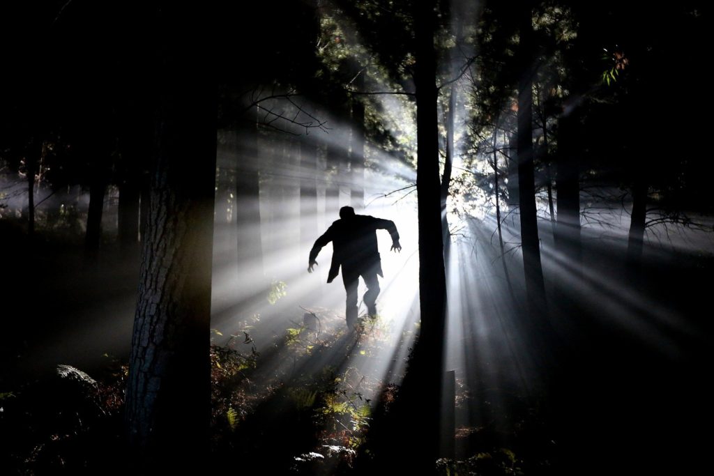
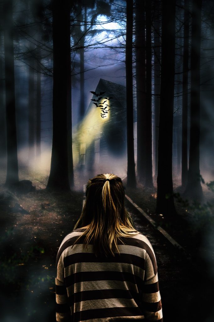
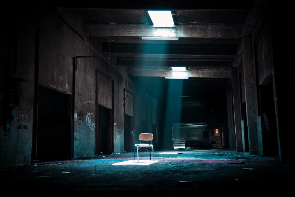
- Light method: Use the illuminance of the light to highlight the main body. As the light shines on the main body part. The main body receives more light and appears bright and eye-catching, while other parts are in a dark environment. The contrast between light and darkness on the screen, and the support of darkness to light, enable the Lord to “brighten”.
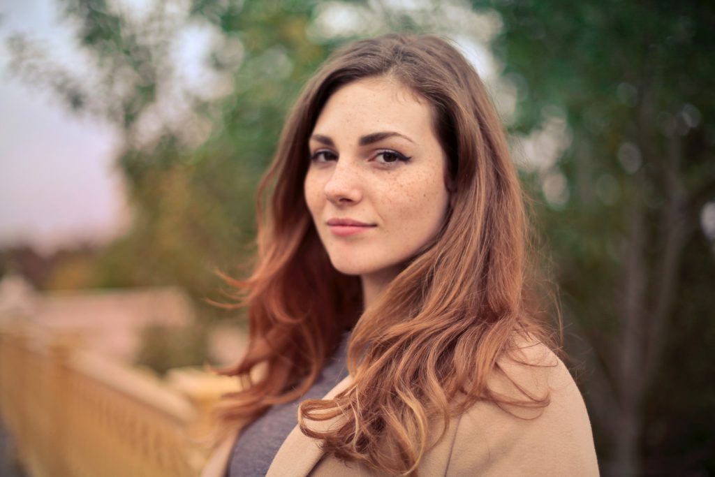
- Geometry: Use geometric figures in the picture to highlight the subject. There are various shapes in nature. When shooting, deliberately arranging the subject in a specific geometric figure can achieve the purpose of attracting the viewer’s attention to highlight the subject. For example, the intersection of lines in the picture is the most visually appealing. If you shoot the subject at the intersection, you can highlight the subject.
- Perspective method; use a strong perspective structure relationship to highlight the main body. Strong perspective lines can most stimulate the viewer’s visual organs. Because the perspective lines have strong dynamic characteristics, they show a strong spatial structure near large and small, forming a greater visual impact. If the subject is placed on the meeting point of the line of vision, it will form a rest in the picture. Thus, the subject will be highly valued visually by the viewer.
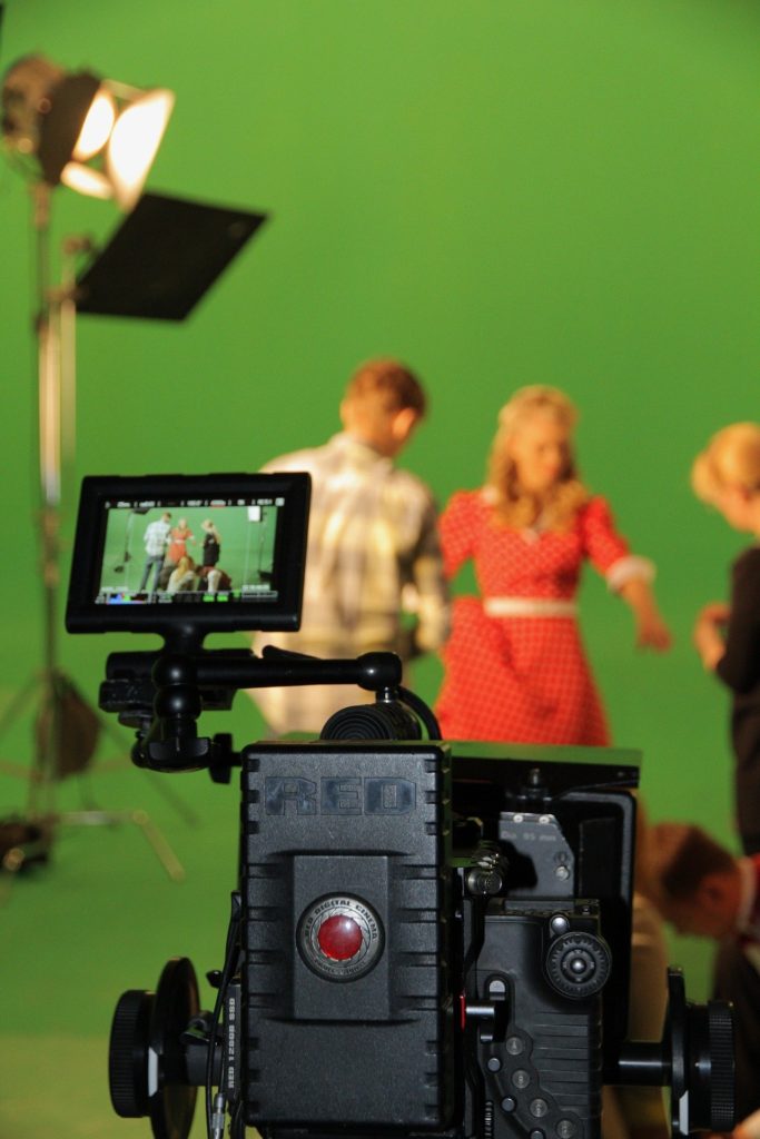
- Focus method: Use the relationship between focus point and depth of field to highlight the subject. In people’s visual habits, they pay more attention and affirmation to clear objects, like to repel and avoid the phenomenon of virtual movement, and use clear focus to express the subject. Use the depth of field to blur the background and companions to form The contrast between the real and the virtual, the clear subject is valued and approved by the viewers in the background of the blurry and blurred.
Contrast method
The contrast method is to compare or juxtapose things of different forms and contents in the picture to emphasize their respective characteristics and make them more expressive.
The most commonly used methods of contrast in photographic expressions are movement and stillness, virtuality and reality. But in the artistic world of photography, the factors of contrast in nature abound, everywhere. For example: size, rigidity and softness, light and shade, shape, denseness, mood, tone, content, how many and so on. All in all. The method of contrast is the most popular and popular artistic expression technique. It is necessary to make full use of the method of contrast in photography to make the picture more attractive.
Horizontal line composition method.
When it comes to horizontal composition, I believe everyone is familiar with it. The so-called horizontal composition in photography is the horizontal composition. Some friends have to ask: “What is the difficulty of horizontal composition? It is better to straighten the horizontal lines of the picture. Already?” In fact, it’s really good. The premise of horizontal line composition is to flatten the horizontal lines in the scenery in the picture. But do you know other knowledge about horizontal line composition?
First of all, horizontal lines symbolize the tranquility and tranquility of nature, and horizontal lines can often be used to compose pictures in landscape photography. It is worth noting that when using the horizontal line composition method, generally do not let the horizontal line pass through the center of the picture, but can pass through one third of the picture, so that the composition will make the picture more harmonious.
Second, choose the right scene and choose the horizontal line. Our horizontal line can be the horizontal plane, the horizon, such as the junction of sea and sky, as long as it is a flat line, it can be used as an auxiliary tool for our composition, and there is not necessarily only one, but it should not be too many, but it should be noted that the proportions The arrangement needs to be carefully designed by the photographer. The choice of the horizontal line position in many ratios such as 1:1, 1:2:1, 3:2, etc., directly affects the harmony of the picture, and the proper proportion can reflect the picture. Sense of arrangement.
Finally, and most importantly, we must pay attention to the primary and secondary relationship between the foreground, background, subject, and companion in the horizontal composition, and the harmony on the screen to achieve a sense of harmony in space can be considered a good use of horizontal composition.
Vertical line composition
The vertical line composition form is composed of vertical lines, which can express the subject’s scene to be majestic, tall and full of momentum. The vertical composition symbolizes strength, dignity, and power.
The composition can also give people a sense of stability and balance, and can fully show the height and depth of the scene. It is often used to express the towering trees, steep mountains and rocks, cascading waterfalls, skyscrapers, and other pictures composed of vertical lines in the forest. The vertical line composition arranges the subject in a vertical position. For vertical line composition, not only can a single vertical line object be represented, when multiple vertical line objects appear at the same time, the overall strength and sense of form of the picture can be more specific.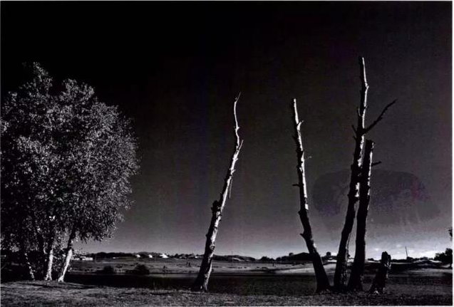
The abrupt tree trunks stand upright and occupy two-thirds of the area of the picture, seemingly quiet and stable. Compared with the lush and leafy trees on the left, the feeling of desolation becomes more evident under the black and white colorless tones.
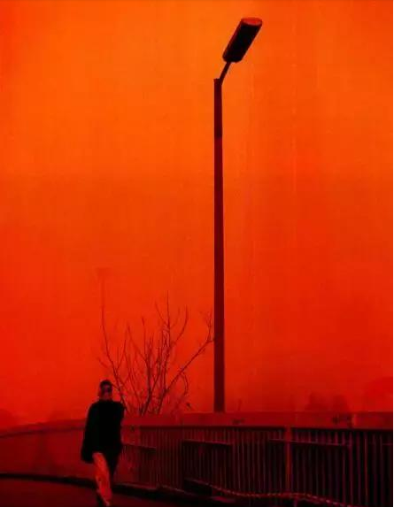
The walking passers-by, the railings on the roadside, and the slender lampposts are all displayed vertically. With the vertical shooting, the atmosphere of the whole picture becomes more serious and serious. Although it is warm orange, it looks very unreal. People are afraid of it. Perhaps it is the huge impact of sandstorms on people’s lives. Humans have to think about and treat it seriously.
Diagonal composition
Diagonal composition is also a technique often used in photography. The use of diagonal composition can reflect a strong sense of movement, and at the same time, it can make the image symmetrical.
How to compose a picture diagonally?
Generally speaking, diagonal composition can be divided into two types: full diagonal composition and near diagonal composition. Complete diagonal composition is relatively simple. It is enough to point the diagonal line in the picture to a corner of the picture. Regardless of whether the line is straight or curved, this kind of composition is called diagonal composition.

What does the near diagonal composition mean?
There are also two situations. The first is that when shooting a diagonal composition, try to straighten the picture a little bit, so that the two sides of the diagonal line do not touch the corners of the picture. In most cases, the picture will look more because it is not so deliberate. Comfortable. Although there are such diagonal lines in the picture, they are not completely diagonal.
Another situation is that the diagonal is not complete. For example, when shooting a landscape, one side of the mountain presses the top corner, and the other side only reaches the middle of the frame. The remaining position may be another mountain, a lake, or the sky. Or as in the picture below, the basketball hoop only reaches half of the frame, and the other half is the sky. This composition is also called a diagonal composition.
What can the diagonal composition be used for?
The first type is single-line things, such as the outlines of buildings, shadows, branches, railings, roads, mountains, and so on. The composition of this shot is easy to imagine;
The second is a dynamic picture. People often think that the horizontal picture is stable, but sometimes we need to make the photo look more dynamic. Some photographers will deliberately tilt the picture (obviously), so that the picture will look extra dynamic.
The third type is characters. No matter what lens equipment you use to shoot, if you sit on the ground and stretch your hands and feet and press the person on the diagonal of the screen when shooting, you can look more slender.
Curve composition
The curve reflects a soft and elegant beauty. In daily life, this technique is often used to show the beauty of the stream and the moving lines of women. People are more likely to be attracted by such lines and resonate.
In photographic composition, curve is a common way of composition. Compared with straight lines, curved lines can express a soft feeling, making the picture more fluid.
The curve is the most beautiful form of the line. The curve composition commonly used in landscape photography renders elegant and vibrant scenes. It not only allows the viewer’s sight to follow it to highlight the subject, but the beautifully curved form can also bring the picture agile Feel, make the picture more vivid and beautiful.
The curve is unique in that it contains a continuous change in direction, which seems to avoid any direct contrast between the horizontal and vertical boundaries of the frame.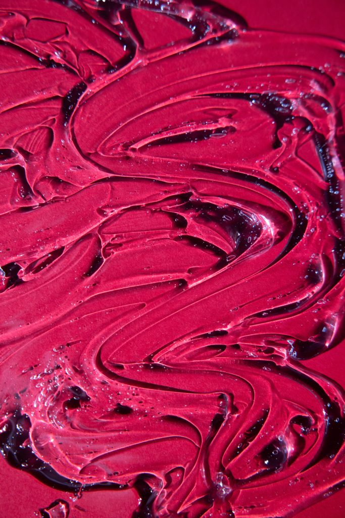
However, many curves are aligned in a certain direction. On the other hand, a curve can be regarded as a series of continuously changing straight lines. In this way, the curve and the straight line will influence each other in the picture.
The gradual characteristic of the curve makes it have a sense of rhythm that a straight line lacks, and the feeling of moving along the curve, even acceleration, is more intense. Other feelings associated with curves are gentle, fluid, graceful and elegant. The curve has a natural appeal to most people, especially when the curve fluctuates.
Curves have a special character: they are smooth and gentle, and they can also guide the eyes. Therefore, they are an effective means of controlling how the audience views the photos. However, the curves are more difficult to introduce into the photos than the diagonal lines. Generally, oblique lines are straight lines in a certain direction that are changed by the viewpoint, but the curve must be real.
They can be viewed exaggeratedly at sharper angles, but the only optical means that photographers can use to actually generate curves is to use fisheye lenses, but this will not choose to transform all straight lines into curves, and sometimes they can pass through points. The arrangement produces a curve.
The curve composition is most suitable for expressing its own curvaceous scenery. In photography, you can choose the winding river, the winding path in the courtyard, the intestinal path between the mountains, the winding street lights, and so on.
The curve composition can make the scenes or lines on the screen be in a curve state. The curve has the characteristics of extension and change, which can well show the gradual rhythm and unrestrained situation in the movement of the subject, making people look rhythmic. Produce a beautiful and harmonious feeling. Therefore, the curve composition is particularly suitable for shooting artistic gymnastics and other projects with great artistic beauty.
Portrait photography-front side lighting
There are many techniques for taking pictures, especially when it comes to using light. Portrait photography must learn to choose the right lighting effect. Here I will introduce the advantages and disadvantages of the front side lighting based on my own experience.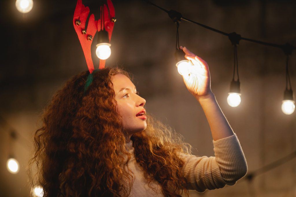
First talk about what is the front side light. Front side light refers to the illuminating light projected from the rear side of the camera (left or right) and the optical axis of the lens at an angle of 30°~60°.
So what are the advantages of front side lighting? First of all, the front side lighting will form a wider light-receiving and narrow backlight surface on the subject. Because of the presence of shadows, this lighting effect can show the subject’s light and dark distribution and three-dimensional shape.
Secondly, the front side light performs better for the three-dimensional shape of the subject than the down light, and the tone will be clearer. Make the scene rich in tones, highlight the depth, and produce a three-dimensional fruit. Especially the texture of the surface structure can be displayed finely.
So what issues should be paid attention to when shooting with the front side light? First of all, it is best to choose the time before 9:00 or after 15:00 to sunset in the front side light application. The side of the subject is 1/4 or 1/3 facing the sun, so that most of the face is illuminated by the light. In this way, the light can perfectly draw the outline of the main body of the face, and produce a small amount of shadow contrast effect, outline the three-dimensional structure of the face, and can also express a moderate skin texture.
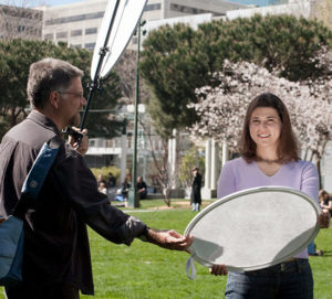
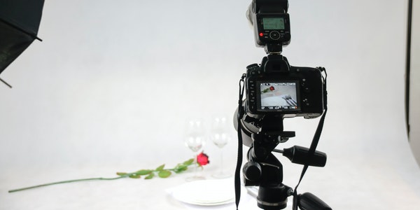
In addition, you should know that if you want to reduce the contrast of light and shadow outdoors, you can use a reflector. The reflector can choose a golden reflector or a white reflector according to the environment. If the reflector is not enough to fill in the light, you can use the flash.


