Categories
Studio Lights Education

Special Lighting Methods in Portrait Photography_Part I

Use Window Light Skillfully

For centuries, painters have liked to use the sunlight from the windows to paint portraits, because this kind of light has strong modeling ability and good projection. In the future, photographers often use this kind of light to shoot portraits indoors.

The light coming in from the north-facing window is a more directional but still soft light. When you put a reflector on the opposite side of the window light to weaken the shadow produced by the light source, the effect that appears is soft and elegant, which can understate the character’s face. This kind of light is especially suitable for color film, and it is happily adopted by many portrait photographers.
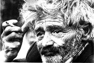
British photographer P. Peizol pointed out that the lighting of the window light is determined by many factors, and its intensity changes much more than what the eyes can see. The distance from the window to the subject determines the type of facial illumination. At the same time, it also depends on the reflective ability of indoor walls and floors. When the subject enters the blind corner of the window light, the reflected light on the wall begins to play a greater role. At this time, the closer the subject is to the wall facing the window, the more fully illuminated.

When shooting indoors, as long as the subject moves a few steps, the contrast between strong light and bright shadow will change greatly. Therefore,’adjusting the distance can solve the problem of uneven illumination. Peizol pointed out that if the subject is in the middle of the window, facing the window, his forehead, nose, cheekbones and chin are all illuminated by white light, which looks very prominent, and the outline can be set off regardless of the background. It’s obvious.

The light comes from the side, the cheek lines are obvious, and the cheeks and jaws can create shadows. The head is slightly turned away from the camera, and the side light can produce the greatest three-dimensional effect. At this time, the best way to express a person’s facial features is to turn the face slightly away from the window and toward the shadow direction so that only the side is fully illuminated.

But at this time, you must also use reflectors or other indoor reflections. If the subject moves to the side of the window, facing the window, the side light and contour light will be weakened, and the face will appear round and even. When the face turned to the camera, shadows appeared on the back window of the face, but the side of the face farthest from the window was more or less illuminated by flat light. When far away from the window, the whole face is in the dark and flat light. The farther the subject is from the window, the more dull the tone.led-hard-&-soft-2-in-1-lights
When shooting portraits with window light, small rooms with light-colored walls reflect more light than large, dark rooms, so the background is brighter. The intensity of the reflected light and the hue of the background can be adjusted by opening or closing the curtains. However, Peizol believes that the most worthwhile pursuit is the luminous effect of direct light. Photographers can use blinds or thick curtains to simulate the effect of hard-tuned direct light according to their wishes. You can also use thin curtains to turn the oblique light into scattered light, and you can also give it a certain color. The lightly-tuned window screen can be used as a diffuser to soften the light. The effect of sunlight on colored curtains is the same as that of floodlights with colored filters.

Use white cardboard, etc. to make a reflector, and adjust the position of the reflector to control the intensity and distribution of the reflected light. But if this technique is used too much, it will lose the characteristics of natural window light. During the day, the color cast caused by changes in light indoors is the same as when taking color photos outdoors. However, some issues that do not need to be noticed in outdoor photography have an impact on indoor window light. For example, if there is a red brick wall near the window, the light of the indoor window will be reddish; outside the window is a garden with tall trees, the light will be greenish; the window facing the blue sky may be bluish. This effect may be more pronounced indoors than outdoors, because windows are more selective and do not have a total balance of colors like outdoors.

If there are windows on both walls of the room and the subject is between the two windows, the cross-lighting at this time will cause various interesting light effect changes. As long as the subject rotates his body while shooting, a series of different changes will be revealed. At this time, care should be taken to try to adjust the light of one window to be slightly brighter than the other window. Equal light from two windows is the worst.ledsfilm-2-in-1-studio-lights
British photographer Ronald Spearman believes that the use of window light to shoot portraits can also be used as auxiliary light. He pointed out that when the subject is exposed to both sunlight and tungsten light, it can produce very satisfactory results on daylight slides, which is generally not realized by beginner photographers. At this time, the only requirement is that the two light sources must come from different directions so that they can illuminate different planes of the subject. In other words, you cannot allow the subject to be exposed to sunlight and light from the front at the same time.

Spearman believes that the best effect can be achieved by entering the window light into a room normally illuminated by tungsten lamps, thus forming a cold beam in one case. If you use a luminaire with a reflector for lighting, it is different from the light in a normal room. Therefore, it is best to let this light scatter, and then it can be reflected to the ceiling or wall and then reflected back.

Of course, if a flash is used as an auxiliary light, there will be no difference in the color quality between the bright part of the subject and the shadow part. But it must be remembered that the strong light part may accept the actual exposure of about 1/30 second, while the shadow part can be supplemented by the flash. The flash time may be 1/1000 second or faster. In this way, you may get a picture with half of the image very soft and the other half with very clear spots and other imperfections. Therefore, it is best to use an umbrella reflector or bounce flash as the auxiliary light in this situation. In addition, you must carefully calculate the light ratio or take a trial shot.

Outdoor Scattered Light

When it is cloudy, the outdoor light is very soft scattered light, and good results can be achieved when shooting portraits with this light. If you can use a hand-held reflector, you can further improve the light effect, that is, use the reflector to increase the light of the eyes and reduce the shadow under the chin, so as to take more beautiful portraits.different types of film lights
The real difficulty in shooting portraits with this kind of light lies in arranging the posture and position of the subject so that the scattered and reflected light illuminate his face as much as possible, while at the same time making the background part free of any obstacles.

The specific process is as follows: Choose an open area and don’t let obstacles block the natural scattered light. Let the subject turn, so that you can observe the light effect on his face, in order to find a position that can get the most scattered light. This light can soften wrinkles and imperfections on the face. Teach the subject how to hold the reflector to reflect the light to the chin, neck and eyes.

If the subject is wearing a hat, in order to prevent the brim of the hat from producing bright shadows on the face, try to tilt his head and adjust the reflector until the shadow is almost invisible. At this time, the exposure can be measured. Every time the subject takes a new pose, the exposure must be measured.

If you are using color film, you can change the exposure to shoot. Check the background carefully and predict the effect of the viewfinder before pressing the shutter. Try to keep the background part completely out of focus, so as not to be distracted by the clear background on the finished portrait.

Use of catch light

When shooting portraits, no matter what light source is used, as long as it is in front of the subject and has sufficient brightness, it will be reflected in the eyes, and reflective spots will appear, thus forming the eye light. The reflective spots shown in the eyes are always different in shape, size, and position. For example, when shooting a portrait indoors, light comes in from a window far away from the subject, and bright window shadows appear in each of his eyes. Using the flash on the camera will create a small white spot in the center of the eye, while using a reflector or umbrella, a reflection area will be formed, and this reflection is usually skewed to one side.
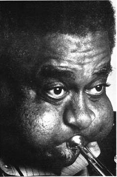
The effects of various catch lights are quite different. The bright and small light is pleasant, the larger light is soft, and the unlit eyes are like a deep pool. British photographer Gordon. Anderson pointed out that in order to take good portrait photography, you must consider the light in your eyes before pressing the shutter. Ask the subject to slightly raise their head or rearrange the light source to determine if there is a catch. The catch light should be balanced, so that there is no light in one eye and no light in the other eye. It is necessary to check whether the light source that produces the catch light is in a sufficient position in front of the subject’s face so that it can illuminate the eyes without being blocked by the shadow of the nose. If the head is turned to one side, it is best to turn the light source of the eyes with it. The position of the light source cannot be too high, otherwise, if the two eyes are not on the same horizontal line, one of the eyes may not be able to illuminate the catch light.
1000W-Soft-Panel-LED-Light


Categories
Studio Lights Education

Film Lighting Layout Process Ideas

Now the time has come to install the first light fixture, and it is also the time for the test. All eyes are looking at you. The electrician on the scene asks you the troublesome question: “Director, what do we need?”

That’s it. This is one of the most important and meaningful decisions of the day. At this time, you don’t even have time to sit at the simple service table and have a cup of coffee.

Placing the first luminaire is different from planning lighting. To know the reason, we must understand the lighting process: it refers to both the physical process and the process in the mind of the lighting personnel.

The process of lighting is like the process of building. Add a lamp or several lamps each time, observe, measure and evaluate the accumulated effect, and then make adjustments and add other lamps. Buildings can take many forms, and lamps can actually be brought to the set or roughly lined up at once, and then turned on for individual adjustments. Obviously, the schedule and budget have a lot to do with how to carry out this link.

This process is very dynamic, and the situations are almost different, but like many things in life, where you start and where you end are very much related.1000W-Soft-Panel-LED-Light

There are several basic ideas for arranging the first luminaire. You have the following options:

  1. According to the existing clues of the set: work lights, windows, doors, skylights, fires, etc. From a practical point of view, this means arranging the lighting for the scenery first. For example, when arranging the first light fixture, one of the most frequent choices is a beam of sunlight through the window, whether the beam of light comes from an HMI lamp, a 5K lamp, or the softness of a strong light reflected into the foam core. Light. This provides a lot of ambient light for the scene, which can immediately show the effect of this lighting and the things that need to be processed. This kind of light is usually used as the main light of the actor, at least for part of the scene.
  2. Arrange the main light of the actors first. This method is usually used when a scene is close-up, or when the scene mainly revolves around a certain actor, or when the setting provides few clues.
    1. Set the tone of the overall environment. It can be obtained with a strong light on top of silk, a pair of open-faced lamps directed towards the white ceiling, or other similar lighting techniques. This technique is clearly the starting point for the overall ambient lighting type. When using this type of lighting, you usually use this method to start lighting, because the basic exposure level is a reference and all other lamps must be balanced with this, so it is important to determine in advance for the progress of the work.

    At this point, we will assume that you have decided to start lighting according to the natural characteristics of the set. For example, we observed this simple room setting, in which a large window is the main element.

    In this way, you decide where to place the lamps. Now, you have to decide what lamps to place. At this time, there are two aspects to consider: the characteristics of the light and the amount of light. The decision on the amount of light is based on two considerations: the foot-candle level you want to achieve and your overall plan. This decision is the result of the following factors:
    1. The rated film speed of the emulsion you are using. Remember, you may not be able to set the film at the speed listed by the manufacturer.
    2. The t-stop aperture you want to obtain. This is determined by the maximum aperture of the lens (that is, whether the lens is slow zoom, normal focus, or fast focus) and the desired depth of field of the scene.
    3. The distance between the lamp and the subject, the soft and hard light effects you want to obtain, and the possible movement of the subject or the movement of the camera.
    4. Does the front of the lamp need a regulator? A large amount of diffusion will lose one aperture of light or even more, but the real culprit may be colored gels, especially dark gels, which can lose several apertures of light.

    Main lighting

    The main light should now be set. The necessary tasks are:

    1. Highlight the characteristics of actors. Make young female stars look more beautiful, make bad guys look more sinister, make products look shiny, etc.
    2. Highlight the atmosphere of the scene. For example, other parts of the scene may be dark, melancholic, vicious or even completely in shadow. If the role itself is insignificant, then it can be passed soon. But if this is a long dialogue scene with a key character, the director may not accept leaving the actor’s face in shadow for a long time. In this case, the main light must look dark and shaded, and at the same time, it must provide enough light to illuminate the face of the actor.
    3. Maintain continuity.
    4. Cover action.
    5. According to other parts of the scene, provide proper exposure and balance for the subject.
    6. Provide the right color balance for what you want to do.

    When deciding on the main light, there should be many questions in mind. Hard light or soft light? What level of foot candles are needed to balance the currently established scene? What kind of lighting is more suitable for facial structure? Does every actor need a main light, or can one main light be enough for all actors? Can one lamp cover the action? Or does a certain actor need several key lights?

Categories
Studio Lights Education

How to Shoot Portraits with “Rembrandt” Light

Night scene portrait photography

Generally speaking, it is more difficult to shoot night portraits. At night, the natural light is reduced to a minimum or disappears. The lighting of the characters depends entirely on artificial light. The color temperature of natural artificial light (street lights, window lights, shop lights) is more complicated, and the illumination is also difficult to meet the needs of reasonable exposure of portraits.
 

  1. Preliminary preparation for shooting night portraits

The first is the camera settings. In low light environments, the aperture priority exposure mode is generally selected. Under the premise that the aperture is opened to the maximum, the shutter can be improved by the sensitivity setting. In the night scene shooting, the sensitivity is recommended to be set to ISO400-800. If you encounter a dark light scene you like, you can increase it appropriately, but high sensitivity will also increase the noise of the photo and reduce the picture effect, so it is not recommended to set it above 2000. When the aperture and sensitivity are set, the main adjustment parameter is exposure compensation during the shooting process. By setting the increase or decrease according to different light conditions, to shoot works of different tones.

Generally beginners may think that shooting night scenes needs to increase the exposure compensation to get more details. In fact, more often, the exposure principle of white plus black minus should be followed. Since most of the night scenes are in a low-light environment with more dark parts, the camera’s metering system will automatically increase the exposure in order to ensure that the exposure is in the correct grayscale, so that the dark parts of the picture are too bright. In fact, at this time, the camera reduced the shutter speed, which greatly increased the possibility of shooting virtual. At the same time, the unique taste of night scene portraits was also lost. The feature of night portraits lies in the unique low-light effect of the night scene. The photographer should reasonably express this feature through exposure control, instead of brightening the dark parts according to the camera’s own judgment. The biggest test of shooting night portraits is the small amount of light, so small props that increase the amount of light such as external flashes, handheld LEDs, and outdoor lights are also indispensable.
  1. Make a light spot

The beautiful spot is the charm of night portraits, which creates gorgeous visual effects for night portraits. The basic technique is a large aperture + a longer focal length + shooting closer to the subject to create a blur effect.

One thing to note is that each spot in the photo is a single light source, not a huge light source can form countless spots, no matter how large a light source can only form one spot in the photo, the same, no matter how small A light source of is also a spot in the photo.

If you want to create a special shape of the spot effect. Use an opaque card or paper, cut out the desired shape on the top, and cover it in front of the lens.


  1. Scene selection and light control

In terms of shooting scene selection, it is necessary to find places that can make full use of ambient light, such as street lights, restaurants open at night, advertising lights, etc.When shooting, the model’s face can be rushed to the light source, so that the face is natural, Brightness higher than the environment, and then stand out from the darker environment.

The glass walls in urban buildings often have sufficient lighting, and will form a natural light and shadow transition on the ground, which is also an ideal scene. Bring the model closer to the glass window. The face can be softly illuminated. There are no strong shadows, and at the same time, bright light and night scenes, colored lights and solid-color glass walls can form a good contrast. You can also choose the window side of a big shopping mall to use the light source diffused from the window, which is equivalent to a huge soft box.


When using the fill light, avoid stiff light effect. It is best to have a small soft box or cover with a white soft cloth in front of the LED light, and it is best to use a soft light umbrella for the flashing light.
If the flashing light is too close to the subject, the light ratio will be too large, and the light will be hard. Highlight parts such as skin or light-colored clothes are easily overexposed. Therefore, we must choose the right distance, and adjust to the best by taking a few more test shots according to the environment.
If you don’t have a soft light umbrella or soft box, you can shoot the flash up to the sky and use the afterglow or reflection to fill in the light. If a scene is illuminated by multiple light sources, it is best to use the existing light as much as possible to reduce artificial lighting, otherwise it will be very messy if it is not handled well.
Moreover, while the position of artificial lighting is fixed, it also restricts the natural expression of the model in terms of angle and light ratio. Many random moments that express specific emotions and variable shooting angles will be forced to sacrifice due to relatively fixed lighting.

If shooting outdoor night scene portraits, it is best to choose when the sky is not completely dark. At this time, the sky in the background will not be dead black, and there will be a faint sky blue, but it will not reduce the unique low light of the night scene. effect. The overall picture will make people feel more layered.

Shooting portraits with “Rembrandt light”

  1. What is “Rembrandt”

Rembrandt is one of the greatest painters in the 17th century in Europe. His oil paintings often use precise triangular three-dimensional light to outline the contours of the characters, and hide the rest in the light and darkness, giving people a stable and solemn feeling. This technique is called “Rembrandt Rays”.

The concept of “Rembrandt light” extends to photography and becomes a special light technique for shooting portraits. When shooting, the shadow side of the subject’s face is facing the camera, and the light source is shining diagonally from above, covering about three-quarters of the face. The portraits taken in this way of light resemble Rembrandt’s portrait paintings. The essence of “Rembrandt light” is to use light to strengthen the main part of the painting, and use the dark part to weaken and ablate the secondary factors.

  1. How to shoot portraits with “Rembrandt light”

The Rembrandt-style lighting technique highlights the subtleties of each face, that is, the sides of the face are different. The light effect can also be adjusted arbitrarily with auxiliary light according to the wishes of the photographer.

Generally, the use of Rembrandt-style lighting requires two lamps to illuminate, and after improvement, a third lamp is added to adjust the contrast.

For specific shooting, first turn on the main light and adjust its angle so that the Rembrandt triangle light is cast on the dark side of the subject’s face. Then turn on the main soft light on the front, directly facing the bright side of the subject’s face, it can illuminate the subject’s face and increase the depth, and continue to try to make the subject turn the head until the Rembrandt triangle The light energy hit his cheek just right. Finally, add light or background light to adjust.

Categories
Studio Lights Education

How to Illuminate the Filming of Micro Movies

Let’s learn how to illuminate micro-films and small large-scale movies together.

Placing the first luminaire is different from planning lighting. We must understand the lighting process: it refers to both the physical process and the process in the mind of the lighting staff.

Lighting a set is never a clear mechanical process, although it may appear to be the case to the beholder. Lighting contains details, beauty, and a strong concept. It is not a simple matter of simply hanging a few pieces of lamps and turning them on. It is the result of a mixture of various factors, including physical aspects, actors, atmosphere and characteristics of a certain scene.

Each light fixture has its own role, each light fixture must be able to integrate into the entire lens, and each light fixture must be matched with other fixtures and plots. They work together in a sophisticated network and cannot be predicted with a single graph.

The process of lighting is like the process of building. Add a lamp or several lamps each time, observe, measure and evaluate the accumulated effect, and then make adjustments and add other lamps. Buildings can take many forms, and lamps can actually be brought to the set or roughly lined up at once, and then opened for individual adjustments. Obviously, the schedule and budget have a lot to do with how to carry out this link.

This process is a very dynamic process. Every situation is almost different, but like many things in life, where you start is very much related to where you end.

Arrange the first light fixture idea:

  1. According to the existing clues of the set: work lights, windows, doors, skylights, fires, etc. From a practical point of view, this means arranging the lighting for the scenery first. For example, when arranging the first light fixture, one of the most frequent choices is a beam of sunlight through the window, whether the beam of light comes from an HMI lamp, Tenner lamp, 5K lamp, or from a strong light reflected into the foam core. Soft light. This scene provides a lot of ambient light, which can immediately show the effect of this lighting and the things that need to be processed. This kind of light is often used as the main light of the actor at the same time, at least for part of the scene.
  2. First arrange the actor’s main light. This method is usually used when a scene is close-up, or when the scene mainly revolves around a certain actor, or when the set provides few clues.
  3. Set the tone of the overall environment. It can be obtained with a strong light on top of silk, a pair of open-faced lamps directed towards the white ceiling, or other similar lighting techniques. This technique is clearly the starting point for the overall ambient lighting type. When using this type of lighting, you usually use this method to start lighting, because the basic exposure level is a reference and all other lamps must be balanced with this, so it is important to determine in advance for the progress of the work.

At this point, we start to assume that you have decided to start lighting according to the natural characteristics of the set. For example, a large window in the room setting in the scene setting is the main element. In this way, you can decide where to put the lamps and what lamps to put.

At this time, two factors need to be considered: the characteristics of the light and the amount of light.

The amount of light is determined based on two considerations: the foot-candle level you want to achieve and your overall plan.

  1. The rated film speed of the emulsion you are using. Remember, you may not be able to set the film at the speed listed by the manufacturer.


  1. The t-stop aperture you want to obtain. This is determined by the maximum aperture of the lens (that is, whether the lens is slow zoom, normal focus, or fast focus) and the desired depth of field of the scene.


  1. The distance between the lamp and the subject (limited by the scenery), the soft/hard light effect you want to obtain, and the possible movement of the subject or the movement of the camera.


  1. Does the front of the luminaire need a regulator? A large amount of diffusion will lose one aperture of light or even more, but the real culprit may be colored gels, especially dark gels, which can lose several apertures of light.

step2: Window lighting:

Scene review: The set is a room in a certain residence. The camera left shots a window and a wood-burning stove, and the camera right shots a bed and some hanging clothes. The plot involves a woman sitting by the fire, a man coming in through the door, and several characters sitting on the bed.

Shooting time: late afternoon

Demand: a light with a harder light makes the actress look more beautiful

Camera settings: The sunlight from the left window of the camera will be the main light source of the scene. Most of the main lighting of the scene must either come from these windows or appear to come from these windows. At this time, the main limitation of the main light of this scene.

We can change the angle of the sunlight so that the sunlight will be projected at a right angle (parallel to the back wall of the set), or even at a more oblique angle, so that the beam can move towards the angle of the camera. But both methods have problems: first, the sunlight at a right angle becomes more like a side light rather than a main light; second, a more oblique angle becomes more like a backlight. Both methods are visually vivid, but they happen to not fit the intent of the scene. In addition, neither of these two angles can light the wall. You have to illuminate both the actors and the set. The light refracted by the wall is an important part, they will make the boring room come alive.

Other options: We are shooting a scene that is first established by a character early in the story. Is there a truly dramatic and climax scene in the later stage of the story, and for this need stronger and more intense lighting? If such a scene does exist, then it would be perfect to use progressive lighting to enhance the story clues Plan. The photographer needs to discuss with the director, but don’t forget to tell the script staff, because the script staff is responsible for coordinating the script in the time of day, weather conditions, and consistency. If, when shooting the later climax scenes, you find that they have just walked in from a scene at noon, then your whole idea will become worthless. Now, we should make sure that everything is seamless.

All questions point to: Bring the light in, as if the sun is on the left shoulder of the camera.

Question: The window is deep in the setting, in the corner. Sunlight coming in through this window will cover the fireside and door side well, but not the front half or the front half of the bed. Because there will be some performances in this area, and the camera is here, the performances here will be a lot of close-ups, and these close-ups require a lot of facial lighting.


Solution: Assume the existence of another window, just to the left of the camera. This will cover the main performance area and give us more flexibility in adjusting the light. Because it is daylight, a 10K lamp would be a suitable lamp. We will do some tricks to make the light falling on the actor’s face softer.


In this way, the first light we set up is a studio 10K light with a lot of diffusion through the frame. After installation and opening, we can check its effect. What matters is the effect of the light on the face of the actor, not how the light itself looks.

step3: The next logical step: bring in sunlight through the window

This had a great impact on the set, and began to define the space and establish the atmosphere. Because we get the total daylight effect in the future, this is a dramatic scene. Therefore: First, we want this light to be hotter than other lights in the scene, because from a psychological point of view, sunlight will be stronger than other light sources; second Fluorescent lamps are a strong focus, because the sun is a point source of light 93 million miles away. We should make the device as far back as possible, so that the shadows will be more clear and concentrated, the beam will not spread, and it will not look unnatural; in the end, it is unlikely that we will diffuse on it.

ledsfilm-2-in-1-studio-lights

The first window is a 10K lamp, so this method must also be the same. The luminaire must also be placed as far back as possible to provide as clear and concentrated shadow as possible. In this case, it does a good job because our 10K lamp is very close, it passes through a large diffusion layer, and therefore loses about one aperture of exposure. As a result, the balance between the two lamps is very appropriate.


Turn on the light, and the scene immediately has some vitality and depth, and it looks more convincing and realistic.


step4: add a second fixture

Purpose: Extend the sunlight to the corner

If you don’t have 5K, you can use a studio 2K light in a full-point state to complete it. This light should be as close to the wall as possible to reach the position we need, spraying a small amount of light on the scene, which can add depth and a sense of space sculpture to the scene. But this is not what Sunshine does. This is the effect you want to get with two independent light sources at different distances from the window.

Categories
Studio Lights Education

The Ideographic Features of the Language of TV Cameras

Some people compare TV works to visual articles, and montage is the grammar of visual language. As an ideographic method, lens language also has rules similar to language ideology in daily life. This rule is agreed upon by people based on a certain life logic and the logical way people understand things. Violating these rules, the audience will not be able to correctly understand the meaning expressed by the combination of shots.

once saw such an advertisement: a red sports car is running on a highway (panoramic view) amidst the sound of cheerful music, and a beautiful woman is driving a sports car (medium shot). The sports car suddenly stopped (close-up shot), the door opened, a pair of red leather shoes stepped on the road (close-up), and then the camera panned from the shoes to the whole body, the woman stood in front of the sports car with her head up, and the commentary sounded: “XX brand stockings “.

At first I thought it was a car advertisement, then I thought it was a leather shoe advertisement, but I didn’t expect it to be a stockings advertisement. Judging from the combination of the lens, there is nothing in it that is not smooth: the panoramic view is connected to the mid-range close-up view and then the close-up pan is connected to the panoramic view. But if you ignore the impact of the corresponding relationship on the visual expression, this kind of mechanical fluency, no matter how clever it is, will not allow the audience to correctly understand the meaning expressed by the lens combination.

Therefore, the lens language is a unique language structure form. This visual ideographic form composed of the lens structure has the following characteristics:

  1. Generally speaking, a single lens often does not have a complete narrative function, and the complete meaning is produced by the lens group after it is connected. One example has always been used as a classic example of montage. Former Soviet directors Kurišov and Pudovkin once combined a close-up of an actor’s face with no obvious expression with three different camera sets. The actor’s face was connected to a pot of soup on the table, and the actor seemed to be hungry. Grouped up with the woman lying in the coffin, showing a sad expression. Grouping up with a child playing with toys, the expression of envy and nostalgia is revealed.
  2. The sequence of shots also plays an important role in the expression of the meaning of visual language. The same shot and different assembly sequence convey different meanings.led-hard-&-soft-2-in-1-lights

For example: There are three pictures like this, A: the child’s happy smiling face, B: the child’s father pushes in, and C: the child’s fearful face. If the sequence of the pictures is from A to B to C, then what it means is that the child is afraid to see his father, and perhaps in the child’s memory, his father brought him some unpleasant things. If the sequence of the pictures is from C to B to A, it can be understood that the child is in a place he thinks is unsafe. After seeing his father, the fear is completely released, so he smiles happily. The sequence is actually a logical relationship. In order to express a certain meaning clearly, the shots must be sorted according to a certain causal relationship.

  1. The visual ideographic characteristics of lens language are also manifested in its processing of time and space. For example, in the TV series “Road Keeper in the Deep Mountains”, the train is moving, the passengers on the train are resting quietly, and the baby is sucking milk in the arms of the mother. There was heavy fog outside the car, and road maintainers were patrolling the line. The repeated splitting and combination of the car and the car reflects the noble spirit of the deep mountain road maintenance workers who have used their hard work in exchange for everyone’s happiness. Therefore, combining shots of different time and space components according to a unified logical relationship can form a whole meaning, which is a unique structure of montage.
  2. Through the alignment of the lens, it creates visual metaphors and symbols. Eisenstein once called it a rational montage, and used this method extensively to express content with ideal meaning.1000W-Soft-Panel-LED-Light

Visual metaphors are similar to textual metaphors, using the comparison of two images to enable people to construct a content with new meaning through psychological associations. For example, in Chaplin’s “Modern Times” on the silent TV, there is a scene where people are deeply impressed: in the previous scene, the door opens and the pigs are crowded out. In the next picture, the factory door opens and workers crowd out. These two isolated and seemingly irrelevant picture groups are connected together, and are connected with the overall theme of the film. They have a powerful metaphorical effect and deeply and vividly reveal the social status of the workers under the capitalist system. The situation is the same as that of livestock, thus expressing a powerful critique of the capitalist system.

These are the most basic characteristics of montage ideology. Use visual ideographic norms to organize and structure the shots—that is, to group the shots together according to a certain logical relationship and method, so that they become a whole of narrative, expressing emotions and elucidating thoughts to express certain Content meaning. This is the meaning of screen editing.

Categories
Studio Lights Education

A Brief Analysis of Film Subjective Dhots, Empty Shots, and Special Effects Shots

Movies have two kinds of objective shots and subjective shots. Any lens that represents the eyes of the director and narrates and expresses everything from the director’s perspective (in a neutral attitude) is collectively called an objective lens. Any lens that represents the eyes of the people in the play and directly witnesses and observes people and things, sceneries and objects in the great world, or that expresses the illusions, dreams, and emotions of the characters, is called a subjective lens.

  1. Subjective lens

It is a vocabulary peculiar to the movie. It is a film picture shot based on the sight and psychological feelings of a certain character in the movie. It makes “our eyes and the eyes of the people in the play become one, so the feelings of both parties also merge.” It’s one.” (Balaz “Film Aesthetics”)

The eyes of the people in the play The lens is used as the eyes of the people in the play, which is a common technique in the film. It allows the audience to appreciate their experiences, feelings and behaviors from the perspective of the people in the play. Make the audience and the people in the play become one.

The mental state or emotions of the characters, such as the revolving of the sky and the wobbly picture, to show the characters’ dizziness or serious injuries; the bizarre and chaotic images reflect the drunken eyes of the characters.

Character Psychology Use the subjective lens to show the character’s hallucinations, auditory hallucinations, and imagination to express the inner world of the characters.

The subjective and objective status of the lens is constantly changing. The subjective lens can only be interspersed and used well, which is the icing on the cake. If a film is subjective shots from beginning to end, it will be twice the result with half the effort and it will be counterproductive.

  1. Empty lens

Refers to a lens without people, people are used to call it a scene lens. The Soviet critic Famalin once said that “theatre cannot tolerate natural scenery. Movies must have natural scenery. Drama is performance. Movies are life.” (“World Movies”, 1982 No. 1)

The “natural scenery” mentioned here is the empty lens in the movie. It is often used as a metaphor, symbolism, lyricism, atmosphere, borrowing and writing about people, etc.

Empty shots can introduce the environment in which the entire story takes place, and are generally used at the beginning of the film.

Empty shots often touch the scene to give birth to emotion, the scene blends, and the scene conveys strong emotions. Metaphorical empty shots often directly vividly embody abstract concepts in visual images.

Empty shots often give the audience imagination, make the audience temporarily leave the narrative of the film’s plot, and allow the visual perception to focus on the emotional color of the event. “Rediscover yourself in the artwork according to your own beliefs, emotions and thoughts, and can Resonate with the object represented”.

  1. Special effects lens

This is the use of the technical performance of the movie camera (including the printing technology) to create a variety of realistic and unrealistic screen images. Special effects shots can create a certain emotional color, sentiment, atmosphere, and create specific psychological effects.

slow motion:

Slow motion was taken with a high-speed camera. The general lens has 24 frames per second, and the high speed can be 48 or 96 frames, but the projection speed is still 24 frames per second, so slow motion occurs. It is also called upgrading in photography. First of all, slow motion can create artistic conception, express poetry or philosophy. Secondly, slow motion can show the most impressive things in the character’s mind, and these things will have a huge impact on his life.

Quick shot:

Contrary to slow motion, the camera shoots at a frequency of less than 24 frames/sec. When it is projected at the normal frequency (24 frames/sec), it produces a visual effect that is faster than the actual process, which is the so-called “fast motion lens.” “. It is called degrading in photography. The characters in the fast camera move like robot-like hands and feet, often creating a funny screen effect. Fast-action shots can also cause sharp psychological effects.

led-hard-&-soft-2-in-1-lights

Close-ups in the movie

A close-up is a shot of the face of a person, a certain part of the human body, and a certain detail of an object in the movie. Close-up shots are a major development in the history of film art creation. They were first created and used by early American film director Griffith and others. Its appearance and use have enriched and enhanced the unique expressive power of film art, which has always been film aesthetics.

A portrait whose lower frame is above the shoulders of an adult or other parts of the subject is called a close-up shot. Close-up shots fill the frame, closer to the audience than close-up shots. The background is of secondary importance and even disappears.

Close-up shots can subtly express the facial expressions of characters. It has a special visual experience that is not common in life. It is mainly used to depict the inner activities of the characters, and the actor transmits the inner activities to the audience through the face.

Close-up shots of people or other objects can give the audience a strong impression. In feature films and TV dramas, close-ups of props often contain important theatrical elements. In a montage paragraph and sentence, the close-up has the meaning of emphasis and emphasis. For example, taking a middle shot of a teacher’s lecture, a glass of water on the table, such as taking a close-up, it means that it may not be ordinary water.

Categories
Studio Lights Education

The Charm of Subjective shots in Movies

“Three Looks” in the Movie

There are “three views” in the movie, which represent different viewpoints of photography. One is to see on behalf of the audience, which is called objective perspective; the other is to see on behalf of actors, which is called subjective perspective; the third is that the director reminds you to see, which is called the director’s perspective.

The most common one is of course the objective point of view of the audience! Because this kind of viewpoint is so common, it is often ignored. Let me analyze it with you.

The objective point of view (viewing on behalf of the audience) is based on the experience of watching theatrical performances. When we watch a play, the audience area is completely separated from the stage area. The audience sits under the stage with relish and “watches” the occurrence of the story within a certain distance. There is no subjective participation in the process of the story. The so-called objective point of view.

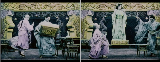
Leave an empty seat in the auditorium and set up a camera to take pictures of the theater performances on stage. This was how early feature films did it. At this time, the camera’s point of view is exactly the same as that of the audience. The drama story is recorded on the film in a way of watching, as shown in the picture below “Magic Bricks”.

This movie is very funny. Several foreigners pretend to be citizens of the Qing Dynasty and perform magic tricks. At first, a buddy holding a box suddenly turned into a man with braids and jumping around. Then he split a pile of bricks and changed. Here comes a foreign beauty in a Tang suit.

In this film, the camera is fixed at the position where the panorama is taken and the shot is taken to the end, which is a bit dull. All, later, gradually developed a scene change of far, full, medium and near, but the logic behind it is unchanged. The change of scene only represents the change of the observation distance. The camera is still in the audience position. After all, there is no breakthrough. And the “invisible wall” between the stage.

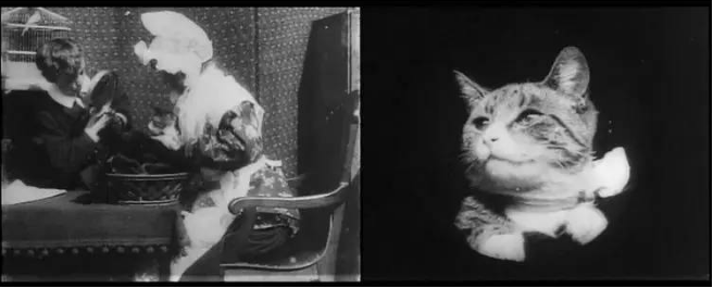
When the camera is no longer satisfied to stay in the audience and jump on the stage willfully, subjective shots are produced. Once the camera runs on the stage, it means abandoning the audience’s viewpoint, and it means that the actors are watching! I have a habit of textual research, let me give you the earliest example.

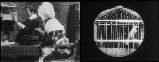
The movie “Grandma`s Reading Glass” is the earliest subjective lens attempt. A little boy curiously picked up his grandmother’s magnifying glass and looked around through the lens. The first subjective lens in movie history appeared miraculously! The director must be excited about the special performance perspective he has discovered. From the boy’s perspective, he shoots several sets of subjective shots in one go. Newspapers, clocks, bird cages, grandmother’s eyes, and cute cats are presented to the audience one after another.

Observing these subjective shots carefully, the little boy saw through the magnifying glass without any distortion, haha! This can be regarded as a flaw in the gangbang. It may be that the director is obsessed with the newly invented technique, so he is too excited and forgets to deal with it.

The audience’s point of view and the actor’s point of view are there, let’s talk about the director’s point of view, let’s make a fictional scene to illustrate. A group of people walked into the conference room (viewpoint of the audience), the actor sat down and looked out the window, and saw a man with a peaked cap riding a bicycle passing by (viewpoint of the actor), behind the actor’s seat, an old handbag ticked slightly sound. There is a time bomb in the bag!

At this time, everyone present, including the male protagonist, had no idea that the danger was about to happen, and the audience had no idea before the performance of this camera. So, whose point of view does the shot of this bag represent?

Obviously, this shot represents the point of view of the director, or the point of view of the storyteller. Its purpose is to remind the audience of the imminent danger, which makes people feel nervous. The director was cruel and didn’t remind the characters in the story, leaving them unaware and defenseless.

Why is the subjective lens the most important?

I talked about the three types of viewpoints in the movie. The audience’s viewpoint is very common. Usually, most of the shots of a film are shot with this viewpoint; the director’s viewpoint is generally used as a tool for the storyteller to remind the audience to pay attention to these two viewpoints. It’s good to know what’s going on. What deserves our focus is the subjective point of view, also known as the subjective lens, for three reasons:

  1. Only important roles are worthy of subjective shots (use your brain and experience).
  2. Subjective shots may only be used in important scenes (not necessarily subjective shots, but once used, they must be key plots or important scenes).
  3. Subjective shots are closely related to the emotions of the characters.

Explain the third point, why shoot subjective shots? Is it just to show what the actors saw? No, the real meaning of subjective shots is to portray the emotions and feelings of the character at the moment by showing what the character sees.

For example, there is a scene in the movie “Looking for a Gun”. After a series of attacks such as the loss of a pistol and the shooting of his former girlfriend, the policeman Ma Shan decided to venture to the train station to lure the gangster to the bait. Before leaving home, the director designed a subjective lens to portray his emotions.

First, Ma Shan was “watching”. In the close-up, he looked tired and looked around the empty room reluctantly. Then came the subjective shot taken from Ma Shan’s point of view. The room was dimly lit and empty, and the furnishings were very simple. Outside the painting were the voices of his wife and son quarreling in the past. The voice that had upset Ma Shan at the moment seemed particularly warm.

From this short subjective scene, the audience read Ma Shan’s complex emotions, heavy pressure, nostalgia for the family and guilt, which accompanied him to the end of death, which seemed particularly sad.

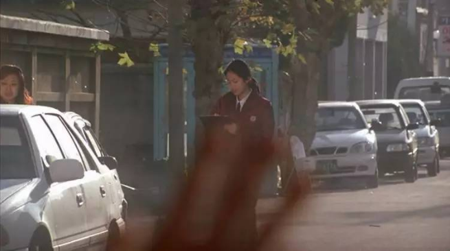
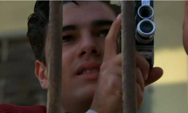
The Korean film “August Photo Gallery” is the first Korean film to be introduced to Hollywood. This film is far less popular than the later popular Korean films such as “Savage Girlfriend”, but the story is still fresh and moving. The protagonist of the story is a photographer who opened a photo studio. Unfortunately, he was terminally ill and knew that he would soon die. In the last part of his life, he fell in love with a beautiful female traffic policeman.

In this scene, the protagonist left the heroine with extreme grief. After a while, in a street bar, he happened to see his beloved girl. This is the most colorful and tear-jerking passage of the movie.

In the subjective lens, soft and sad music sounded, and the actor’s hand was separated from the glass, gently stroking the female traffic police in the distance, until she finished recording the illegal license plate and left with a bright smile. Transparent glass is like an invisible obstacle that cannot be broken through. The lover can see it clearly in the eyes of the lover! The lover is separated by glass, the boundary cannot be crossed! It’s heartbreaking. (See picture above)

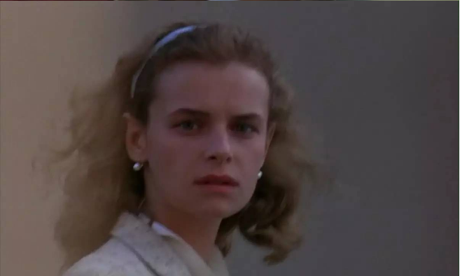
To give an example from “Paradise Cinema” at the end, the protagonist Duoduo first met the first lover who influenced his life. This is an extremely important scene in the film and the heroine’s first appearance.

Since it is the first appearance of an important person, of course it must be carefully designed. The director’s plan was to let Duoduo (later a pivotal director) practice photography with a camera. During the shooting, through the lens, he happened to see a beautiful girl.

Look at the fascinating woman who calmly drifts past the camera, and then look at the stare and grin of the male protagonist. The young first love is destined to begin!

In the movie, they fell in love vigorously. Later, due to the disparity between the poor boy and the rich business family, the lovers were forced to break up and left their hometown with a lot of hatred. Later, he became a world-renowned director.

In his later years, Duoduo returned to his hometown after he became famous. Through the dusty film, he once again saw the moving appearance of his first love girlfriend…

This film not only praises love, but also praises the power of images! It is a movie that freezes the beautiful love that has long been turned into ashes, and also freezes the beautiful youth that has never returned.

Categories
Studio Lights Education

The Aspect Ratio of the Screen Frame

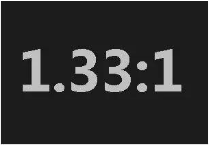
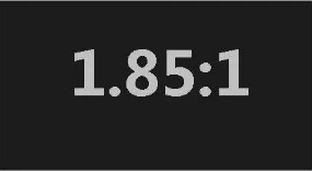
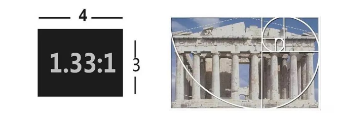
1.33:1, 1.85:1 and 2.35:1, these are the three most mainstream frame ratios in film history. 1.33:1 is the earliest established screen aspect ratio, known as the “standard screen”, the latter two are evolved from it.

1.85:1 is the widescreen standard established by the American Academy of Motion Picture Arts and Sciences, called “academic widescreen”, and mainstream literary and artistic films basically use this frame ratio.

2.35:1 is the frame standard for Hollywood blockbusters. It is shot by an anamorphic lens and is called an anamorphic screen, which has the highest aspect ratio.

The origin of the standard screen

You may ask, why is 1.33:1 established as the standard screen for movies? This matter has something to do with Edison.

That’s right, it was Edison, the king of invention. He invented and applied for an invention patent for perforated film. Before mass-produced and launched on the market, the aspect ratio of the frame must be determined. This small problem has caused turmoil. debate.

Everyone put forward all kinds of suggestions, such as squares, rectangles, and even rounds (which are technically difficult to achieve). Speaking of rectangles alone, some people suggested that it should be a vertical rectangle, and the height of the picture should be greater than the width, and they gave seemingly sufficient reasons.

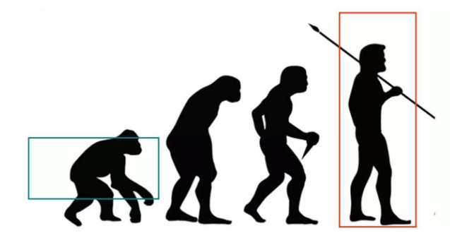
The reason is quite interesting: humans have evolved from reptiles to walking upright, and the state of walking upright is closer to the vertical rectangle. The photography is mainly human, of course the vertical ratio is more appropriate!

Don’t be fooled by this argument. It seems reasonable, but it’s nonsense. Because it does not take into account the visual field of the human eye at all.

The field of view of human eyes is equivalent to the horizontal crossing of two circles. If simplified as a rectangle, it is obviously horizontal rather than vertical. From the perspective of viewing, a horizontal rectangle is definitely more appropriate for a movie frame.

Edison also preferred the aspect ratio of the banner, but he had no idea about the specific ratio. Finally, he thought of the golden ratio principle in painting and set the film aspect ratio to 4:3, which is 1.33:1.

The golden ratio in the painting is like this on the right, not as simple as applying numbers directly. But in any case, the 4:3 frame ratio is so determined. Although it is made by the engineering male Edison, it cannot be said that it has nothing to do with art (the golden section).

Although the visual experience of this picture frame ratio is not very good, it has been used as an industry standard. After the birth of the TV, in order to facilitate the movie on the TV screen, the 4:3 frame ratio was also used.

“Metamorphosis” adapted to the TV screen

TV screens have always been an important channel for movie broadcasts. The two are both in the 4:3 era. Everything is so harmonious. When the movie becomes a wide screen, the 4:3 TV screen is a bit overwhelming, and you must continue to play it. Movies, you have to think about something.

The first method is to directly broadcast the widescreen movie on the TV. This is the most convenient, but there are black borders on the top and bottom, which wastes the display range of the TV screen, which is a pity. And the picture becomes very small and it looks uncomfortable.

The second method is to crop the widescreen movie to a 4:3 ratio so that it can be played on a full screen.

In fact, many films do this. In order to prevent the important information from being missed after cutting and affecting the audience’s understanding, the cutting problem of TV broadcasting must be considered when making a movie, and the drama elements must be arranged in the box of TV cutting as much as possible. The technical term is “TV Security Range”.

The filming should consider the composition of the two frame ratios of film and television, which makes the photographer too hard to toss.

The third method is the most weird, it directly transforms the wide screen picture into 4:3 projection.

In the 1990s, many TV stations broadcast movies in this way. The picture frame was squashed horizontally, and the result was that the fat man in the movie became thinner, and the thin man became a matchstick, which made the audience think that people look like this.

Nowadays, TV screens have popularized wide screens, and they are basically no longer bothered by the above-mentioned problems.

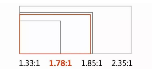
By the way, the current standard for high-definition TV is 1920*1080, and the calculated aspect ratio is about 1.78:1, which is between the college wide screen and the anamorphic wide screen. As shown in the figure:

Of course, it was a rather compromised result. The purpose was to take into account the needs of two wide-screen movies on the TV screen, and to consider a large number of news programs shot in 4:3 format.

Which frame ratio is the most popular?

There is no doubt that the 4:3 frame is too narrow, it cannot fill the field of vision of our eyes. Watching a 4:3 movie will give people a feeling of peeping through the window, which weakens the appeal of the picture.

All kinds of screens we come into contact with in our lives have gradually become widescreens, such as movies, TVs, computers, mobile phones, etc. Because most viewers do not like 4:3, it does give people an impression of being behind the times.

By the way, the 4:3 format is close to the monocular field of vision. If you open an old movie, close one eye, and look at it with the other eye, the field of vision will be much more comfortable, at least the field of view is basically filled, but would you like to finish watching a movie like this?

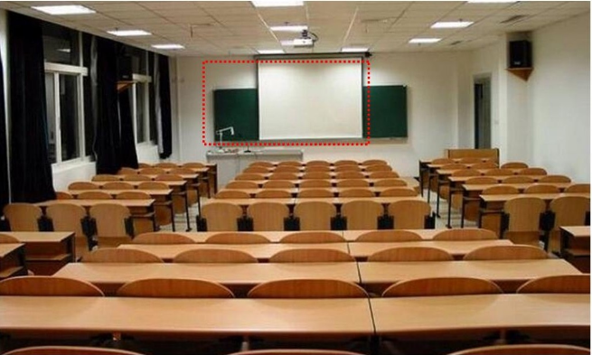
Let’s talk about it again, the multimedia screens in the classroom basically still use the ratio of 4:3. I applaud this “backward” design because it is not easy for students to immerse themselves in the screen, allowing students to switch their attention at any time. On the nagging teacher on the side.

1.85:1 is the closest human vision to the binoculars. It is the most plain and natural frame ratio. It is best at expressing the relationship between characters and the environment. It is the favorite frame of literary films.

2.35:1 It has a wider field of vision than the human eye, giving people a feeling of extreme openness, beyond the experience of daily life. Hollywood blockbusters love this ratio the most. They like to create spectacles on the screen, create shocking magnificent scenes, and create daydreams that you can’t see in life. This is undoubtedly the most suitable ratio.

The influence of frame ratio on photography

1.33:1

The picture is mainly human figures. When shooting close-ups, medium and close shots, the picture appears full and natural, but the performance of the environmental space tends to appear cramped.

If the film focuses on characters and shows the relationship between the characters, and there is no need to highlight the environmental modeling elements, 4:3 is actually a good frame ratio. You can try the 4:3 format when you are shooting student homework, which can also save a lot of art work.


1.85:1

It can combine the characters and the environment in a more harmonious way. While expressing the characters, it can also present the relationship between the person and the environment more comfortably, and it is a more natural and intimate relationship, which is similar to what we see in life.


2.35:1

First of all, the magnificent environment is easy to do.

However, shooting small scenes is a bit at a loss. For example, to take close-up shots of people, a 1.33:1 frame is actually the most suitable. At 1.85:1, there is a bit of extra environment. The 2.35:1 frame is directly empty, and there is a suspicion of wasting film.

It’s not that the 2.35:1 frame will not be able to take close-ups comfortably. It is still feasible to find ways to use the extra frame, such as adding some props or actions. In short, it will take a little effort, otherwise the frame will be quite thin.

The more common double medium shot is very suitable to be placed in a 1.85:1 frame, and how comfortable it looks.

But in the 2.35:1 frame, there is a problem. Either let the actors be far away, like shouting in the air, or grab more actors and props to fill in the blanks, and the composition will become more complicated.

Categories
Studio Lights Education

A Performance Bound by Light

Since the 1930s, the film industry has flourished in the United States, and star actors have become the most important assets of film companies. The core of the film lighting work is to use all means to make the actors beautiful. This situation continued until the 1960s.

In order to make the actor look refreshed on the screen, no matter what scene is shot, the first thing to consider is to make the actor’s face exposed correctly, not caring about the brightness balance between the character and the environment, as in the example above.

First look at the beauty, ah, sitting at the golden section on the right side of the frame, her face is delicate and ruddy, not bad! Looking at the scenery outside the window again, I found the problem, the actress’s face is actually brighter than the sky outside the window.

Is it reasonable? This was a problem that didn’t need to be considered at the time. As long as you were on the same scene with the star actors, the sky would be dark, and the sun would go dark!

This kind of willful notion dominated the film industry for a long time. The movie screen stage is like a reappearance of theatrical stage. For the glory of the actors, all backgrounds must be humbled and dimmed.

Okay, the actors are beautiful, what’s the atmosphere of the scene? Please see the picture below:

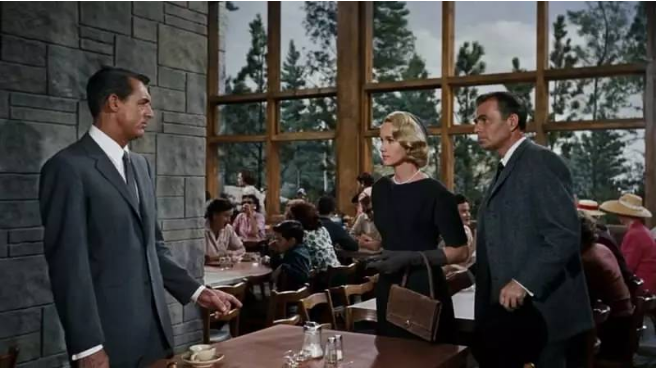
This scene comes from the thriller “North by Northwest”. In this scene, the protagonist (left) in crisis meets with a spy, and the atmosphere is quite tense.

In order to fully expose the characters, the scene was beaten up and down. The color film in the 1950s is only about iso25. It is conceivable how much light is needed to shoot this scene.

The bright scenes dilute the thrilling drama atmosphere and make the picture dull. From today’s perspective, this lighting design is really thankless!

Look at the above picture again, the three protagonists are surrounded by light, and the main light, secondary light, and contour light are all available, completely separated from the environment.

In the movie lighting at that time, modeling light was abused uncontrollably. Normally, celebrities enjoy this kind of treatment. Who doesn’t want to look more beautiful? But in order to be beautiful, a corresponding price must be paid.

In order to obtain the “perfect” light effect, after the lighting is set, you can only perform in the designated position and cannot move freely. In the close-up shots, you can’t even twist your head casually, completely becoming a captive of the light.

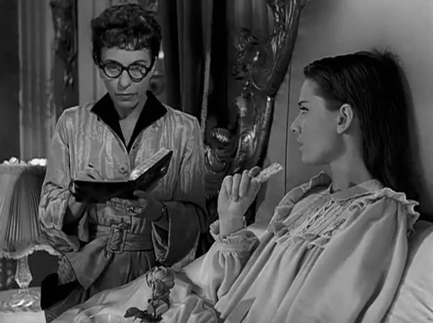
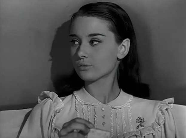
For example, in the movie “Roman Holiday”, the little princess prepares to go to bed.

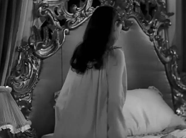
Action! The little princess is ready to go to bed.

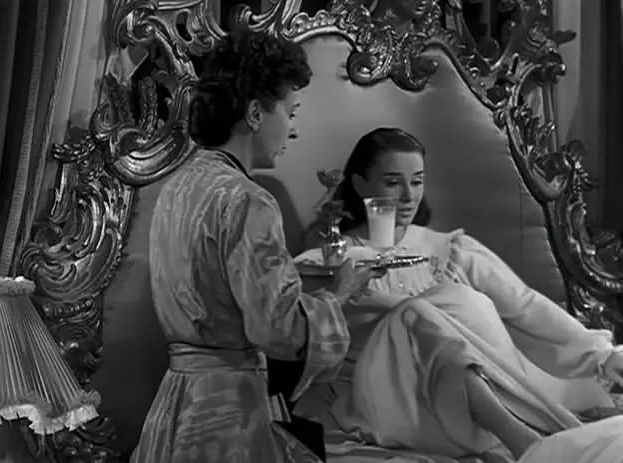
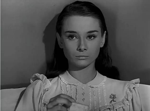
The princess sat down, and the modeling light was waiting here. The main light of the character’s face was meticulously illuminated at 45 degrees, and the shadow contrast was carefully controlled. What’s even more surprising is that in such a small space, the contour light is also painstakingly applied (look at the bright spots on Hepburn’s hair) for the sake of beauty, it is really well-intentioned.

Then there is a close-up of Hepburn’s front, with a beautiful face and perfect lighting.

The princess started to talk to the maid, and while talking, she turned her head unexpectedly. Seeing that the side-light effect is about to appear, is this okay?

The camera switched immediately, saving Hepburn’s perfect image.

I don’t know what Hepburn said about the performance of this scene. Anyway, I feel that the acting is strangely stiff, restricted in position and restricted in movement, and there is no room for full play. But having said that, the audience watched this film just to see their faces. Who cares about the performance itself?

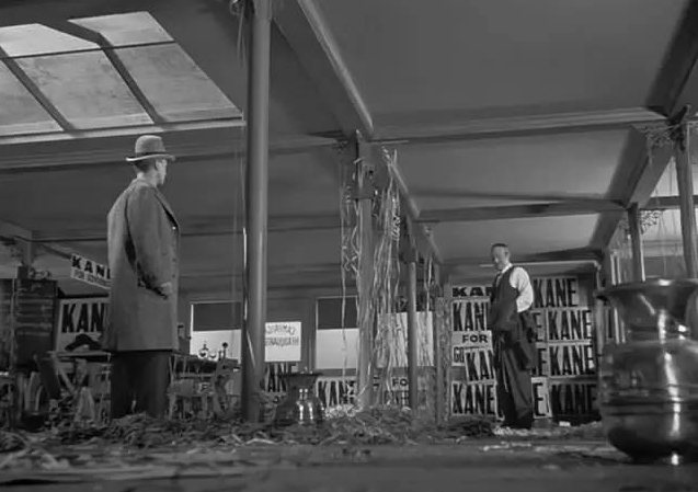
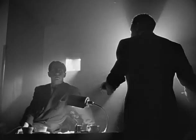
In that era, there were also great people who dared to challenge stereotypes, such as Orson Wells, the director of “Citizen Kane”.

Orson Wells was a radio drama director. “Citizen Kane” was his first film work. Due to his lack of experience in the film industry, his understanding of cinematography got rid of the barriers of the times, making this work unique The visual style is very avant-garde and refreshing.

The scene in the above picture will never appear in the previous Hollywood movies, because indoor low-angle photography will inevitably shoot the ceiling, while in the previous Hollywood movies, the ceiling is the position of the hidden lights and it is forbidden to appear in the lens. .

Wells didn’t care so much, in order to get the shape of the character in the upward shot, so he shot. The lighting uses foot lighting, which is another bold move to destroy the stereotypes. Regardless of his character modeling light, everything depends on obeying the atmosphere of the scene.

Looking at this scene again, the character is in front of the window, his face is completely black, destroying the dogma that brightens the actors and suppresses the environment, and is full of provocation.

This scene coincides with the lighting design of some of today’s literary films, that is, the ambient light is the leading factor, and the actors’ light effects are no longer considered separately. Actors perform in real scene light. It doesn’t matter if it is bright or dark.

The problem is that the audience at the time was used to the handsome men and women surrounded by modeling lights. The avant-garde lighting design of this movie did not suit the audience’s taste, which led to a fiasco at the box office. People only realized its outstanding value several years later.

Of course, the development of the concept of film lighting does not completely rely on the exploration of certain geniuses, more often it is the result of technological progress.

Categories
Studio Lights Education

Lighting Design Under Arc Lamp

The electric light invented by Edison in 1879 is a tungsten filament incandescent lamp, which emits a lot of red light. Early film is sensitive to blue and green light, but not to red light. Even if the scene is illuminated with an incandescent lamp, the film looks It’s dark and completely useless.

In 1912, the American Biography Film Company invented the carbon arc lamp, which improved the problem of insensitivity to red light. Moreover, this kind of lamp has high brightness, more than 3 times brighter than incandescent lamp under the same energy consumption, and has become a popular popular movie lamp.

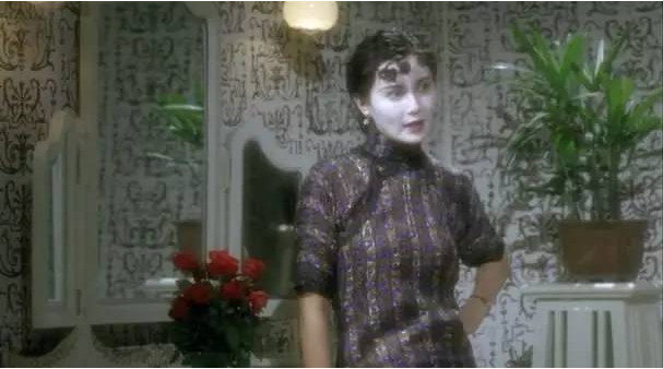
The Hong Kong film “Ruan Lingyu” truly reproduces the filming scene of the silent film period. The huge lamp in the picture is an arc lamp, which emits bright light and huge heat at the same time.

The studio where the crew is located is open, surrounded by transparent glass, natural light and artificial light provide mixed lighting for the scene. This kind of studio has been popular for a while.

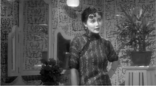
Early arc lamps did not completely eradicate the problem of insensitivity to red light, and the film at that time only had a modest ISO5 with a maximum aperture of about 4.5. The arc light was sometimes too difficult to use as a lighting fixture. In order to ensure that the characters were fully exposed, they would usually The actor’s face is painted white with powder, and then painted with blue-green, which is weird. Take a look at the heroine’s face in the picture below:

If the wall is white, the American Union paints it pink to prevent overexposure. Haha, it can be considered a reasonable use of the characteristics of the early film.

In order to present a perfect black and white image effect, the crew also worked hard. The black-and-white images the audience sees are probably like this, um, pretty beautiful!

The light emitted by the arc lamp has a strong sense of direction, which creates convenient conditions for light modeling

  1. The main body and the background are separated by the light ratio.

Under natural lighting, people and the environment rely on daylight lighting with the same brightness, and there is no condition for a light ratio between the subject and the background. After the introduction of artificial light sources, the light ratio between the subject and the background can be controlled by means of regional lighting, and the subject can be emphasized from the environment, making the picture more layered.

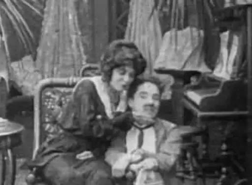
The above picture is from an interior scene in Chaplin’s early short films. Like many films at that time, the light was only used to illuminate the scene, and the brightness of the characters and the background were the same. The messy background in the picture weakened the audience’s attention.

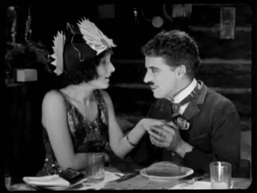
When the photographer consciously controlled the ratio of the subject to the background light, the situation improved immediately. In “Gold Rush” in 1925, Chaplin showed love to the girl in the cabin. The audience’s attention is undoubtedly focused on the actors. By controlling the light ratio between the subject and the background, the subject of the picture is more prominent, and the effect is immediate.

  1. The three-point lighting method has become the mainstream modeling method.

Suppressing the background and highlighting the main body is just the beginning. The real charm of arc lights is the “three-point lighting method”, that is, lighting the actors from three positions to form a lighting design of main light, auxiliary light, and contour light. It is more glamorous on the screen and more attractive than in reality.

A large number of stars were born on the screen and became the guarantee of the movie box office. The “three-point lighting method” born in the arc lamp era, through careful control of the main and auxiliary light ratios, plus the beautiful contour light behind him, the effect is indeed not bad.

Even on the way to escape, it is the night in the wilderness, as long as the star is there, the contour light must not be absent. How can you not be handsome?

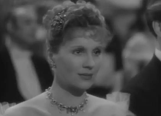
Looking at the close-up of the actress’s face below, it seems to be covered with a layer of veil, and the picture cannot find the focus. This is the iconic soft focus lens effect of the arc lamp era.

The light from the arc lamp is very hard and rough, and the actress will have a bad skin texture in close-ups. As a result, a soft focus lens came into being. By blurring the focus, the rough mark under the arc lamp was smoothed out, and the actress’s face appeared tender and tender.

The soft focus lens is equivalent to the blunt feel of the PS arc lamp through optical means. However, this method itself will produce a “stiff” feeling. With the progress of lighting fixtures, the soft focus lens has long been abandoned. If you like this kind of arc light The unique beauty of the light age can only be seen in old movies.

  1. Light began to be used to create the tone atmosphere of the picture.

The picture is no longer limited to the pursuit of correct exposure, but is moving towards a reasonable reproduction of the dramatic atmosphere. Cinematographers began to realize the charm of shadows, and charming low-key lighting effects began to appear.

When shooting the crime film “Sunrise”, Onyx was the first to try a low-key lighting design, creating a thrilling and dramatic lighting effect on the screen through a large area of shadow, which was highly praised. Subsequently, low-key lighting design was widely used in crime films, thrillers and western-themed films.

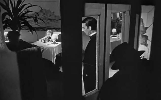
In addition to creating a high-key and low-key atmosphere, the concept of the light zone of the picture was established. The same scene was not satisfied with the simple design of the subject with a bright background and a dark background. Instead, it began to be designed as a light zone with alternating light and dark.

In the above picture, the light cuts the picture into three different performance areas. In the shadow of the foreground of the picture, the man on the phone, the man in dark clothes standing in the middle, and the woman sitting at the table.

The movements and expressions of the three are different, and the brightness of the light on each body is also different. The brightest light is on the woman. She lifts her cheeks in contemplation, and the flower pot in front of her is in a large area of shadow, blocking her vision, and it seems very depressing. .

The lighting design of this scene is exquisite enough, I am afraid that many movies are not as good as it is now. In the field of film lighting, must today’s mainstream cinematographers surpass their predecessors? I don’t think so!