Table of Contents
How to Use the Golden Ratio in Composition
An excellent photographic work should not only have a profound theme and content, but also have a beautiful form and harmonious composition consistent with the content. Beginner photography, understand and master the golden ratio when framing. It is very helpful for improving the aesthetic value of the work.
What is the golden section
The golden section method is to divide a straight line into two parts, and the ratio of one part to the whole is equal to the ratio of the other part to this part. The ratio of approximate values such as 2:3, 3:5 or 5:8 is commonly used.
Introducing art design and photographic composition, this ratio is also known as the golden rule. In the photographic composition, the general method often used is to draw two horizontal and vertical lines on the screen that are parallel to the sides and equally divided, and divide the screen into 9 equal squares, which is called the Nine Palaces Diagram. The 4 points where the straight line and the horizontal line meet are called the golden ratio point.
According to experience, arranging the main scene near the golden section point can better play the organizational role of the main scene on the drawing. It is conducive to the coordination and connection of the surrounding scenery, which is easy to cause a sense of beauty, produces a better visual effect, and makes the subject scenery more vivid and prominent.
In addition, people have a habit of looking at pictures and books, that is, they move from left to right, and their eyes often fall to the right. Therefore, when composing the picture, place the main scene and the eye-catching image on the right side, which can achieve better results.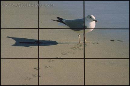
How to use the golden section method
If you are a beginner in photography, you can choose the “golden section” practice composition. After many times of practice, after you have your own experience and experience, you can create your own creations according to the actual situation.
If they are all the same, it is not advisable to copy this form. After a long time, it will constrain one’s creative thinking, so that the photos taken are stable and lacking in changes. Bland and boring, there is no art.
Using the golden section to determine the position of the subject does not complete the entire process of composition. Attention should also be paid to arranging the necessary space, considering the echo between the subject and the companion, and fully expressing the ideological content of the theme. At the same time, also consider the tone, light processing, color performance and so on.
In order to improve the basic skills, there is a very important point, that is, to earnestly study the knowledge of aesthetics and strengthen the aesthetic cultivation. And through shooting practice, constantly sum up, accumulate experience, and take more photos with a higher artistic level.
How to perform partial occlusion when shooting night scenes
When shooting night scenes, we often encounter such a situation: in the pictures to be shot, some places are brightly lit, and some places are dimly lit. Or the lights are few and bright, and the scene is large and dark. In the case of the above situation, measures can be taken to take photos with moderate contrast and good levels of light and dark parts. For example, using partial occlusion to control exposure to reduce the exposure of bright parts and increase the exposure of dark parts.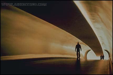
Occlusion shooting method
The so-called occlusion shooting method is to cover a certain part of the picture (usually the bright part) with hands or other objects purposefully during the long exposure process, reduce its exposure, and make the remaining dark parts more visible. full exposure. Just like partial occlusion when zooming in on a photo, in order to achieve the desired effect.
When blocking, it must be constantly shaken depending on the light conditions, and must not block a certain part fixedly, so as to avoid the phenomenon of excessive or insufficient uniformity of the film.
Partial occlusion shooting
When performing partial occlusion shooting, corresponding shooting methods should also be adopted according to different types of cameras. For dual-lens reflex cameras, although you can directly see the blocking part in the viewfinder of the frosted glass, because it is an upper and lower lens, if the left and right are blocked, a longer blocking tool can be used to block the top and bottom vertically.
Then the blocked part observed in the viewfinder is also the blocked part of the lens. If it is occluded up and down, it can only be occluded according to your own estimation.
With a single-lens reflex camera, although the blocking position can be observed in the viewfinder when framing, but after pressing the shutter, the scene cannot be observed from the viewfinder. Therefore, the camera should be fixed before pressing the shutter, and the blocking position should be pre-determined.
Other types of cameras can only be occluded according to the angle and position of the part to be occluded entering the lens. These are not easy to master accurately, you can practice several times before shooting.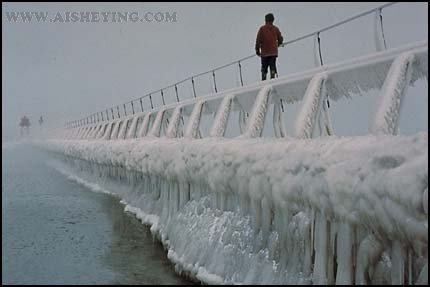
How to use diagonal composition
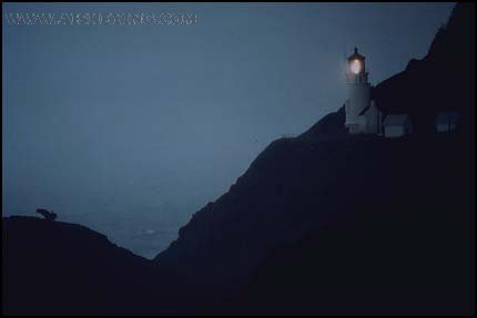
A horizontal, vertical or square screen has four corners. If the main body of the picture and the important companions are placed in two diagonally opposite corners, or if the main body of the picture itself occupies two diagonally opposite corners of the picture, this is a diagonal composition.
It has the characteristics of harmonious correspondence, lively and vivid, and natural beauty. It is a manifestation of changes in the unity of the composition of the picture, and unity in the changes. This composition is suitable for a variety of shooting content. It can make the layout flexible, easy to master, and achieve better results.
How to use:
- The screen is divided according to the word “#”, and the dividing line generates 4 intersection points. At the same time, the screen is divided into 9 small blocks with the same proportion, so that the main body and important companions of the screen are respectively deployed in the upper left and lower right, or the upper right and lower left. Corner points or even diagonal blocks.
- The subject and the companion of the picture in the diagonal positions can be intrinsically connected (for example, a person looks up at a picture). It can also be unrelated to each other (for example, a lazy cat is napping in the lower left corner of the screen, and a pot of spider plants is in the upper right corner).
But the opposite of the main body must be an important and eye-catching companion. If the accompaniment diagonal to the subject is not obvious and vivid, but the accompaniment diagonal to the subject is clear and eye-catching, it cannot be a diagonal composition.
- Under normal circumstances, the main body and the accompaniment of the diagonal must maintain a directional or visual effect that echoes each other. When the subject of the picture itself forms a diagonal composition layout, there must be appropriate space in front of the movement, inclination, and trend.
How to use symmetrical composition
The layout structure of photographic composition mainly includes two series: symmetrical and asymmetrical. The so-called symmetrical composition means that the content of the shot is equal or roughly equal on both sides of the vertical line in the center of the screen or on the horizontal line in the center of the screen. The picture thus has the characteristics of balanced layout, regular structure, beautiful pattern and interestingness.
Examples of the use of this form of composition are as follows:
- In real life and the surrounding environment, there are many scenes, objects that are often equal on left and right . Such as weightlifters lifting weights, swimmers’ butterfly strokes, etc.. Shoot from the center of the left and right angles to form a left-right symmetry screen layout.
- The swan floating on the calm lake, the girl lying on the glass plate of the table contemplating, the athlete performing rhythmic gymnastics on the bright terrazzo floor. Because of the reflection of the glossy surface, the subject will have a clear reflection . Taking the image of the entity together with the reflection becomes a symmetrical layout with equal upper and lower.
- Symmetrical composition should not be mechanically equivalent, but must be vivid. There are changes in the equivalence, or it contains interesting, decorative, otherwise it will be bland and boring.
- The left and right are equal and the bottom is equal. Although there is a symmetrical effect in the form of a pattern, it is generally not desirable. For example, if you shoot a swan head-on, the left and right are equal. If you add a reflection, it becomes a “cross” shape, which will not be aesthetically pleasing, but only rigid.
How to highlight the subject
People, crowds or scenery can work as the subject of the photo frame. The subject is the center of the content and structure of the picture. The main object used to express the content on the picture. And the object that the photographer is most interested in and attracts him to raise the camera.
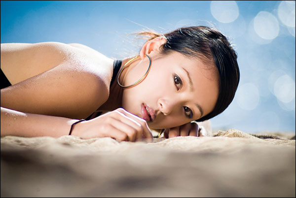
Therefore, we must use all feasible means to highlight the subject when photographing composition.
Generally, there are several ways to highlight the subject:
1. Close-up
Use the close-up form to shoot the subject at a suitable position slightly closer to the lens. So that the size ratio of the subject is larger than that of the surrounding scene. It occupies a larger area of the frame. So that it highlights the subject from the contrast of the body size.
2. The change between the virtual and the real
Use the change of virtual and real. That is, use the change of the aperture to change the depth of field. So that the subject is clear, and the accompanying body or the background is blur. When the surrounding scenery is blur, the clear image will stand out and catch the eye.
3. Line guidance
Use the guiding role of lines to highlight the subject. The convergence point or intersection point of the lines of the picture is generally the focus point of people’s eyes. When we manage the subject in this position, the viewer’s eyes can fall on the subject automatically.
4. Contrast of light and dark
Use light and dark contrast to highlight the subject. In the use of light, the main light is bright, and the accompanying body is dim. So that we can achieve the purpose of brightening with darkness.
5. Color contrast
Use color contrast to accentuate the subject. For example, red flowers will stand out against the backdrop of large green leaves.
6. Filters
Use the function of the filter to adjust the tone of the picture, and also make the subject stand out.
How to properly use prospects
Anything that is closer to the lens than the subject of the picture can generally be called the foreground. Like the background, it is a companion.
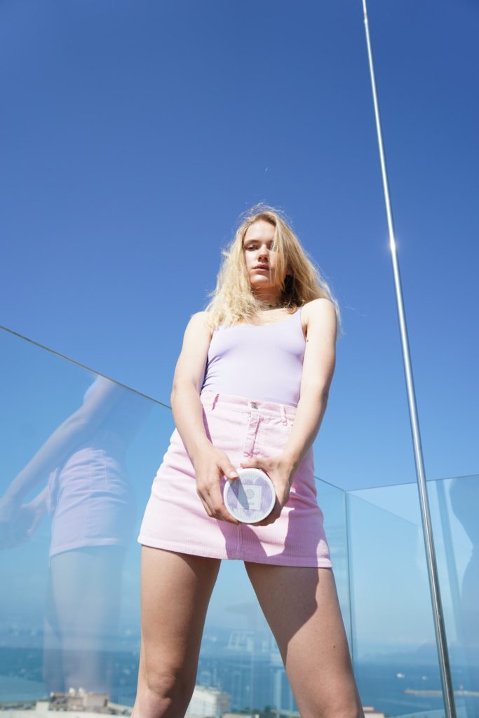
In terms of enhancing the performance of the main body of the picture, the two have the same purpose. For example, by blurring the foreground, we can highlight the main body by using the virtual to support the real. Exaggerating the foreground, filling it all around the picture to form a closed composition, has the obvious effect of focusing on the subject. Cropping the foreground, depending on the limitation of the frame of the picture, appropriately deletes the accompanying body that appears to be larger in the close-up lens. So that its shape is incomplete, so as to contrast the main body with complete shape.
However, the so-called proper use of the foreground usually mainly refers to making the foreground play the following three roles on the screen:
1. Form an apparent sinking space
Shooting rainy, foggy and other hazy scenery often lacks the sense of depth. Even when shooting distant mountains, near water, and deep houses, the distance, near and depth on the screen may not be obvious. If combined with the close-up, even if it is just a rock, a clump of grass, or a tree branch, it can reflect the distance of other scenes in the picture.
2. Balanced composition layout
The screen needs a certain amount of white space. This can be an empty space with a single-tone background of white, gray, and black. Or an open space with the same tone of sky, water, and ground. Photographers use it to adjust the structure of the picture, make the layout balance, and even contain artistic conception.
However, if there are too many blanks, it will not only give a sense of emptiness, but also cause the picture to lose weight. Therefore, some foregrounds must be properly incorporated to fill in the blanks and make the composition and layout balanced.

3. Has a decorative aesthetic
For example, to express the scene of spring ploughing, one or even a peach blossom is taken in the corner of the picture, the quiet lake and mountains are photographed. And a few reeds turn up as the foreground. Or photograph city buildings through the wonderful water jets of the fountain. Similar to this kind of utilization prospect, although it is an embellishment, it is also the icing on the cake. And it can often play the role of beautifying the picture.
The list of scenes suitable for foreground is endless. However, if it hinders the performance of the main body of the picture, and does not have any of the above functions. We must use such a prospect with caution, or simply not use it. So as not to lose more than the gain.
(To Be Continued)
