Table of Contents
Use Light Meter
White objects reflect about five times as much light-about 90% of the light. Therefore, the readings they took from the white object were as high as five times, which is too bright. By opening the sophomore stop, they can regain the readings they should get when they measure 18% gray. Now they have the readings needed for a normal exposure. Since the scene is initially illuminated by dim light, this “normal” exposure will reproduce the darkness of the original scene. The result is a photo with on-site lighting effects.
Live Light and Development
The course “Black and White Film Development” is optional. If you want to get a live light effect, the following on how to develop is also worth learning. However, if you develop your own black and white film, then these contents are very important.
In the weak and dim light of typical live lighting, as we have introduced, you should expose the strong light or midtone part, not the shadow part. The result is that you underexpose the film.
Why does this reading make the film underexposed? Let’s discuss it in depth. As we said, you took the “normal” reading of the shaded area, and the light meter told you to use an aperture of f/2 and an exposure of 1/60 second. Then you close the aperture by one stop to f/4 to get a “normal” exposure. However, under live light conditions, you need to take the mid-tone or strong light readings, not the shaded readings. Now suppose that the light meter tells you to use f/16 aperture for the same scene, 1/60 second exposure. With this aperture, you will make the film get a lot less light. The result is underexposure! You may open the first stop or second stop, but you are still underexposed compared to the “normal” exposure. This is what happens when shooting most low-light photos. Generally speaking, you want to underexpose the film.
Now if you shoot an underexposed black-and-white film, and then press normal processing, then you run the risk of getting an underdeveloped image-an image with few details in the bright part and almost no detail in the shadow part. In the photo made with this film, the bright part may be faint gray, and the midtones and shadow parts may be pitch black. In live light photos, you don’t mind the black shadows, but you like to see some details in the midtones so that they are different from the strong light.
How can you achieve this distinction between midtones and strong light parts? Since the film is underexposed, you can get more details in the midtones by overdeveloping the film. The over-developed part of the strong light may look pure white on the photo, but now the over-developed mid-tone part may show some gray tones on the photo. This is exactly the effect you want.
How Professional Photographers Use Live Light Creatively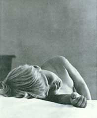
In this live photo taken by Hella Hammid, the light from a nearby window subtly reveals the softness and smoothness of the child’s skin and the air of his imagination. The reflections of the walls and sheets made the child’s room like a holy and ethereal wonderland.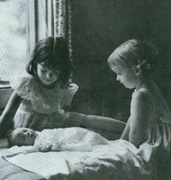
The live light coming in through the window has long been a favorite lighting source for painters and photographers. Fritz Henry (FritzHenle) knows that he doesn’t need to do anything, just find the angle he wants and press the shutter. The white bed sheet under the baby reflects light on the faces of the two little girls and makes the shadows appear sparse and soft.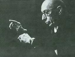
Ernst Haas captured the main features of composer Lgor Stravinsky while conducting his orchestral music. Except for a few parts that can outline the activities of the characters, all other parts are black. We saw the main features of his face, including the outline light that clearly outlined his ears and head, so we could recognize this person.
We see his moving hands, so we can recognize the outline of his body. If a cartoonist wants to paint a portrait of Stravinsky, isn’t it just these basic elements that he has to choose? Ernst Haas uses light here in the way Picasso might use, that is, to draw the image with only a few simple lines-that is to say, in order to depict the subject, he only illuminates Those absolutely important parts are ignored, and other parts are ignored. This is an excellent example of live light photography skills.
Although we usually associate live light photography with black and white images, and in this image, the shadow part loses all the details and is submerged in black without any obvious features, but the live light can also be used for color photography . Let’s introduce the representative works taken by photographer David Hamilton. Hamilton is world-famous for his beautiful color photographs of young and beautiful women. Let’s explore together how Hanmi combines the use of live light with other techniques you have learned in order to achieve a “sentiment” that conveys innocence and sexiness in his photos.
While watching these photos, it should be understood that all of Hamilton’s photos were taken with a 35mm single-lens reflex camera equipped with a 50mm lens. In other words, he did not use any special equipment or lighting fixtures. Even his model is not particularly beautiful. Therefore, when you study these photos, you should ask yourself: “In order to achieve these fascinating effects, how did Hamilton use the three principles I learned in Lesson 1? How can I sample the effects?”
In the photos in this article, you will see examples of David Hamilton’s use of live light to achieve a soft and provocative mood. To our eyes, this picture hints at the sexual mystery of a woman’s maturity. Let us examine the method Hamilton used to express this theme.
The first is the direction of the light. Light enters the room from an invisible window on the right side of the screen. One side of the model is bathed in warm light, but her other side is in mysterious shadows. This kind of light is similar to the side light, and the angled side light creates a strong texture on her skin and pajamas. It also provides the contour light often found in backlighting, thus realizing her profile. This use of light provides a good example of how sidelights and backlights can produce dramatic and textured effects that contrast with shadows.
The second is the color of light. Obviously, the photo was taken at dawn or dusk, because the model was bathed in orange light, which produced a sexy warm tone. You can ask yourself: If the daylight illuminates her at noon, how would this picture be different? Will it cause people to have similar associations?
The third is the pose of the model. She avoids the camera, her eyes are looking out the window. What is she looking for? Is she waiting for someone? That’s the mystery reflected in the photo. What kind of clothes is she wearing, is it pajamas? That is part of showing sex. The neck of the shirt is open, and the belt around the neck is not fastened. This way of dressing enhances the sexy of the photo.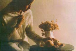
Can you think of any ways Hamilton can simplify this picture? We can’t figure it out. In fact, there are only two components in this picture-model and light. Everything else is omitted.
All of David Hamilton’s better photos have the style of old paintings as shown in Figure 10.6. Especially this picture reminds people of the work of a Dutch master painter. In fact, the use of light on the face-the face facing the camera is basically dark except for a small patch of light-is called Rembrandt’s use of light. We will discuss this light method in detail in the portrait photography course.
This photo also clearly shows how light from one direction forms a pattern of light and shadow, thereby providing a three-dimensional effect. Please pay attention to this photo, especially the fruits in the plate, the characteristics of the round objects are clearly depicted. It should also be noted how the side light shines on the wall to show the texture of the wall. Imagine, if you change the background to white seamless paper, what the photo will look like. Will it be so compelling? We don’t think it will. The texture of the walls makes the scene appropriate; an old-school girl lives in an (alludatively) old-style house.
Notice how Hamilton follows the rule of thirds. His subject is not at the center of the frame, but at one-third of one side, with his face facing the wider side. As you learned earlier, this is usually a more preferable arrangement because it is more alive than putting the subject directly in the center of the frame.
Please also pay attention to how to arrange the main body into a triangle, forming an angle from the upper left corner down to the lower right corner. Finally, please notice how Hamilton draws the audience’s attention to private technology to his subjects (girls, flowers and fruits). He framed them with the bright light on the wall. Do you think it is simple? Without diminishing this beautiful picture, we can’t see anything that can be removed.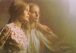
Two young women are looking out the window. This is a picture of innocence and friendship. Let us see how Hamilton expresses this theme.
The first is the use of light. Compared with the “hot light” used in the cover photo, cold light is used here, and diffused light is used, which is the opposite of warm light, which is sexy. Pay attention to how all the shaded parts turn black-a sign of live light photography.
The second is posture. The purpose of this photo is to express harmony. Let us now look at this excellent example. When you photograph two or more people together, you usually like to make them appear as a whole, rather than separate individuals. This is called harmony.
In order to achieve harmony in this photo, Hamilton used some classical techniques. He kept the subjects close together, leaving no space between the two. To enhance their sense of relationship, he put one person’s arm on the other’s shoulder.
In addition, in arranging models, he adopted a classical form of expression-triangle. Notice how the positions they occupy form a triangle with the head at the top and the sloping arms on both sides. This triangular layout is very effective when arranging people and objects in a picture.
Finally, in order to enhance the sense of harmony, Hamilton asked the two subjects to look in the same direction, possibly at the same object.
