To take color photos, in addition to mastering the basic knowledge and skills of color formation and restoration, you should also master the ability to express ideas with color expressions and the ability to process colors on the screen.
Table of Contents
1. The Three Eements of Color
①Separate
Also called color and hue. Refers to the appearance characteristics of various colors and the difference between each other. For example, the seven standard colors of the spectrum-red, orange, yellow, green, blue, blue and purple, each have its own appearance. Another example is red, which is divided into red, magenta, rose, pink, and crimson. Each has its own appearance.
②Brightness
Refers to the intensity of the color, that is, the brightness. The brightness of each color is different, with yellow being the highest, red-green second, and blue-violet the lowest. In each color, the brightness will also change due to different lighting conditions. The light is strong, the brightness is high. The brightness is low when the light is weak. The light-receiving part is light in color and high in brightness. The backlight is dark in color and low in brightness.
③Purity
Also called color saturation. Refers to the vividness of the color and the number of color components contained in the color. Black and white are panchromatic, also called achromatic. The purity is low if there are many decolorizing ingredients in each color. Colors with less decolorizing components have more color components, that is, high purity.
Smooth and clean surface, high color purity. Objects with rough surface and dust, low color purity. The seven standard colors in the spectrum have the highest purity. Adjacent mixed colors have the second highest purity. Complementary color mixing, the lowest purity.
2. Basic Tone of Color Picture
Taking color photos does not mean that the picture is colorful. Too many colors are too complicated, and the picture becomes messy and sometimes very tacky.
Learn to master the method of taking pictures with basic tones to make the picture look uniform and beautiful.
The basic tone of a color photo is that the screen takes a certain color as the main tendency, and appropriately includes the basic tone formed by other colors.
The main keynotes are:
Warm tone-mainly red and orange
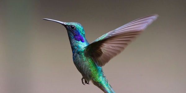
Cool tone-mainly blue and cyan
Midtones-mainly yellow and green
Some Points to Note When Taking Color Photos
When shooting color photos with various tone tendencies, pay attention to the following aspects.
1). Choose an object with consistent color as the subject, occupying the entire frame or most of the frame to form the basic tendency of colors. Such as red pepper, yellow rice, corn on the cob, on the drying yard, storage yard, can all be photographed. Another example is the blue sky, the green water surface, and the large gardens, grasslands, woods, etc. of the same color, all of which can form a different tone of the picture.
2) Use the color change of the light source. In the morning and evening, the sunlight has low color temperature and contains many red light components, so you can get warm-toned scenery photos of the sky. For the night scenery, use the “daylight” block to take photos with various lighting embellishments in warm tones. You can also add red in post-processing. The method of using flash and indoor lighting to add color film can also make the subject have a strong color tendency.
3) Pay attention to choosing a more uniform color background. Such as the background of blue sky and white clouds or sunset. Or use red, yellow, and blue background paper as a background in the studio.
3. Contrast and Coordination Between Colors
Generally speaking, certain color pairs are stronger, such as red and cyan, yellow and blue, green and magenta. The colors appear closer between red and orange, orange and yellow, yellow and green, green and blue, blue and cyan, and cyan and purple.
When the contrasting colors are put together, the difference in the size of each area should be used to achieve harmony. Photographing a girl wearing a red jacket and green pants will look homesick and tacky. Two basic opposing colors appear equally in the picture, it will appear inconsistent. But if you adjust the ratio of red and green to the size of the area, it will look much better. For example, if a girl in a green dress wears a little red lipstick or puts a red flower on her chest, she will look very fresh and lively, and a little red will be very eye-catching. “A little red in the ten thousand green clusters” is the use of changes in area to make them coordinated.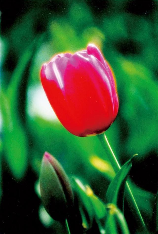
Color contrasting picture
How to Deal with Two Contrasting Colors
When two contrasting colors get together, you can also use the transition of light and shade to make them more coordinated. If the subject of golden yellow is placed in front of the blue background, the contrast is very strong. But if the brightness of the background gradually darkens up or down from the middle, and the color gradually becomes darker and darker, it will appear coordinated and not very dazzling. It can not only highlight the subject, but also prevent the color of the picture from jumping too much.
When the two color blocks have a strong contrast and little difference in size, the intermediate colors can also be used to coordinate them. For example, add a piece of green between yellow and blue, and add a piece of purple between red and blue. Of course, you can also improve their brightness, and seek harmony in the light and soft tones.
When the color blocks are more complicated and objects with more colors get along and it is difficult to coordinate, if conditions permit, you can choose a white or black background to set off to make them coordinated and unified.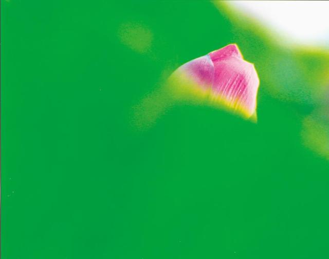
Bright contrast is elegant and harmonious
4. Color Echo and Layout
The color blocks of the same color and other colors in the picture do not necessarily have to be grouped together. Sometimes the same color blocks are scattered in different parts of the picture, echoing each other, the form is more lively, and the visual effect will be better. The color blocks that play an echoing role should be distinguished between large and small. Sometimes several colors are intertwined and distributed regularly, which can produce a certain rhythm and rhythm. As a result, we can obtain a unified and varied picture effect.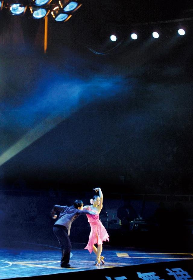
The light on the top and the color of the floor form a good echo
In the general color processing layout, in addition to forming echoes, rhythms, and rhythms, attention should be paid to the basic principles of cold top and warm bottom, light top and dark bottom, near warm and far cold in order to conform to the law of balance and perspective.
