Table of Contents
1. Regarding the Screen, Adhere to Two Basic Principles
(1) Concise
That is, the screen is concise. It refers to the principle of making the picture look concise and clear, with prominent key points and prominent subjects through means of composition and post-processing.
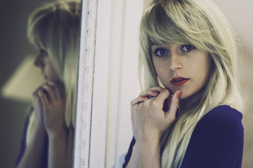
The simplicity of the picture is the only rule of thumb for making the point of a photo clear at a glance. Because there are not too many elements or companions to interfere with the main body and focus of the picture, such photos are the easiest for people’s vision to find the focus that the photographer wants them to focus on in a short period of time.
There are two easy ways to get a clean picture. The first is to use a large aperture to blur the background, resulting in a photo with a prominent subject and a clean picture. The second is to make the picture look concise and charming by leaving a large blank area in the picture, that is, “white space”.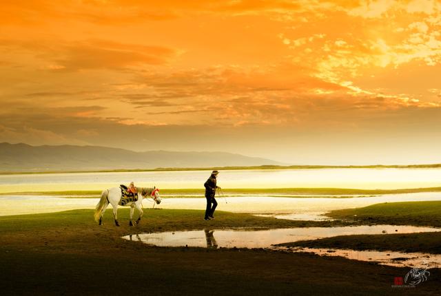
(2) Balance
That is, the balance of the picture. Refers to the photographic composition, as far as possible to avoid the instability of the upper and lower weights and the left and right vacancies in arranging the scene of the picture.
People’s vision tends to be balanced, which is partly determined by physiology. Therefore, the image of photographic works and the connection between them should also conform to people’s visual habits and physiological balance needs, so that people can feel natural and comfortable. Otherwise, it will cause a sense of psychological imbalance and instability. It should be noted that balance refers to the macroscopic visual impression of the picture, not the microscopic requirements of the partial impression of the picture, and definitely does not refer to the averaging and symmetry of the picture.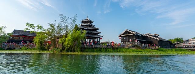
In the creation of landscape photography, special attention should be paid to the effect of horizontal and vertical lines in the picture on the balance of the picture. For example, the horizon is tilted and positioned incorrectly, which can make the viewer feel out of balance. If the relatively long vertical line cannot be perpendicular to the ground or the horizontal line, it is easy to give people a feeling of instability. This is evident when photographing trees and architectural subjects.
Simplicity and balance are the two rules for arranging a good picture.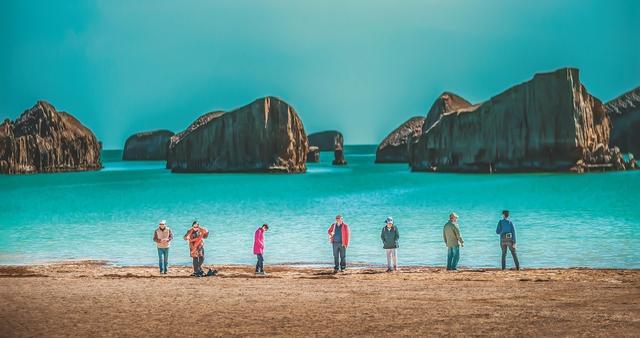
2. About Composition, Understand 3 Basic Components
A photo is mainly composed of three basic elements:
(1) Subject
The subject is the center of the composition of the picture, and refers to the main object of interest in shooting. It is the main component of the composition of the picture, the visual center that concentrates the line of sight, and the main embodiment of the content of the picture. The subject can be a person, a thing, or anything that can carry the content of expression.
A beautiful photo will have various elements such as subject, companion, foreground, background, etc. But the position of the subject cannot be changed, and the perfect combination of other elements is to highlight the subject, and arrange the position and proportion of the subject for this purpose.
To stand out the subject in photography, we can use a variety of means. The most commonly used method is contrast, for example, virtual and real contrast, size contrast, light and dark contrast, dynamic and static contrast, etc.
(2) Accompanying body
The images used to accompany the subject in the photographic picture are collectively referred to as the accompaniment.
Accompanying body plays a foil role in the picture, as the so-called “safflower needs green leaves to support”. Even the most beautiful safflower will lose its vitality without the presence of green leaves. When “green leaves” serve as a foil, it serves “safflower”. It is important to distinguish between the main and the secondary, and avoid arrogantly taking the lead.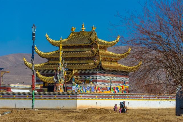
In general, you can use the direct method and the indirect method to deal with the companions in the picture. The direct method is to place the accompanying body in the picture, but it should be noted that the accompanying body cannot overwhelm the subject, and is often arranged in the corner of the foreground or background. The indirect method, as the name suggests, is to arrange the accompanying body outside the screen. This method is more subtle and more flavorful. This helps to create an invisible voiceover, so that there is a picture within the picture and a picture outside the picture.
(3) Environment
The environment highlights the subject and creates a sense of hierarchy.
Genarally speaking, the environment refers to the scene near the subject. It is neither the foreground nor the background. Environment can be scenery or objects, or birds or other animals. The environment sets off and illustrates the role of the subject.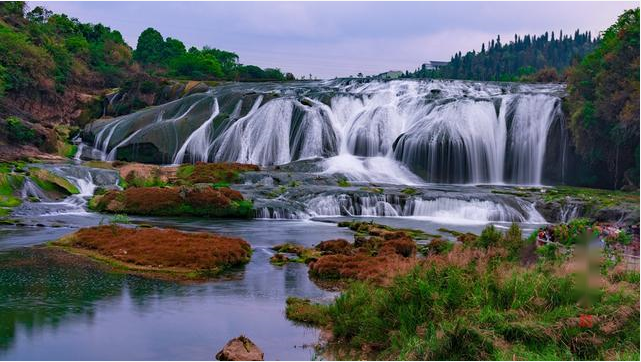
In a photographic work, in addition to seeing the subject and companions, we can also see some elements as the environment. These elements set off the theme and plot, further emphasize the expressive power of the theme idea, and enrich the level of the picture.
Reasonable arrangement of subject, companion and environment are the three rules of picture composition.
3. Environment
Regarding the environment, make good use of three basic factors.
A photo will be more expressive and attractive if it uses and handles the three environmental factors of foreground, background and white space.
(1) Prospect
The foreground is the scene closest to the lens on the screen or the scene in front of the subject can be called the foreground.
The foreground can help the subject form a complete visual impression in the picture. Because some shooting themes rely on the subject of the picture alone, it is difficult to explain the whole picture of facts or things, and even make the audience unable to understand the intention of photography. There is no special regulation on the position of the foreground when shooting, and it is mainly determined according to the main characteristics of the subject and the needs of composition.
(2) Background
The background usually refers to the scene behind the subject, which can be simply understood as the scene and object farthest from the photographic lens.
Different background choices and different expression techniques can make your pictures look more artistic.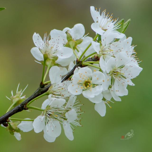
Leonardo da Vinci once explained the role of the background, “Dark objects on a bright background will appear smaller than the original, while bright objects on a darker background will appear larger.” This explanation of the trompe l’oeil effect fully demonstrates the influence of the background on the subject.
In the actual shooting, usually a large aperture is used to blur the background, so that the background can form a beautiful blur effect. In addition to that, it is possible to brighten the subject and dim the background through metering tricks. Or darken the subject and brighten the background to contrast the subject of the picture.
(3) White space
White space is the blank part of the screen.
The blank size of the picture determines the orientation, size and distance of the form in space. Blank and form constitute the overall spatial system of the picture. It not only plays the role of communication and connection form, but also plays the role of creating the artistic conception of the picture.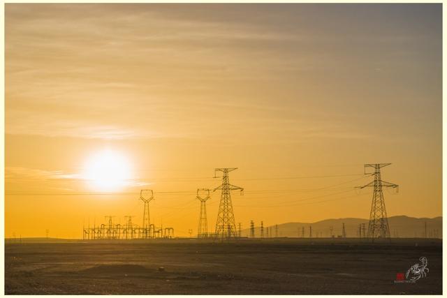
But white space in photography is not necessarily white in the actual sense. It can be a large piece of the same color or the same type of scenery, such as sky, sea, mountain, grassland, land, etc. When shooting, the purpose of leaving blank space is to suddenly change in the peace of the blockbuster, so as to create a center of interest, to highlight and express the subject, and to make people feel the mood of silence rather than sound.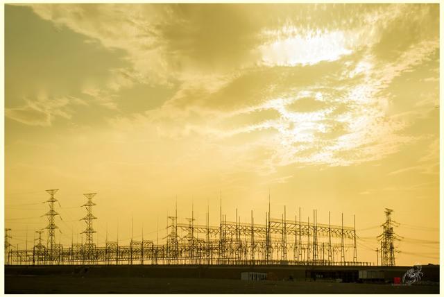
Reasonable layout of foreground, background and white space are the three rules for the composition of the picture environment.
You’ve matured when you’ve left the rules of composition behind and you can rely on your own intuition to compose a picture freely. You can become a master just around the corner.
