Table of Contents
1. The Layering of Composition Graphics
The sense of hierarchy between graphics and elements can highlight the theme you want to embody while interfering with the vision. This way of expression is often a more direct and effective way.
We’re talking about this kind of visual distraction, which distracts the viewer’s unwanted attention while making them more aware of the subject of the shot. The graphics produced for this type of interference are auxiliary graphics for this theme.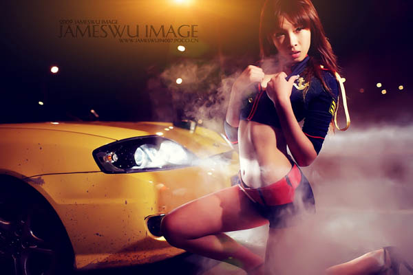
The layering of composition graphics
Just like the above piece, the irregular elements, light, light spots, smoke and the sports car that occupies half of the composition in the work, although there are many things in the picture, they constitute a certain sense of depth and hierarchy. These elements distract the eye while bringing the viewer’s eye to the center. This method is now a more common way of shooting. Maybe most people think it’s more cool.
2. The Visual line Traction of the Composition
Use colors or elements to draw the viewer’s vision, allowing the viewer to think and watch the works with the photographer’s thinking. Most of the works that exist now are guided by points, lines and surfaces, and works in the form of graphics and elements are rare.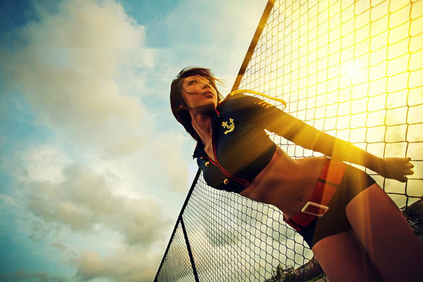
The visual line traction of the composition
Just like the above work, the visual impact is not on the characters, but the brightest light. However, the author uses a ball net to divide the picture as a traction line, and the appearance of characters at the junction of the upper and lower parts is to pull the viewer’s vision to move to the characters, making them more impactful.
3. Color Induction
In fact, the principles of photography and painting are the same. The color matching and position, even if it is just a hint of embellishment, can make the picture have a super impact.
Therefore, the use of this expression method will mostly appear in the lens of artists or photography enthusiasts who have learned the use of color.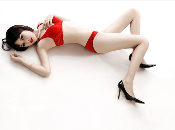
color induced
The main color block in the image above uses red and black. In the picture, the white block in the background and the red line form a strong contrast. While balancing the strong contrast of colors, the black shoes also play a certain contrasting role with red. The crystal color of the bracelet has also become an embellishment, so that the whole picture will not be weightless. However, it must be noted that the proportion of each color block must be adjusted well, otherwise the whole picture will be very scattered.
4. Light and Dark Induction
Use some commonalities of light perception refraction, light perception capture, dynamic light perception and difference between light and shade to set off the theme.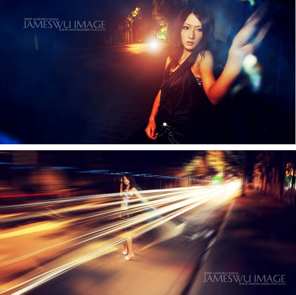
light and dark induction
In Figure 1, the author uses a lamp as the background, but reduces the exposure value to make the contrast between light and dark strong, and the refraction in the environment embellishes the subject (the small light spot on the right side of the figure), which strongly attracts the viewer’s attention.
As shown in Figure 2, the slow shutter speed makes the dynamic light perception and the difference between near and far light and dark make the original inconspicuous shooting distance and inconspicuous characters become the focus.
5. Instant Capture
Use the momentary reception of the eyes senses to capture the visual point.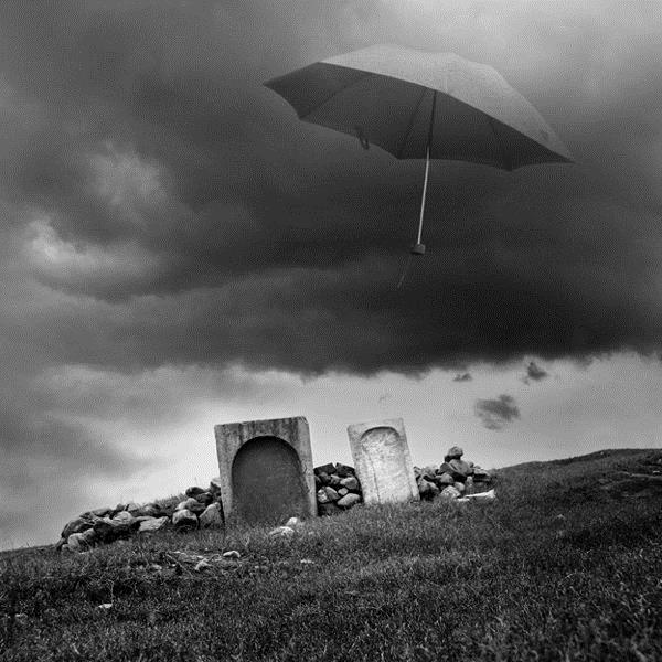
instant capture
The moment when the umbrella floats in this work, it can instantly stimulate the sensory visual response. Although this is just a very ordinary scene, but it makes people have an inexplicable sense of shock!
6. Grasp the Breakthrough Point
The visual requirements are achieved by breaking through the visual balance point of the image itself, and the main element itself is used to find the breakthrough point of shooting. According to the sense of space, light, and other prominent places generated by the subject itself, use them to highlight the subject of shooting.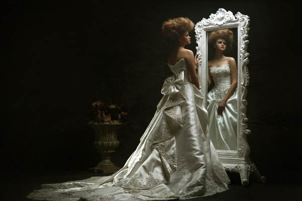
Grasp the breakthrough point
As shown in the picture, the mirror in the picture creates a strong sense of space. The photo breaks the visual convention, allowing the focus of the vision to focus on the mirror, and instead transforms the original subject into an “ornament”.
7. Proportional Size
According to the proportional relationship of the thing itself, it pursues the visual balance relationship in the proportional relationship, breaks through the proportional relationship of the thing itself, and then pushes out its own visual focus for breakthrough. Just like some exaggerated cartoons, a character with a big head and a small body, an exaggerated way of distorting the normal proportions, can often have miraculous effects inadvertently.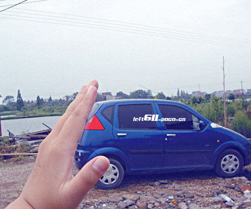
Proportional size
When taking this photo, the author just used the principle of a small visual error. That changed the proportion of the subject, lost the balance relationship, and made a visual breakthrough in the ordinary picture.
8. The Cognitive Abilities of the Appreciator
According to the appreciator’s receptive ability, that is, the feelings commonly referred to, use some elements of daily life. And fully consider the appreciator’s ability to recognize the film. Touch viewers’ emotions with natural beauty and brutal beauty that transcends ordinary acceptance to get people to have a clear memory of the photos you take.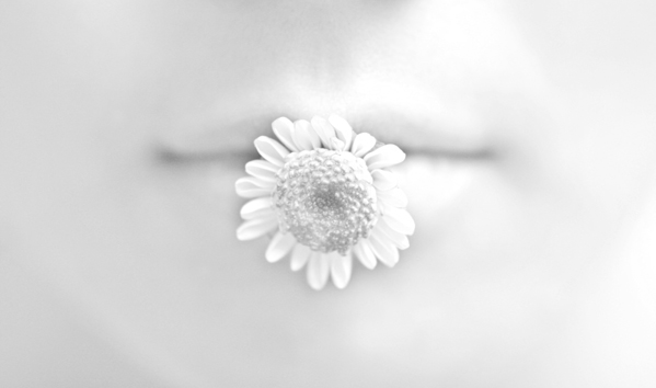
Appreciator’s Receptive Ability and Feelings
9. Visual Illusions
Use the visual illusion of space to highlight the visual center of the overall shot.
visual illusion
The object in the work is actually just an ordinary fruit. But the author uses lighting and other effects to create a visual fantasy.
10. Abstract Representation
abstract representation
In the above work, the author abstracts the use of flowers to represent the water sprayed by the shower. And uses the contrast of colors to highlight the theme and at the same time play a certain entertainment. This kind of work is easy to make people feel good about, and it is less easy to forget.
